Print design has been a core part of my work as a graphic designer, allowing me to focus on thoughtful layouts, strong typography, and clear visual storytelling. I’ve designed a variety of print materials including brochures, flyers, magazines, infographics, and branded PDF documents, always with real-world use in mind. The projects shown below reflect my attention to detail, understanding of brand consistency, and ability to turn information into clean, engaging designs that work both visually and functionally.
While working at Flexco, I worked on a wide variety of projects, both digital and print. This experience allowed me to deepen my understanding of designing for clients and adhering to strict brand guidelines. I created everything from social media posts and banners to printed materials like posters and brochures. Each project provided valuable insights into maintaining brand consistency while meeting the specific needs and preferences of our clients. This diverse experience has significantly enhanced my design skills and adaptability.
For this project, I was assigned to create two posters for an upcoming conference where two of our employees would be speaking. I researched and applied design principles to ensure readability and effective communication of the message. I developed several iterations, incorporating Flexco’s brand colors, to achieve the best possible design.


For the Walker Brochure project, I was assigned to create a fresh, updated brochure design with new graphics for clients visiting the company for tours. The old brochure was outdated and needed a refresh. I conducted research and went through multiple iterations to develop a clean, modern look. I also printed the brochure to ensure all the folds aligned correctly, using the C-fold method. The colors, imagery, and content all fit perfectly.
Another edition of the IABSC summit hosted by Flexco, I was tasked with creating a fresh, new look for the event, themed around “airport.” I was provided with a detailed agenda, including the schedule and activities. I conducted thorough research to find the best images and incorporated various logos provided to me. To ensure everything aligned perfectly when folded, I printed out the design. This hands-on approach helped me verify that all the graphics were correctly positioned and the final product met the high standards expected for the event.
For this project, I was assigned to create special hardhat decal sticker designs for Minexpo 2024, a trade show sponsored by the National Mining Association. This event showcases the latest technologies, machinery, and equipment for the coal, metal, and nonmetal mining industries. The designs needed to be tough and durable, so I created several iterations, experimenting with colors, shapes, and typography, all while adhering to Flexco's brand guidelines. I narrowed it down to two designs, refined them, and submitted them for a chance to be featured at the expo.


While working at Everspring Partners, I was responsible for designing Zoom backgrounds and social media posts for different schools. I thoroughly studied the brand guidelines of each school and ensured that my content aligned with their branding. Here are the projects that I had the pleasure of working on.
When I initially started this project, I was filled with enthusiasm. I was tasked with redesigning four documents that had been poorly laid out using Microsoft Word. These documents contained valuable information, but they needed restructuring to effectively reach the intended audience. As I reviewed the materials, I also discovered that one of them was an infographic that required a redesign.
To begin the process, I conducted online research and utilized the school databases to explore how similar designs had been approached in the past. With all the gathered information, I proceeded to create four new designs that incorporated color, imagery, icons, and layouts, all while adhering to New York Institute of Technology's brand guidelines.
Throughout the project, I maintained communication with my creative director, regularly reviewing my work to ensure the effective communication of the messages conveyed in these documents.
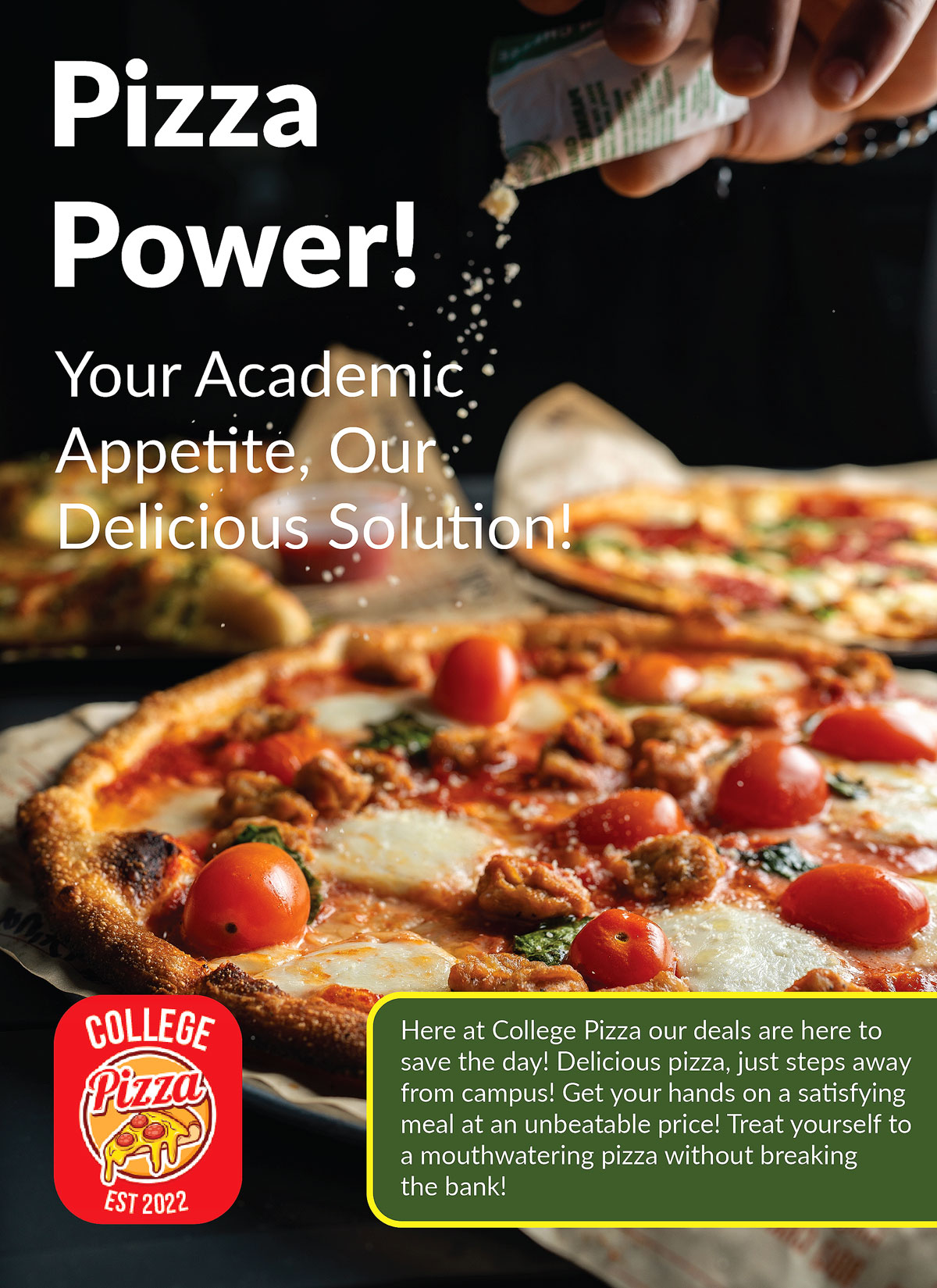
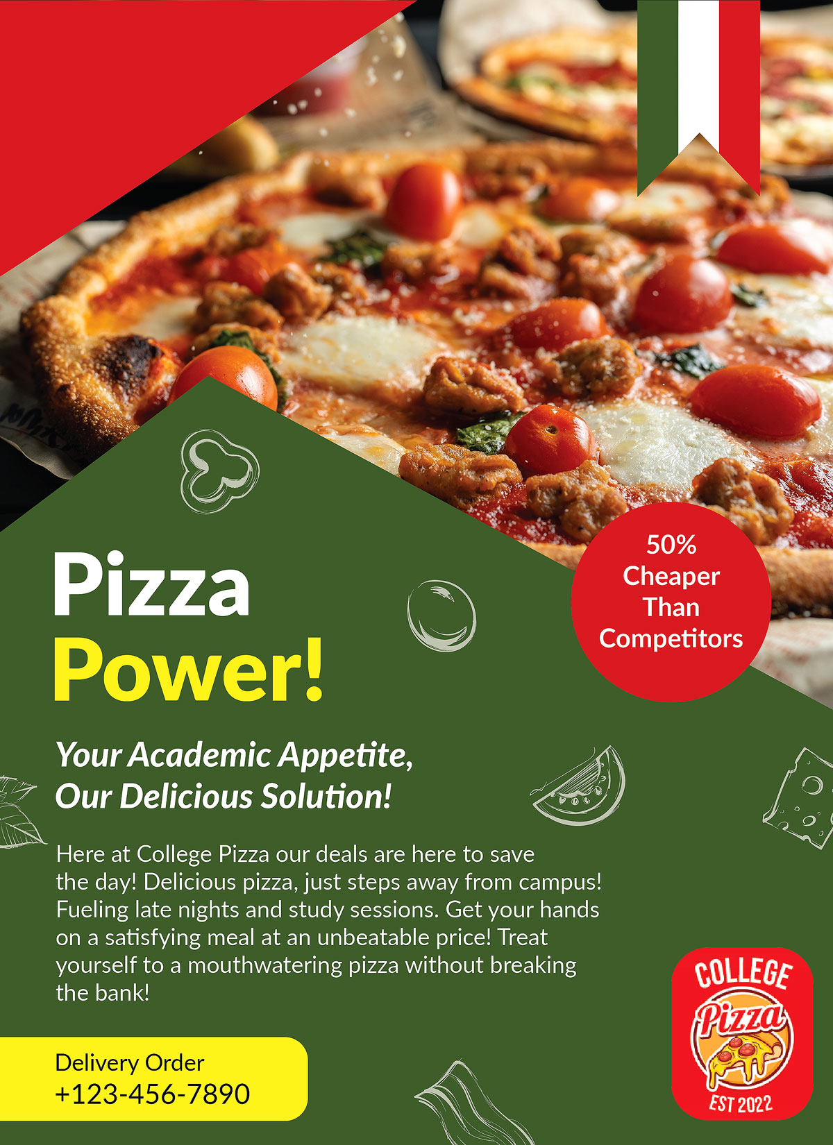
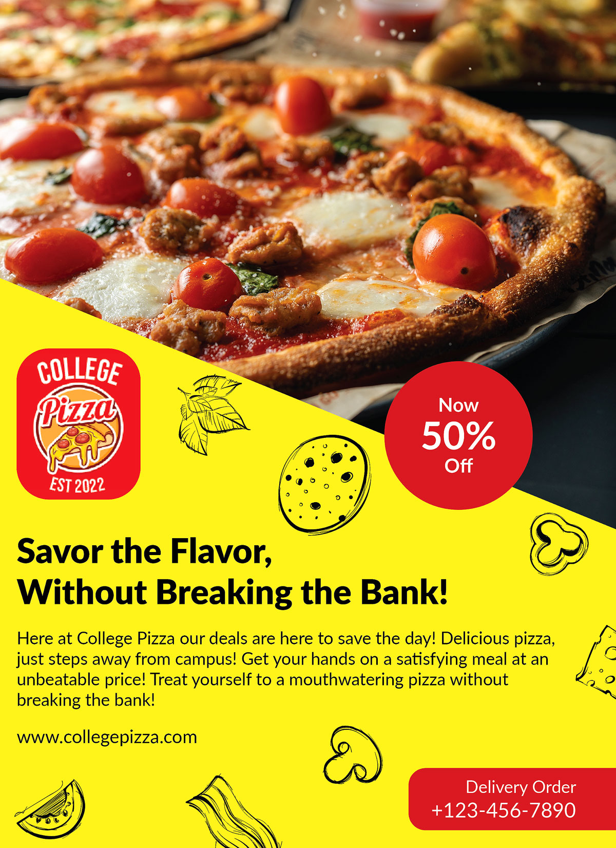
I was given the task of designing a pizza flyer for a company called College Pizza. The restaurant is located near a college campus and wanted to attract the attention of college students to visit their establishment. Their previous advertisement didn't yield the desired results, as revealed by their customer survey data. To rectify this, the new design needed to specifically target the age range of 18-24, which corresponds to college students.
To create the design, I relied on a detailed creative brief provided by the company, which offered valuable insights into the preferences of this target audience. Utilizing the information from the brief, I developed a mood board and mind map as a foundation for the new advertisement design. This helped me align the color schemes, fonts, and imagery with the expectations and requirements of both the company and the target audience.
Additionally, I incorporated relevant keywords from the brief to guide my creative approach. Throughout the process, I created three different versions of the flyer, but ultimately had to select one for the assignment. Enclosed are the three iterations of the flyer, accompanied by a Photoshop mock-up showcasing the final product.
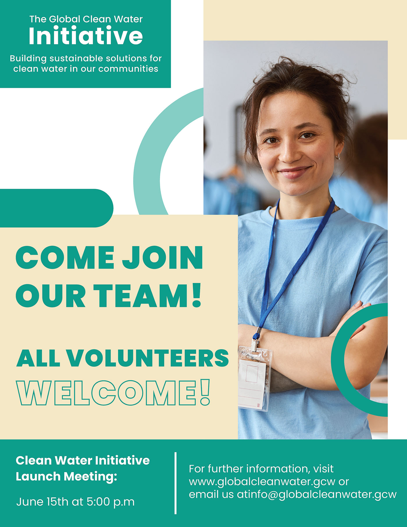
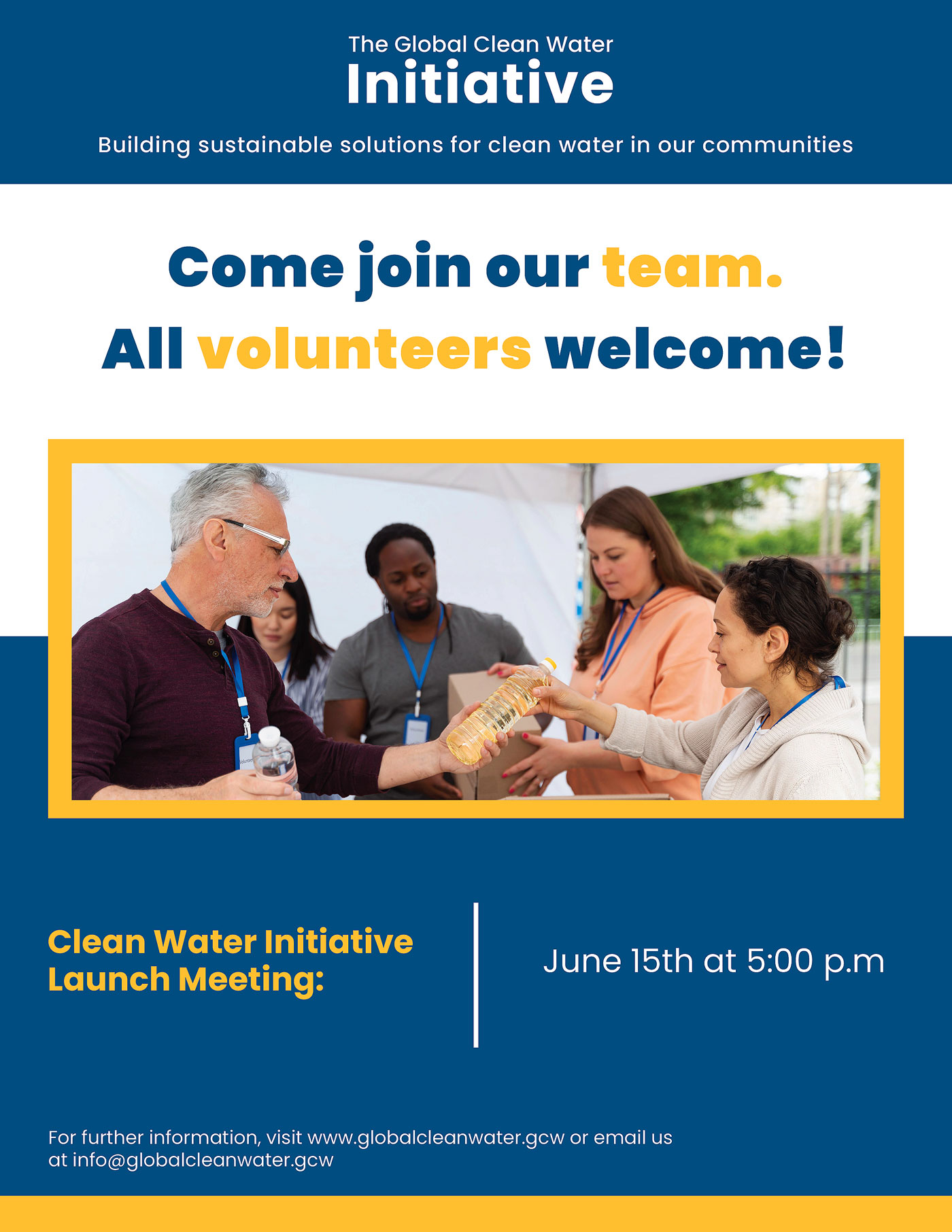
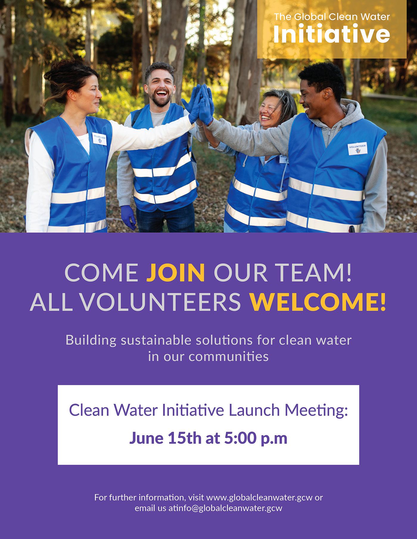
For this project, my assignment was to design a flyer for a nonprofit organization named Global Clean Water Initiative, which is based in California. This organization operates from three satellite offices located in Vietnam, Nigeria, and Mexico. I was required to select one of these countries and craft a flyer using research focused on that country's culture.
I chose to work on Mexico since I wanted to enhance my understanding of the country, as my knowledge about it was limited. The research process involved investigating elements such as colors, fonts, images, typography, and tone that resonate with the culture of Mexico. I also needed to create a profile of the intended audience for the flyer.
The main objective of the flyer was to raise awareness about the initiative and encourage local community members to volunteer. The distribution of the flyer was intended throughout the community. The project included a Word document containing relevant details regarding design guidelines, a call to action text, and vision statements. These components were essential to ensure that the message was effectively communicated.
For this project, I was tasked with creating a magazine catalog for a museum, highlighting an artist and their collection. The goal was to uphold the highest standards of quality, professionalism, and effectiveness in presenting my work to the audience.
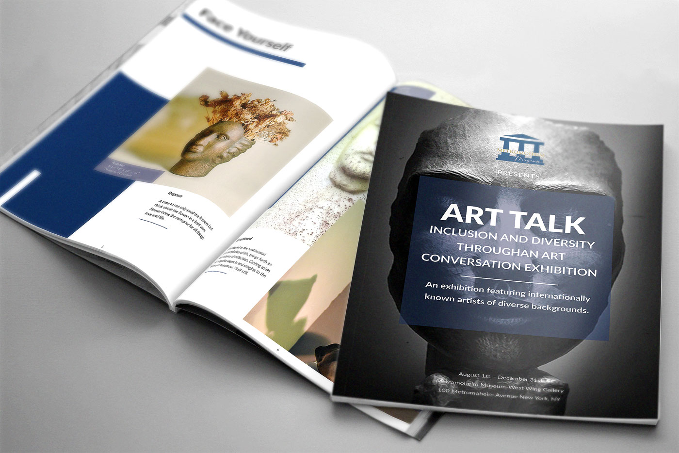
Metromoheim Museum - Magazine Catalog
Following the museum's brand guidelines, I structured an 8 to 12-page layout using a grid system to meet design requirements and prepare it for printing. To ensure proper printing, I learned how to impose the document and utilized the 2-saddle-stitch method. Additionally, I created an EPUB version for online reading using InDesign's export feature. The catalog includes a cover page, table of contents, introduction, artworks, and accompanying descriptions, all designed to enhance readability.
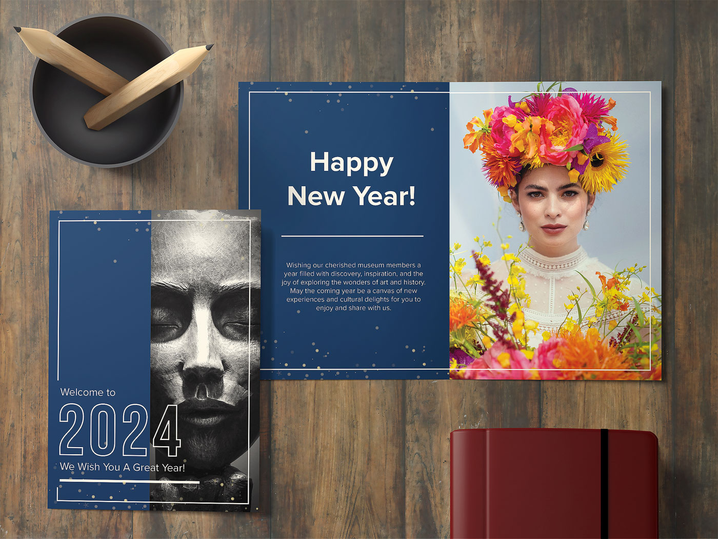
Metromoheim Museum - Greeting Card
Subsequently, I designed a new year's greeting card for the museum, incorporating fold techniques specific to greeting card design. Consistent with the magazine catalog, I employed a grid layout and integrated colors, imagery, and text. Content creation involved utilizing typography skills to enhance the overall design. Throughout both projects, extensive research was conducted, and various design principles such as rhythm, balance, unity, proportion, hierarchy, contrast, and dominance were applied.
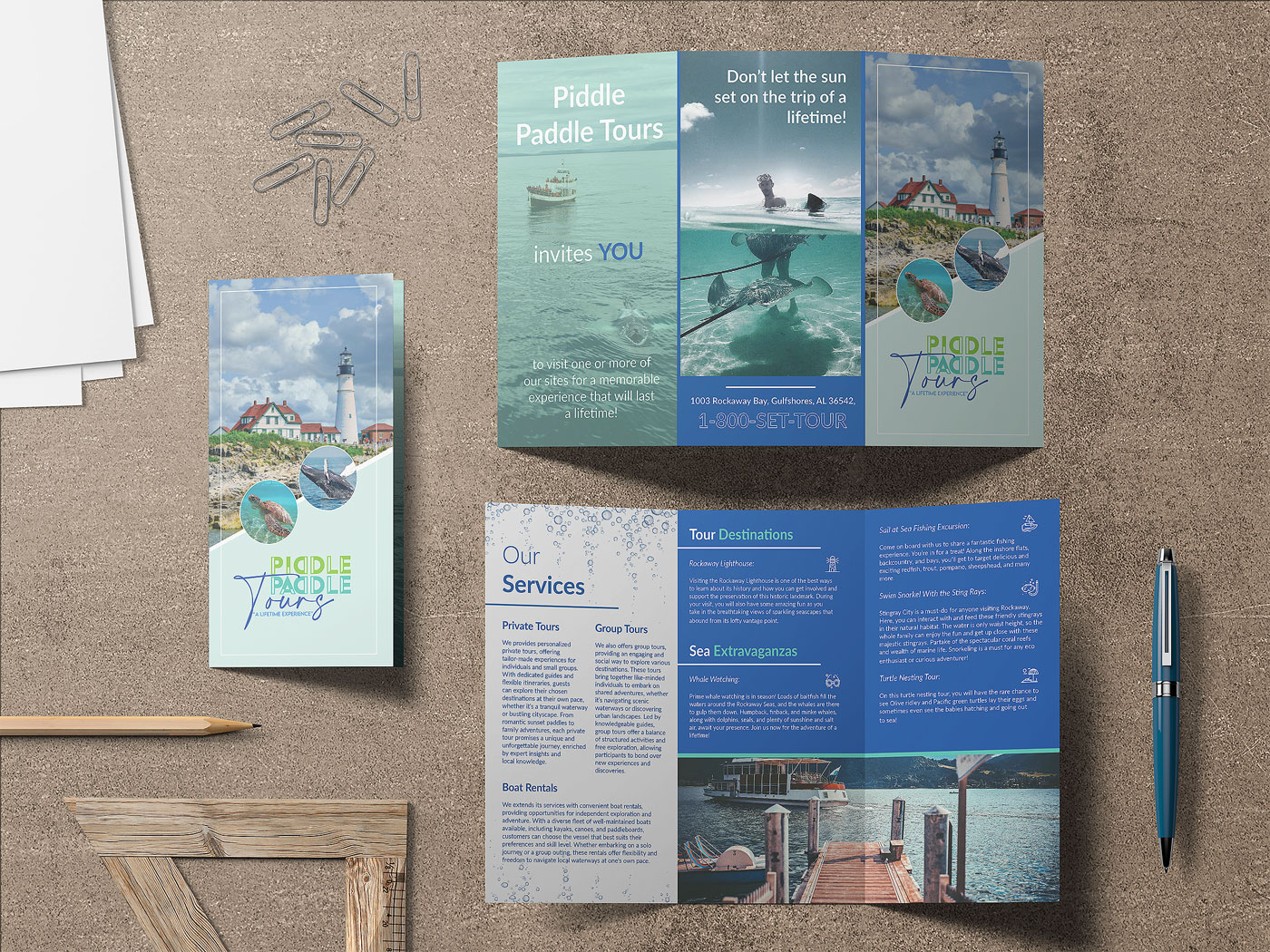
For this project, I was assigned the task of creating a brochure for a company known as Piddle Paddle Tours. I had specific requirements for the brochure that guided my design process. I incorporated elements like color, typography, and imagery, and utilized different grid layouts to present the design effectively. The brochure dimensions were 11” x 17”, and I opted for the "Trifold" paper fold. It will be distributed at information centers, various locations within towns, and nearby rest stops to attract tourists. Piddle Paddle Tours offers seasonal, family-friendly boat tours in a tourist town on the East Coast, featuring activities such as whale watching and sightseeing of historical landmarks. Overall, the project was successful, and I produced a print-ready, multi-page brochure.
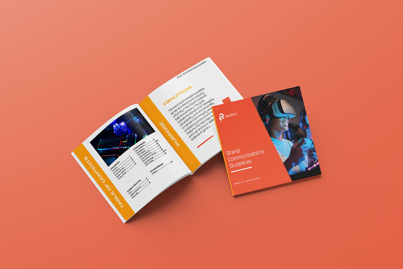
For this project, my task was to create a logo tailored to specific demographics and aligned with the needs and preferences of the target audience. Extensive research and multiple iterations were conducted to refine the logo design. The comprehensive brand style guide encompassed the finalized logo, client messaging, guidelines for logo placement, and other visual identity elements. RacerX is a gaming company dedicated to offering family-friendly, inclusive games suitable for individuals of all ages and abilities.
These typography posters were created as part of a class project focused on exploring influential design movements. For the series, I chose Swiss Design and the International Typographic Style, drawing inspiration from the work of Max Miedinger. The project challenged me to design a cohesive set of three posters that emphasized clean layouts, strong typographic hierarchy, and the clarity that defines Swiss design principles.


