My UI and web design projects showcase my ability to blend visual design with usability and thoughtful interaction. I’ve designed and built a personal portfolio site using WordPress as my final graduation project, fully coded a website for the Chinese restaurant TOWN using HTML and CSS, and created responsive desktop and mobile designs in Adobe XD. Across these projects, I applied key UI principles such as wireframing, user flows, responsive layouts, hierarchy, accessibility considerations, and consistent design systems. These projects represent my growing experience in UI and web design, with many more to come as I continue to expand my skills and explore new digital experiences.
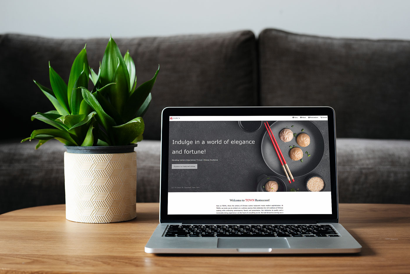
For this project, I was assigned the task of creating a mobile-friendly website. I conducted thorough testing to ensure compatibility across various web browsers, including Microsoft Edge, Chrome, Safari, and others. Adhering to brand guidelines, I incorporated color schemes, text styles, and imagery that aligned with the identity of the company I was working for—an authentic Chinese restaurant named "Town."
My goal was to craft a website that effectively introduced the restaurant while ensuring a user-friendly experience. To achieve this, I applied principles of user interface (UI) and user experience (UX) design. Leveraging HTML, CSS, and JavaScript, I showcased my coding skills and designed an elegant website that seamlessly integrated various design elements. Click the image below to view the website in action.
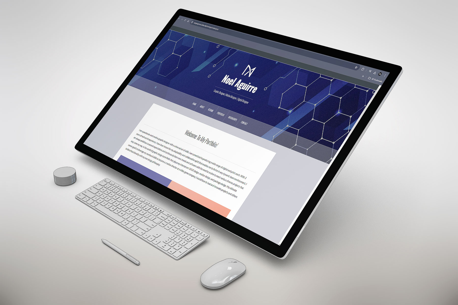
In this project, I designed and developed a self-promotional portfolio website using WordPress. I researched professional designer websites to understand how they promote themselves and applied UI/UX design best practices to create the themes, content, and layout for my site. I started by creating a visual sitemap to plan the pages I wanted to include. I wrote all the content and designed the visual elements, showcasing various projects from my previous jobs and freelance work. I focused on several key UI/UX principles during the design process such as user-centered design, consistency and accessibility.
Additionally, I implemented responsive design to ensure the website looks and functions well on various devices, including desktops, tablets, and smartphones. This involved using features within WordPress such as flexible layouts, fluid grids, and media queries to adapt the design to different screen sizes.
I also optimized images to improve the website's performance. This included compressing images to reduce file sizes without compromising quality and using appropriate image formats for different types of visual content. These optimizations helped to enhance the user experience by reducing page load times and ensuring the website was fast and efficient.
During this project, I created two high-fidelity mockups—one for desktop and tablet, and another for mobile—using Adobe XD to ensure a consistent and intuitive user experience across different devices. My approach followed key UI/UX design principles, including establishing a strong visual hierarchy, maintaining accessibility standards, and designing clear, user-friendly navigation paths. I also prioritized consistency in typography, color schemes, and interactive elements across breakpoints, allowing users to transition smoothly between devices without encountering disjointed experiences.
After completing the designs in Adobe XD, I used Claude AI to translate the mockups into a fully interactive website. I then went into the HTML and CSS files to refine and adjust the code, ensuring the final build aligned closely with my original Adobe XD layouts and design intentions.
Throughout the design process, I collaborated closely with users to gather feedback on pain points they encountered. This helped identify areas of frustration, such as cluttered layouts on smaller screens and difficulty locating essential features. Using this insight, I made strategic improvements, including redesigning the mobile navigation into a collapsible hamburger menu and streamlining forms to reduce cognitive load. I also ensured that interactive elements like buttons and icons were properly sized for both touch interactions on mobile devices and mouse interactions on desktops, enhancing overall usability.
The final product delivers a seamless experience across all devices by balancing aesthetics with functionality. The desktop and tablet versions emphasize more detailed layouts, while the mobile version is optimized with concise content and intuitive touch interactions for on-the-go users. This iterative and hands-on process resulted in a polished, user-centered design that effectively bridges both visual design and front-end implementation.
