This class project was also done in my graphic design 1 class. I had to think of a concept of a record label. I thought this idea was going to be great because I love music a lot and always wanted to create my very own brand for it.
Electric Eye Records is a record company like no other. This company wants to create a world where the artist is supported and not to controlled by their label. They want to pursue their creation of amazing music and most of all to find a connection with their audience of fellow metal heads. The company provides great quality sound and videos uniquely designed by professionals. It’s label manages the development of songs, production of music, manufacturing of merchandise, creative marketing and distribution of the products that we create. Our desired goal is to operate with a high standard of excellence in business organization and effectively manage music licensing and the copyright process, song promotions, royalty collection and key partnerships around the world.
Young men and women between the age range of 18-30 who love the thrill of metal music as it hits your audio receptors.
When doing research for inspiration for logos I picked out a lot of companies that specifically sponsor a lot of bands that play metal or rock. Since my company is all about supporting people in metal bands I wanted to go for a look using record companies that I already know that are into that scene. Companies like Facedown, Redbull, along with Sumerian Records all use a animal or symbol of some sort for their logo. I also thought about using a letter mark for the logo which can be seen on this page. Epitaph, Tooth and Nail, and Rise Records use a letter mark for their logo. I wanted to experiment with both to be able to build out this company logo.
For my sketches I thought about how metal music makes me feel, electrifying. The name of the company derives from a band called Judas Priest. So I went with a electrifying eye almost like a god. I wanted to use an eye for the logo almost as if it is electricity is coming out of the eye when playing a guitar or just the way the music makes you feel in general. I also tried my hand at using some typography work using boxes to surround the text or just using the first letters of the logo name. I thought this would give it a unique look and would be different than all the other logos I have seen. Out of all the logo sketches I created I really like just the eye logo. I wanted to make the logo look like an actual record and use the eye at the same time but that wasn’t going to work so I just decided to use just one symbol at a time. These are just different ways I would want to put the few logos that I liked.
After exploring some ideas from my sketches I decided to go with the concept of using a record disc. The idea came from the vinyl itself when I saw a broken record that almost closely resembled a persons eye. I then created digital iterations from my sketch and placed it in 3 different ways which is a stacked version, horizontal and vertical version to give me a better idea of how the logo could look in different forms when displayed on different objects.
Brand Mark
Live Area: x/4 when x is the height of the logo.
Min Use: .25 Inches for the height
Word Mark
Live Area: x/4 when x is the height of the logo.
Min Use: .25 Inches for the height
Combination Mark
Live Area: x/4 when x is the height of the logo.
Min Use: .25 Inches for the height
Final Logo
For the final logo I went with the stacked version of it because the wordmark logo looked better.I wanted people to look at the brand mark first then make their way downward where the name of the logo will sit. The use of the blue implemented in the word "eye" gave it a nice touch.
Proxima Nova
ABCDEFGHIJKLMNOPQRSTUVWXYZ
abcdefghijklmnopqrstuvwxyz
1234567890
!@#$%^*()_+
HP Simplified
ABCDEFGHIJKLMNOPQRSTUVWXYZ
abcdefghijklmnopqrstuvwxyz
1234567890
!@#$%^*()_+
Royal Blue
RGB: 44, 163, 221
CMYK: 70, 20, 0, 0
Web Safe: #3399CC
Black
RGB: 35, 31, 32
CMYK: 0, 0, 0, 100
Web Safe: #000000
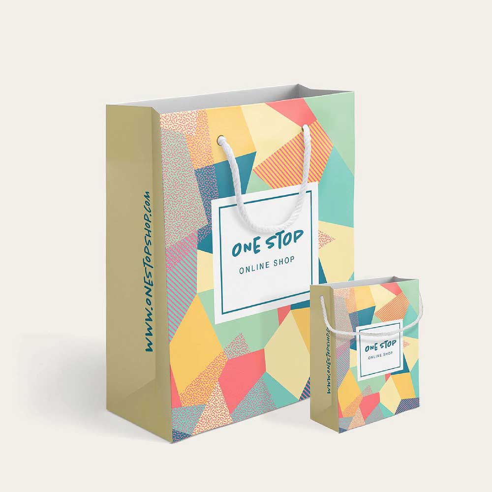
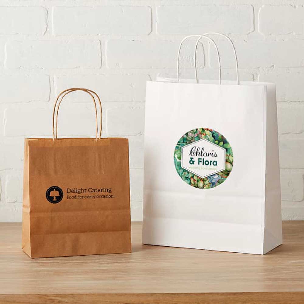
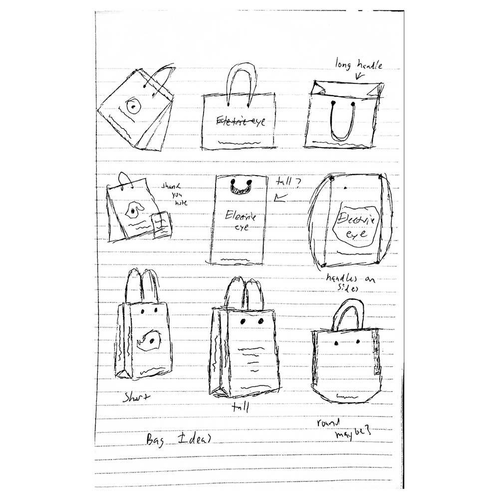
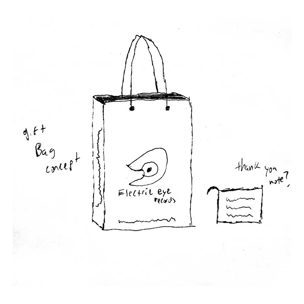
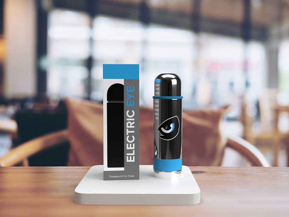
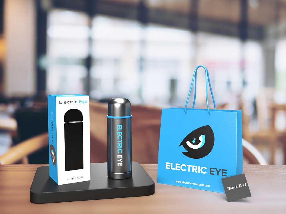
At first when I thought of creating packaging for this brand. I didn’t want to go with something a typical record company would have which is a packaging for the vinyl record. I thought about implementing a water bottle flask and a gift bag that goes a long with it to show appreciation towards the customers for doing business with them. I thought about the many different ways I would design the boxes as shown in my sketches. I really wanted to design a really nice bag for people to take home because after all we want people to talk about the brand and bring in more customers for us to do business with.
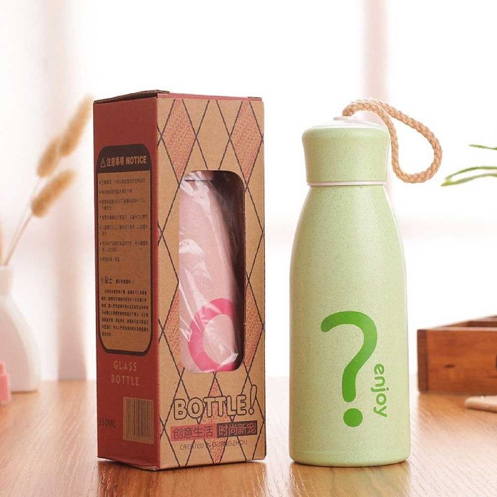
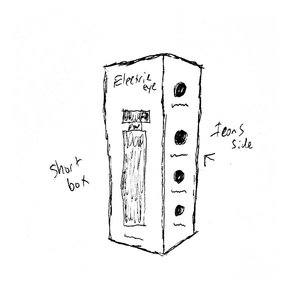
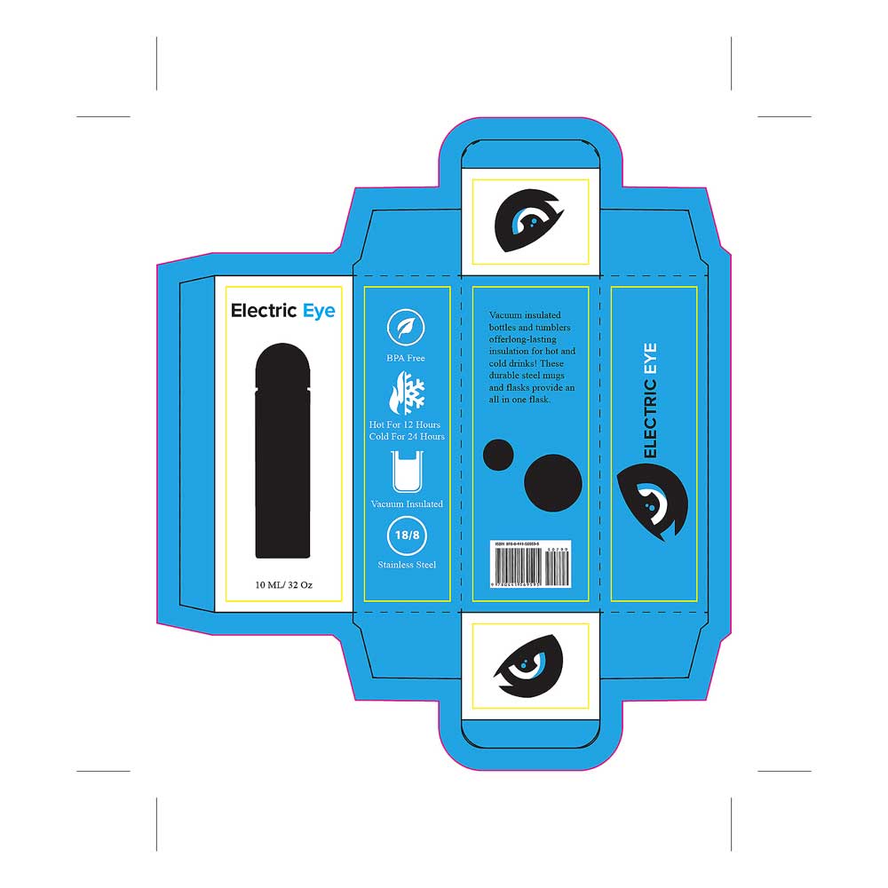
When sketching out my ideas for the packaging component of this project. I really wanted to design something else other than the average record vinly. The idea of creating a tall box and a medium size box for the water bottle flasks. The reason for the water bottle flasks is because people spend a lot of time inside of the building recording music intill they get the right sound. It is also a way of telling our customers a thank you after they do business with us. The gift bag component also comes with the water bottle flask when they do business with the company. They can get it during the time they are recording music or after the project is completed. I wanted to create a cut out on the left side of the box to show the expose the items on the inside and see the graphics that are placed on the bottle. Kind of like a try before you buy.
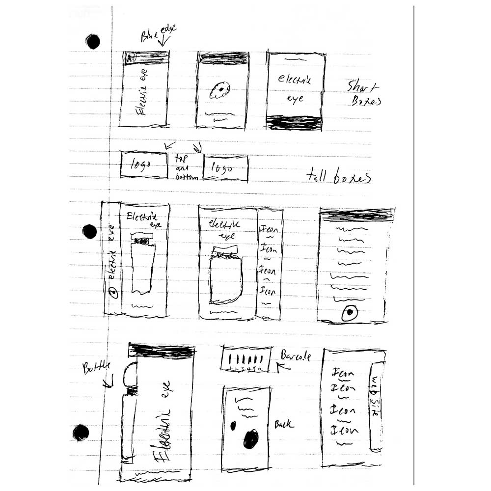
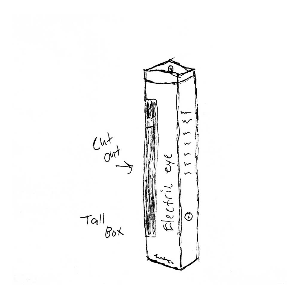
When designing my die templates I was focusing on the structure of how these packages are built. I knew by doing this that I would know how to place the graphics properly. As you can see here I wanted to design a 4-6 carrier which can carry more, is bigger in width and height and is more exposed. I thought of many ideas for this as I went out to different grocery stores to see what is trending. I kept seeing varations of this type as it was used for bottles. I never seen one where it held cans, so I decided to implement that idea here displayed on these two spreads. I wanted to place the logo on one end and the name on the other so when you place the packaging on the shelf you would either see the logo or the name of the company.
After I did some research on products that I could sell I sketched out ideas that I had in my mind of what products that my company can sell. I thought of using a water bottle flask because of how much time people can spend inside of a building making music so I came up with the idea of using 2 different sized water bottle flasks that have their own unique packaging. I also thought of having a gift bag for when they do business with us, it is a way of us saying thank you for their service and we hope they come back or tell all of their friends about our wonderful company and the things we can accomplish together.
After going through some critique from my classmates as well as my instructor. I began to rearrange some graphics around and add more to the packaging since I had a lot of space to play around with. I decided that I wanted to create a cut out on the side to show the contents in the package if you ever picked it up at a store or if you received one from the company itself. The icons were a new edition since I wanted to explain more to the customer what type of material was being used in creating this product. I, then went through many different versions of this packaging I thought everything through and designed a whole different packaging for the bag and smaller box. I wanted to place icons on the back of the box so that way people can know what kind of material was used in the making of this product. I also wanted to create a carbon cut out in the middle of the box just like I tried to do it on the other box but only different. I wanted to show the customer that these two boxes are both different in a way. The bag stood the same since everyone like it.
I created this in my motion design class, it was for a project to animate text or a logo of our choosing. I chose to do this one because it was for one of my branding logos that I have worked on for awhile, I wanted to add more stuff to a logo to showcase the things I have done for it. I used a plug in called "Saber" by Video Copilot I animated the logo to outline the logo and use masking as well as the trakmat feature in After Effects, I created a background particle effect using another plug in called "Trapcode Particular" by redgiant. You can view the video below.