After completing my studies at Flashpoint Chicago, I made the choice to further expand my knowledge in the field of graphic design by returning to school. I enrolled as an online student at Southern New Hampshire University, where I had the opportunity to delve deeper into various aspects of design. Throughout my time there, I enjoyed working on several exciting projects, incorporating the design principles I learned from the school. I would like to share a glimpse of some of these projects with you, and rest assured, there are more to come. Stay tuned for updates!
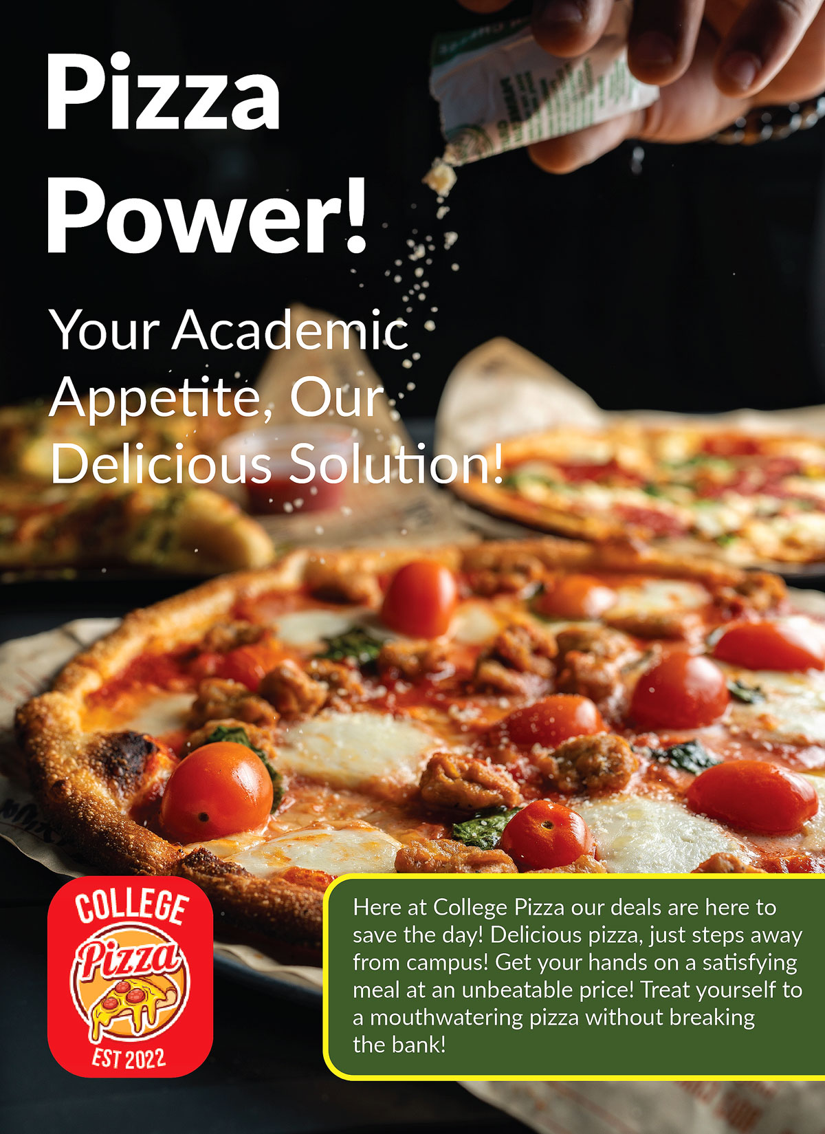
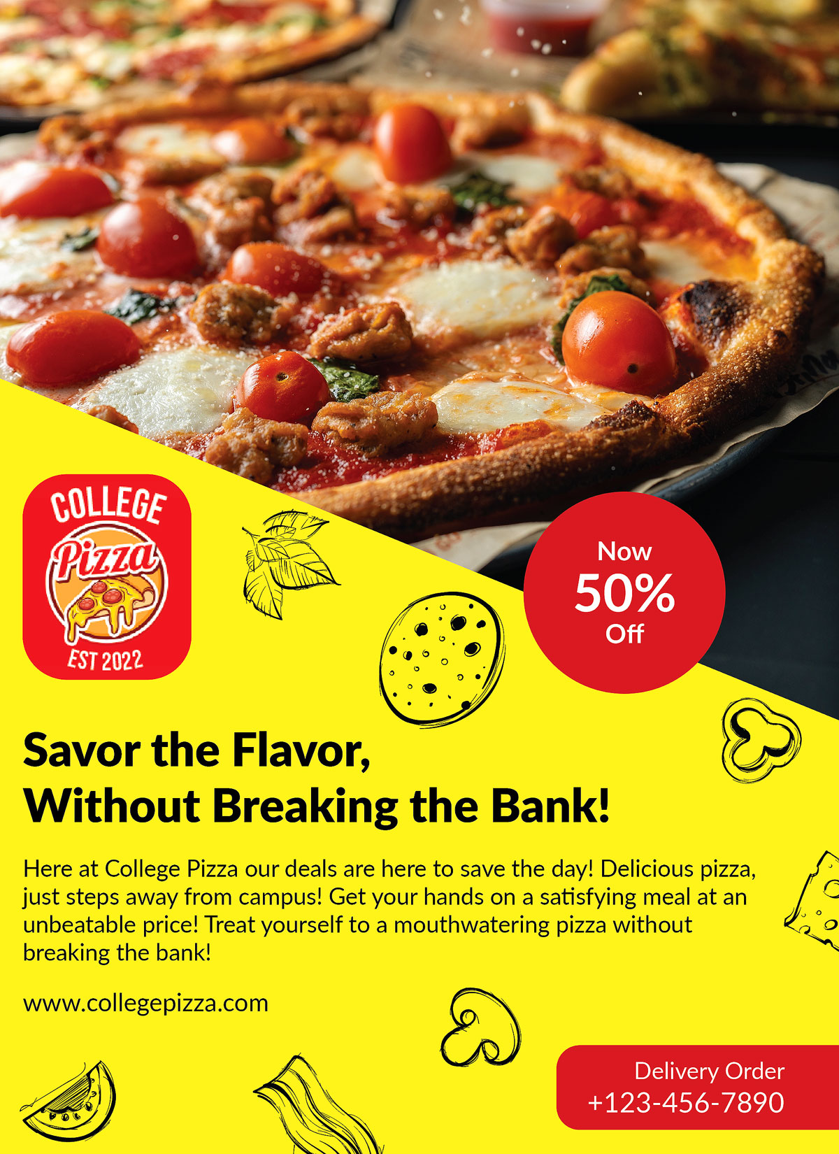
I was given the task of designing a pizza flyer for a company called College Pizza. The restaurant is located near a college campus and wanted to attract the attention of college students to visit their establishment. Their previous advertisement didn't yield the desired results, as revealed by their customer survey data. To rectify this, the new design needed to specifically target the age range of 18-24, which corresponds to college students.
To create the design, I relied on a detailed creative brief provided by the company, which offered valuable insights into the preferences of this target audience. Utilizing the information from the brief, I developed a mood board and mind map as a foundation for the new advertisement design. This helped me align the color schemes, fonts, and imagery with the expectations and requirements of both the company and the target audience.
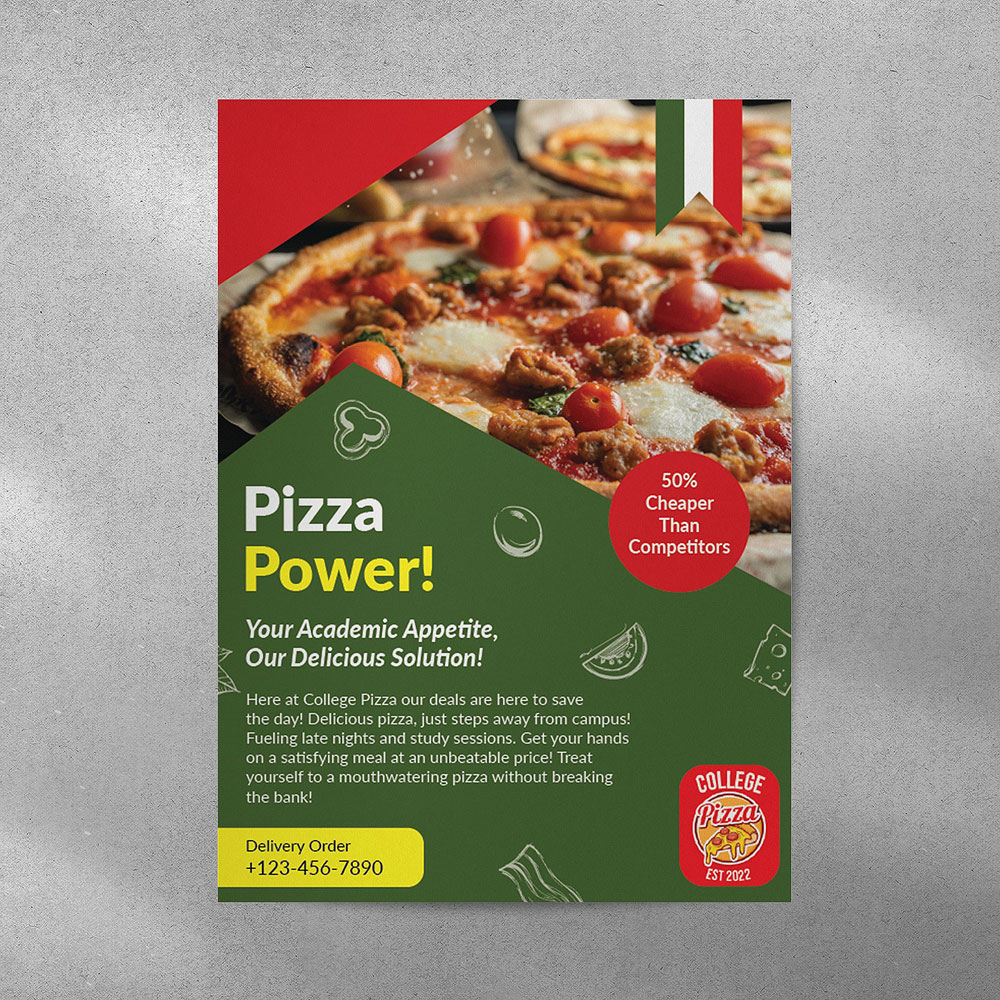
Additionally, I incorporated relevant keywords from the brief to guide my creative approach. Throughout the process, I created three different versions of the flyer, but ultimately had to select one for the assignment. Enclosed are the three iterations of the flyer, accompanied by a Photoshop mock-up showcasing the final product.
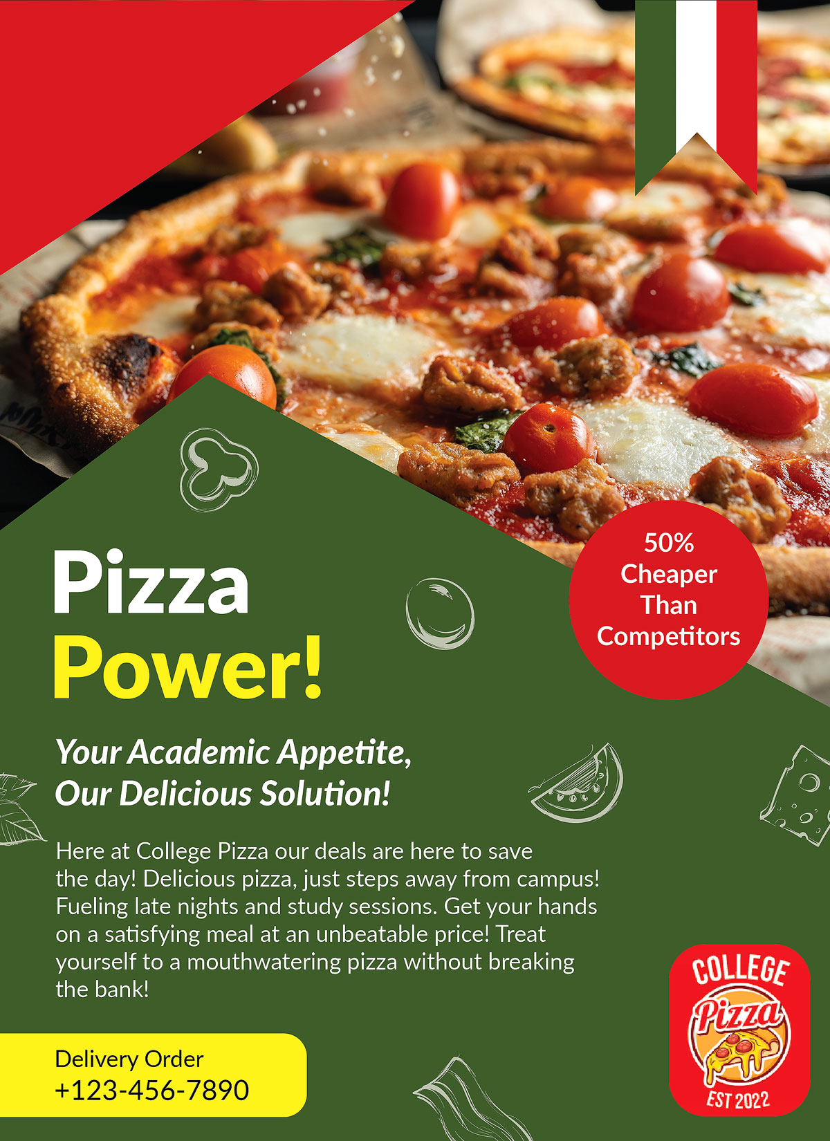
Final Mock-Up
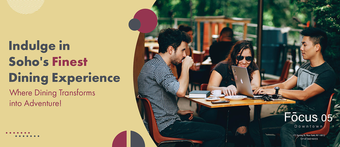
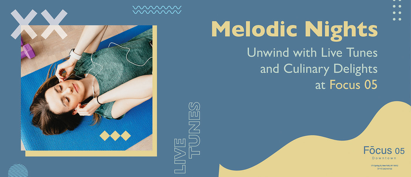
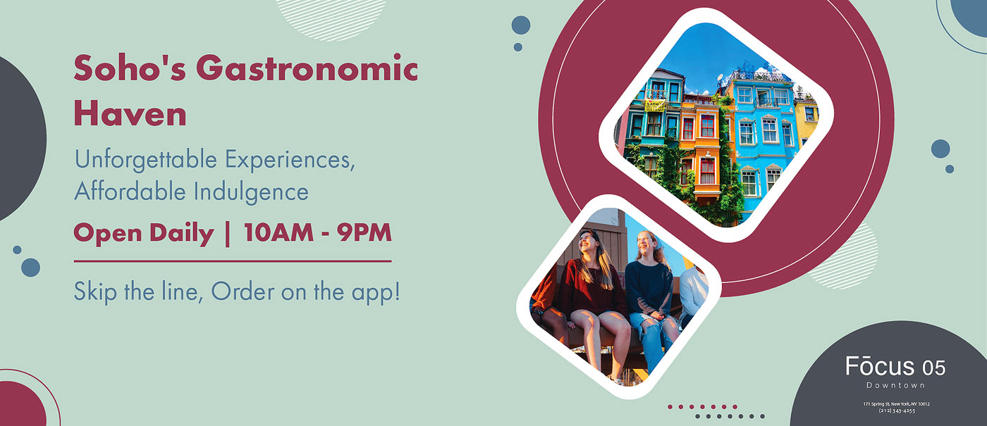
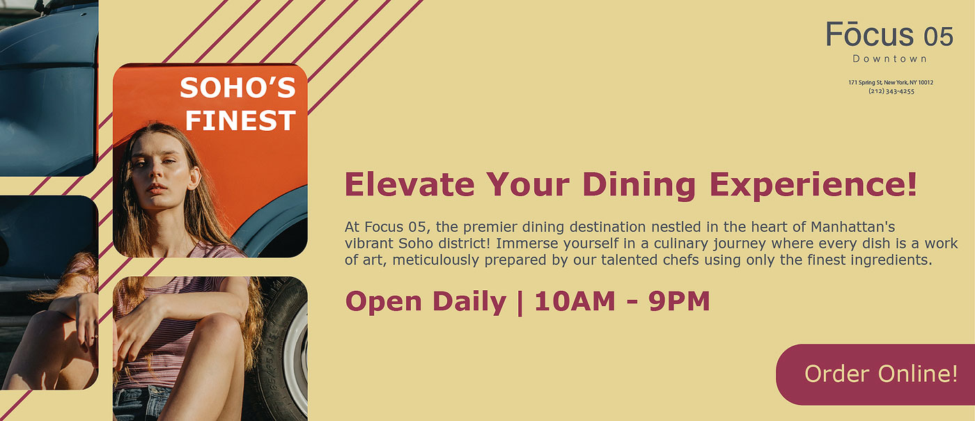
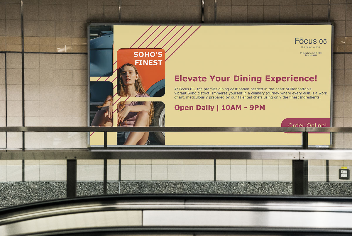
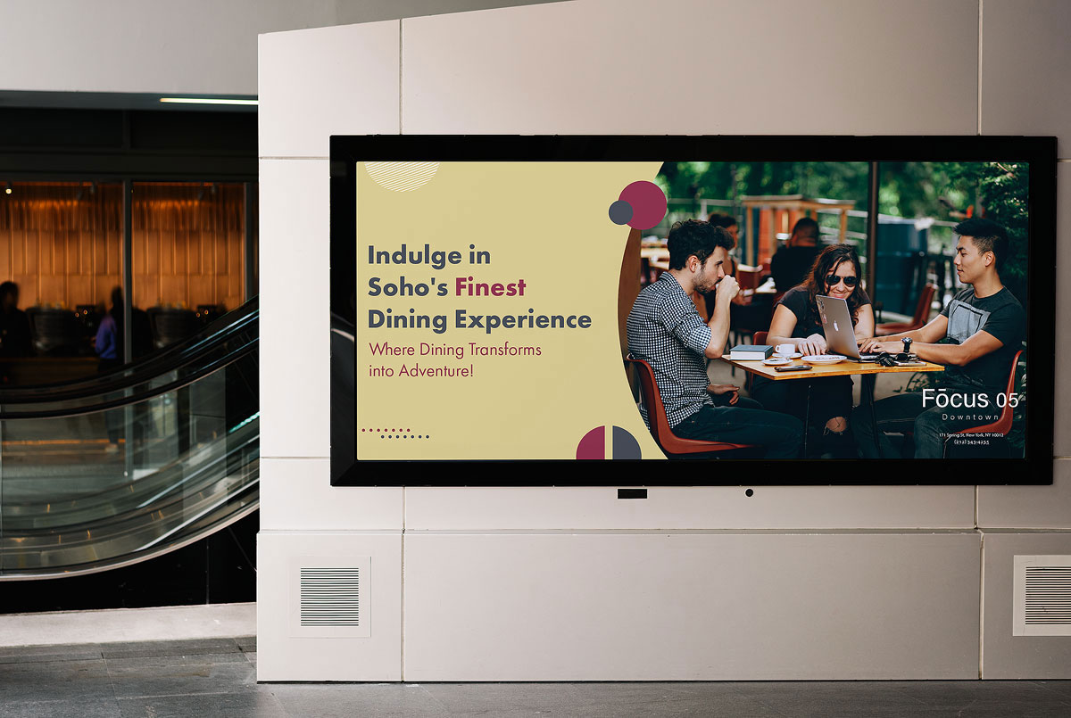
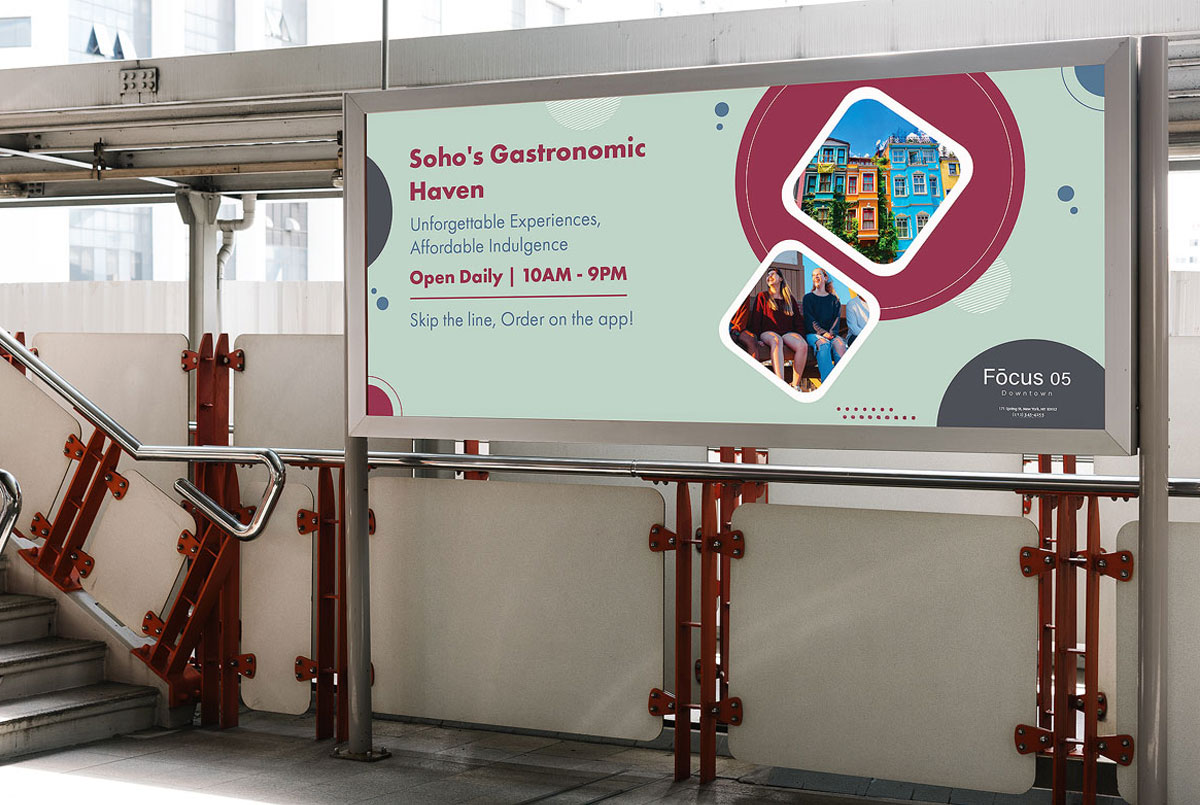
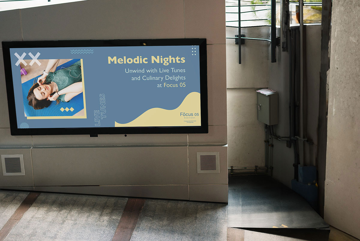
For this project, my main responsibility was to develop subway train advertisements for a restaurant called Focus 05, targeting millennials specifically. The restaurant recognized the need for a redesign of their previous ad campaigns as they were attracting the wrong audience. To tackle this challenge, I received a comprehensive creative brief containing extensive research on the millennial demographic. This research greatly enhanced my understanding of millennial behaviors and preferences.
To effectively cater to this audience, I took their needs and expectations into consideration. I began by creating a mood board and mind map, guided by the insights gained from the research. By carefully selecting images, fonts, and color schemes, I aimed to tailor the visuals to resonate with millennials and effectively convey the desired message. The ultimate goal was to entice them to visit the restaurant.
I have included below the four designs I created for Focus 05, along with some Photoshop mock-ups to give you a visual representation of how the designs would look. These designs were developed based on the research we conducted for the project.
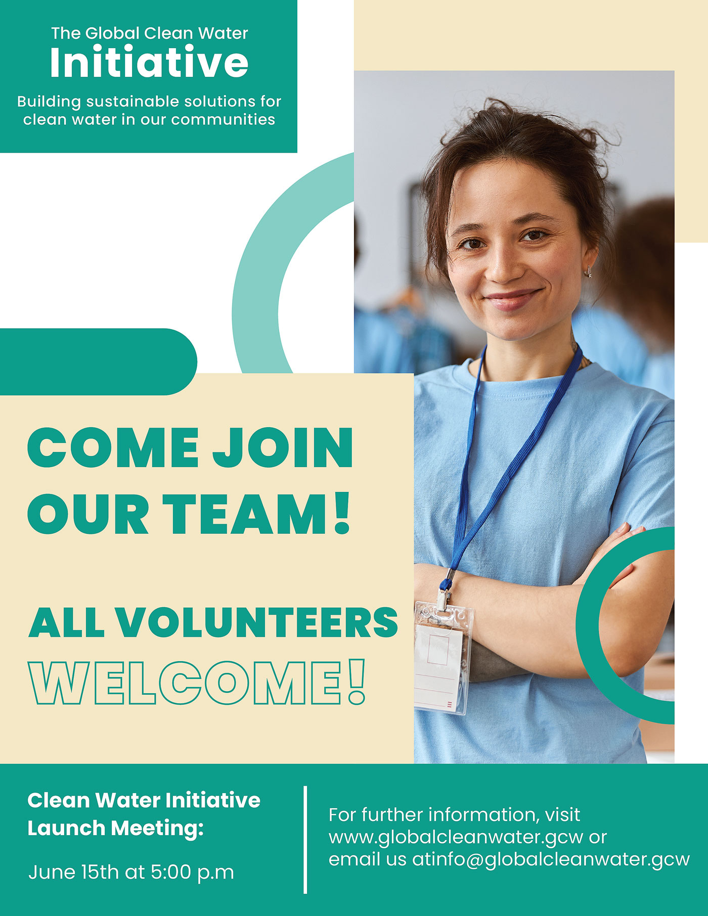
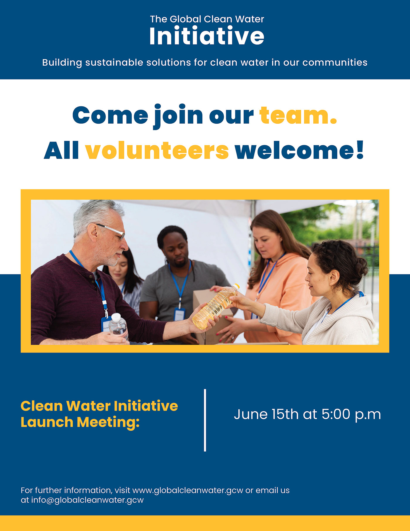
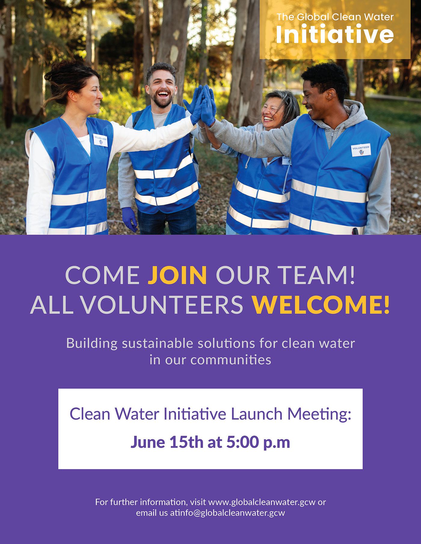
For this project, my assignment was to design a flyer for a nonprofit organization named Global Clean Water Initiative, which is based in California. This organization operates from three satellite offices located in Vietnam, Nigeria, and Mexico. I was required to select one of these countries and craft a flyer using research focused on that country's culture.
I chose to work on Mexico since I wanted to enhance my understanding of the country, as my knowledge about it was limited. The research process involved investigating elements such as colors, fonts, images, typography, and tone that resonate with the culture of Mexico. I also needed to create a profile of the intended audience for the flyer.
The main objective of the flyer was to raise awareness about the initiative and encourage local community members to volunteer. The distribution of the flyer was intended throughout the community. The project included a Word document containing relevant details regarding design guidelines, a call to action text, and vision statements. These components were essential to ensure that the message was effectively communicated.
Final Mock-Up
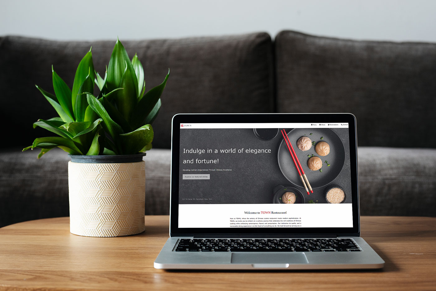
For this project, I was assigned the task of creating a mobile-friendly website. I conducted thorough testing to ensure compatibility across various web browsers, including Microsoft Edge, Chrome, Safari, and others. Adhering to brand guidelines, I incorporated color schemes, text styles, and imagery that aligned with the identity of the company I was working for—an authentic Chinese restaurant named "Town."
My goal was to craft a website that effectively introduced the restaurant while ensuring a user-friendly experience. To achieve this, I applied principles of user interface (UI) and user experience (UX) design. Leveraging HTML, CSS, and JavaScript, I showcased my coding skills and designed an elegant website that seamlessly integrated various design elements. Click the image below to view the website in action.
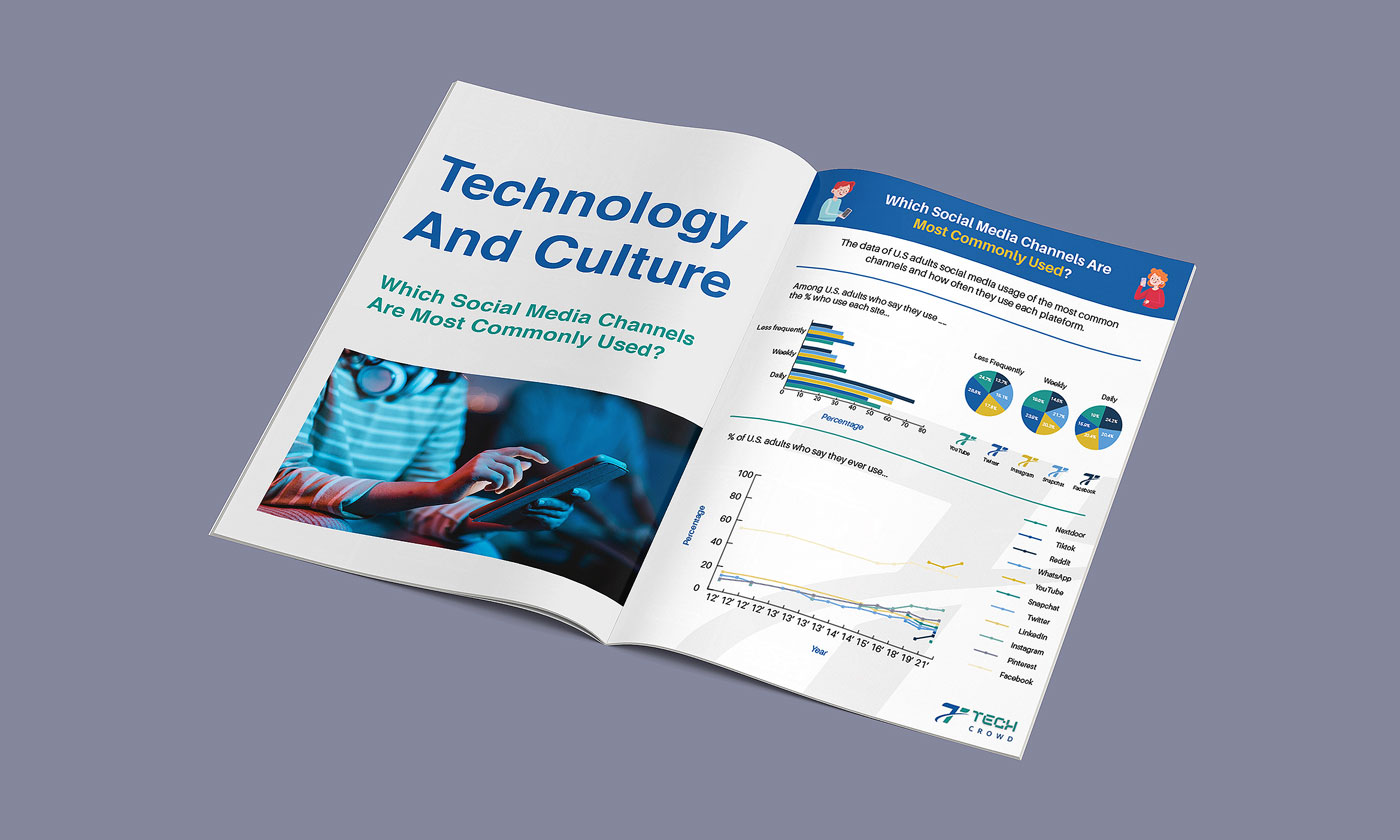
During this project, I was tasked with evaluating data to determine suitable designs for visualizations, creating a data visualization, and developing a visual story for a data-driven design intended for a fictional company named Tech Crowd Magazine. This was to be featured in a section of the magazine dedicated to "Technology and Culture." My assignment involved crafting a tabloid-size, static infographic focused on the topic of "Which Social Media Channels are Most Commonly Used."
I conducted research for both imagery and data related to mobile technology and social media use, ensuring compliance with brand guidelines. Using Adobe Illustrator's chart tool, I successfully translated data from an Excel sheet into a visually appealing chart. The design incorporated brand colors and typography, contributing to a cohesive and engaging presentation.
Tech Crowd Infographic
For this project, I was tasked with creating a magazine catalog for a museum, highlighting an artist and their collection. The goal was to uphold the highest standards of quality, professionalism, and effectiveness in presenting my work to the audience.
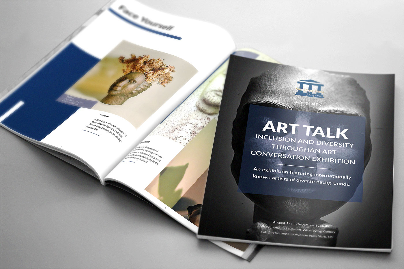
Metromoheim Museum - Magazine Catalog
Following the museum's brand guidelines, I structured an 8 to 12-page layout using a grid system to meet design requirements and prepare it for printing. To ensure proper printing, I learned how to impose the document and utilized the 2-saddle-stitch method. Additionally, I created an EPUB version for online reading using InDesign's export feature. The catalog includes a cover page, table of contents, introduction, artworks, and accompanying descriptions, all designed to enhance readability.
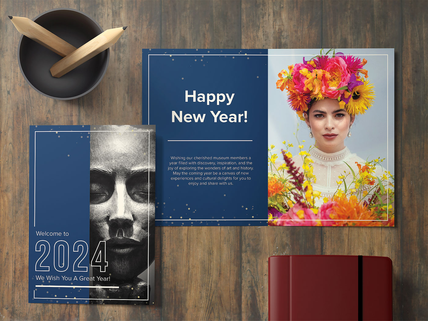
Metromoheim Museum - Greeting Card
Subsequently, I designed a new year's greeting card for the museum, incorporating fold techniques specific to greeting card design. Consistent with the magazine catalog, I employed a grid layout and integrated colors, imagery, and text. Content creation involved utilizing typography skills to enhance the overall design. Throughout both projects, extensive research was conducted, and various design principles such as rhythm, balance, unity, proportion, hierarchy, contrast, and dominance were applied.
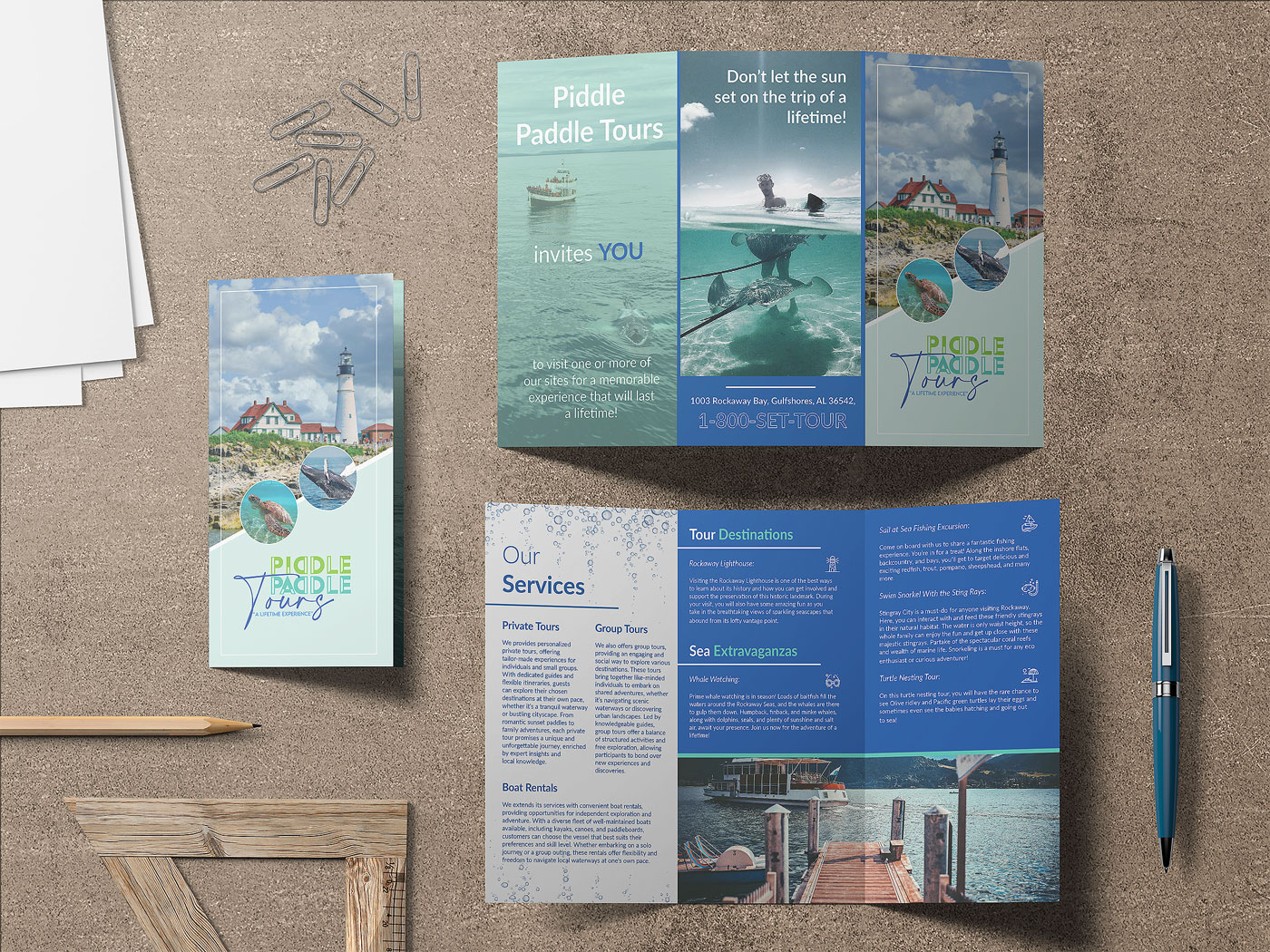
For this project, I was assigned the task of creating a brochure for a company known as Piddle Paddle Tours. I had specific requirements for the brochure that guided my design process. I incorporated elements like color, typography, and imagery, and utilized different grid layouts to present the design effectively. The brochure dimensions were 11” x 17”, and I opted for the "Trifold" paper fold. It will be distributed at information centers, various locations within towns, and nearby rest stops to attract tourists. Piddle Paddle Tours offers seasonal, family-friendly boat tours in a tourist town on the East Coast, featuring activities such as whale watching and sightseeing of historical landmarks. Overall, the project was successful, and I produced a print-ready, multi-page brochure.
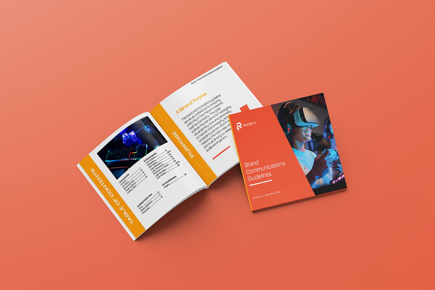
For this project, my task was to create a logo tailored to specific demographics and aligned with the needs and preferences of the target audience. Extensive research and multiple iterations were conducted to refine the logo design. The comprehensive brand style guide encompassed the finalized logo, client messaging, guidelines for logo placement, and other visual identity elements. RacerX is a gaming company dedicated to offering family-friendly, inclusive games suitable for individuals of all ages and abilities.
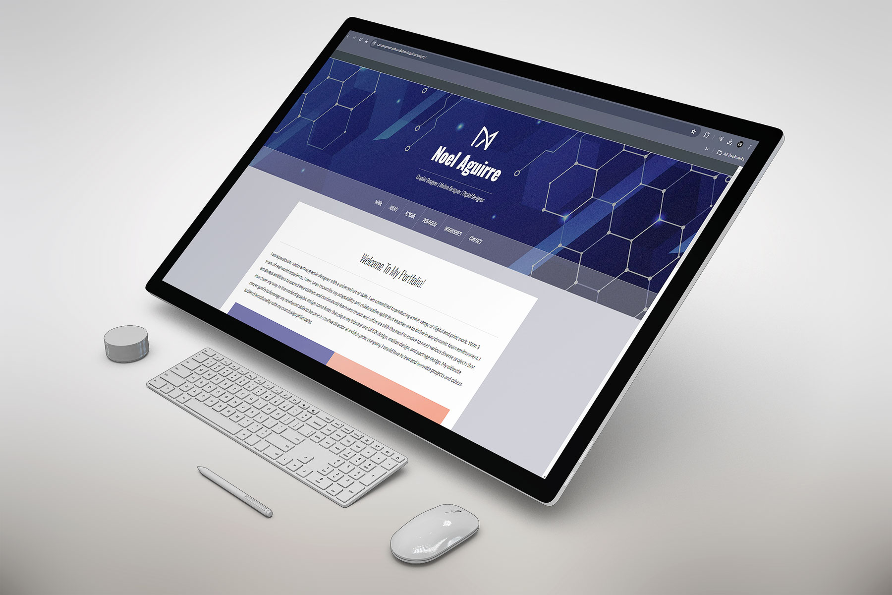
In this project, I designed and developed a self-promotional portfolio website using WordPress. I researched professional designer websites to understand how they promote themselves and applied UI/UX design best practices to create the themes, content, and layout for my site. I started by creating a visual sitemap to plan the pages I wanted to include. I wrote all the content and designed the visual elements, showcasing various projects from my previous jobs and freelance work. I focused on several key UI/UX principles during the design process such as user-centered design, consistency and accessibility.
Additionally, I implemented responsive design to ensure the website looks and functions well on various devices, including desktops, tablets, and smartphones. This involved using features within WordPress such as flexible layouts, fluid grids, and media queries to adapt the design to different screen sizes.
I also optimized images to improve the website's performance. This included compressing images to reduce file sizes without compromising quality and using appropriate image formats for different types of visual content. These optimizations helped to enhance the user experience by reducing page load times and ensuring the website was fast and efficient.
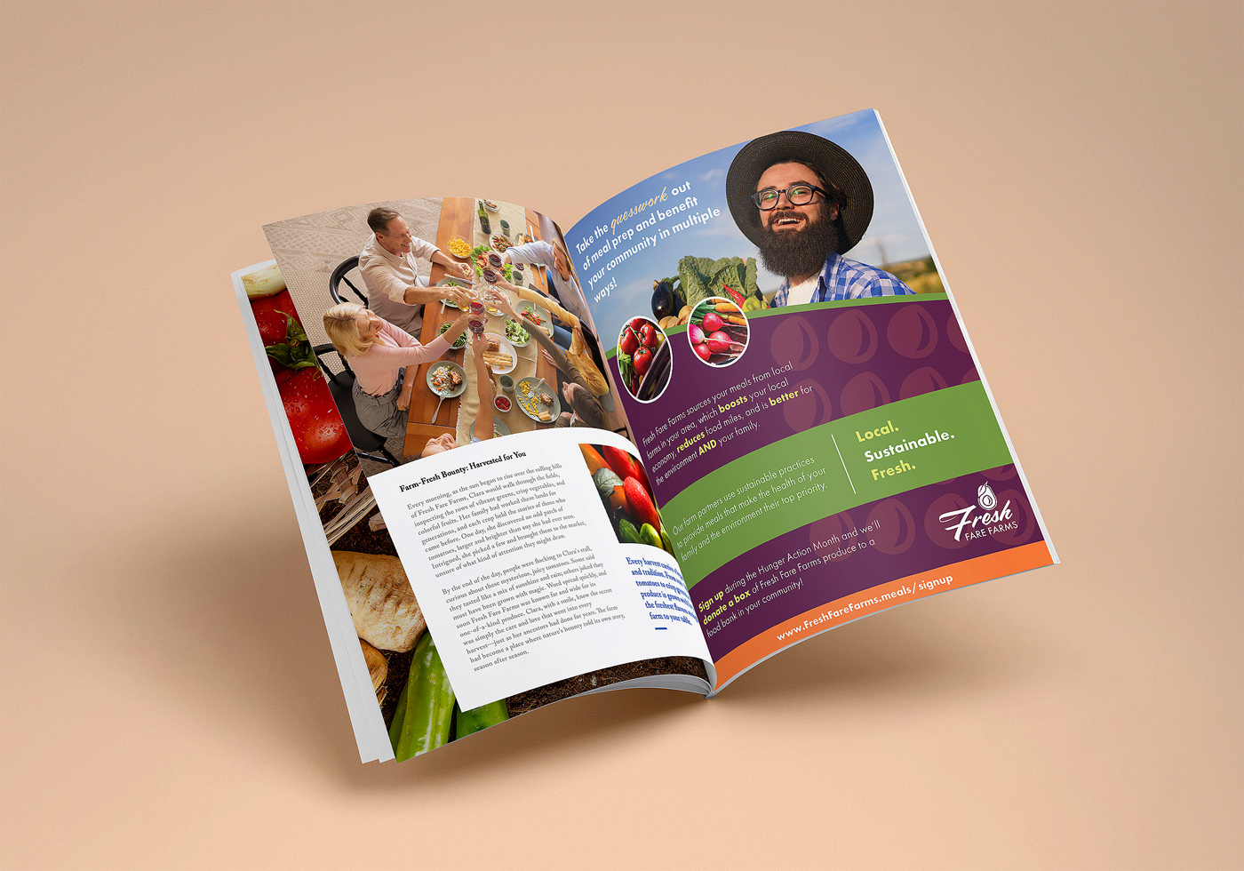
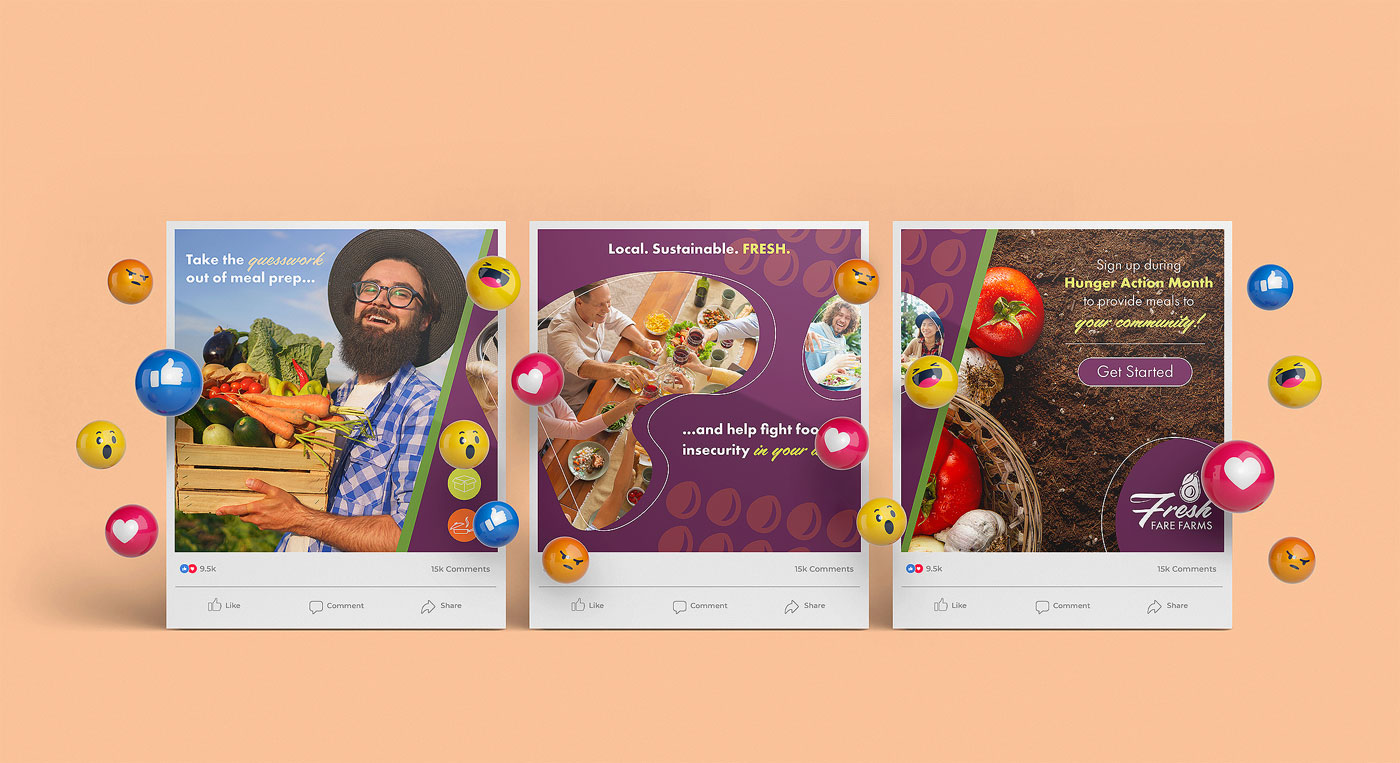
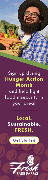
In this project, I worked as a junior graphic designer, tasked with creating a multi-channel advertising campaign for Fresh Fare Farms. The company, which offers a meal kit delivery service, focuses on locally sourced ingredients from farmers who practice sustainability. As part of their initiative for Hunger Action Month, they aimed to expand their customer base by encouraging sign-ups, with a promise to donate to local food banks in each customer’s area. The campaign involved three key deliverables: a magazine ad, a digital animated ad, and a seamless social media carousel. I conducted thorough research, went through multiple design iterations, and followed the company's brand style guide to deliver the final marketing materials to the client.
Fresh Fare Farms - Seamless Carousel Social Media Advertisment
Fresh Fare Farms - Digital Animated Ad
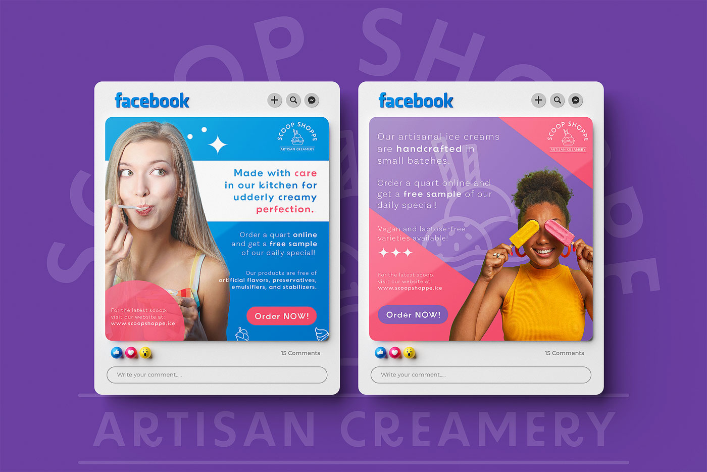
For this project, I acted as a freelance graphic designer to create social media advertisements for Scoop Shoppe Artisan Creamery, a niche ice cream company that handcrafts small batches of artisanal ice cream using organic ingredients without artificial additives, preservatives, emulsifiers, or stabilizers. They also offer vegan and lactose-free options. While Scoop Shoppe is well-known locally, this company wants to expand their reach to nearby areas and grow their online presence. My goal was to design social media posts that showcased their passion and told their brand story. By conducting research, iterating, and following their brand guidelines, I successfully created visual content that communicated their values.
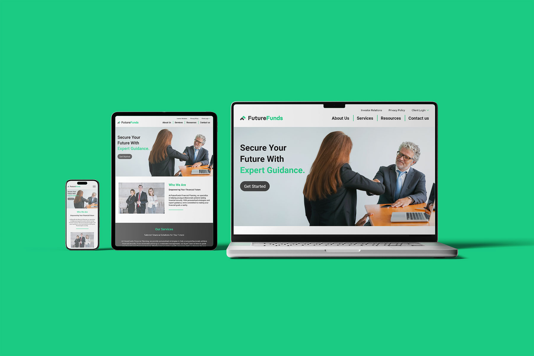
During this project, I created two high-fidelity mock-ups — one for desktop and tablet, and the other for mobile — using Adobe XD to ensure a consistent and intuitive user experience across different devices. My approach followed key UI/UX design principles, such as maintaining visual hierarchy, ensuring accessibility, and creating easy navigation paths. I also prioritized consistency in typography, color schemes, and interactive elements across breakpoints, ensuring users could transition smoothly between platforms without encountering disjointed experiences.
Throughout the design process, I collaborated closely with users to gather feedback on pain points they encountered. This helped me identify areas where they felt frustrated, such as cluttered layouts on smaller screens or difficulty finding essential features. Incorporating this feedback allowed me to make strategic adjustments, such as redesigning the menu for mobile views to a collapsible hamburger icon and streamlining forms to reduce cognitive load on smaller screens. I also ensured that interactive elements like buttons and icons were appropriately sized for both touch interactions on mobile devices and mouse clicks on desktops, enhancing usability.
The final mock-ups provided a seamless user experience across all devices by balancing aesthetics with functionality. The desktop and tablet versions emphasized more detailed layouts, while the mobile version was optimized with concise content and intuitive touch gestures to accommodate on-the-go users. This iterative process ensured that every design element aligned with user needs and expectations, leading to a polished, user-friendly product.