When I first got into graphic design, one of my early projects was creating a logo for a food-related product. I chose to design an energy drink because it’s something I genuinely enjoy and something a lot of people connect with. The name was inspired by an item from the Final Fantasy series—one of the strongest items in the game—which immediately stood out to me. I wanted the brand to feel powerful and bold, and that influence helped shape the direction of the design.
Lionheart Energy isn’t your typical energy drink. Instead of relying on harsh chemicals, it’s made with organic, plant-based ingredients that deliver clean, natural energy. Our goal is simple: create a high-quality drink that tastes great, keeps you energized, and helps you avoid the usual crash. Whether you’re studying late, grinding through long work hours, gaming into the night, training for sports, or just trying to stay focused and stress-free, Lionheart Energy has your back. It’s designed to keep you alert, hydrated, and refreshed—without sacrificing flavor—so you can power through whatever your day (or night) throws at you.
Our target audience is young adults ages 18–30—people who live fast-paced, high-energy lifestyles. This includes video gamers, athletes, and computer programmers who need sustained focus, endurance, and a reliable boost to keep up with what they do every day.
When I started researching inspiration, I wanted to take a more refined and sophisticated approach instead of following the bold, aggressive style used by brands like Monster Energy, Red Bull, and Rockstar Energy. My goal was to create something that felt different and stood out, even though it would still clearly say “energy drink” on the label so customers knew exactly what they were buying. That led me to the idea of using a lion for the logo. I wanted a symbol that represented strength and confidence, and the lion felt like the perfect fit. You don’t often see energy drinks built around an animal like this, and lions are widely known as powerful leaders in the wild—strong, fearless, and capable of intimidating anything in their way. That sense of dominance and strength helped shape the identity of the brand.
When I started sketching, I knew I wanted a powerful animal to immediately grab attention and represent the energy behind the drink. I was drawn to the lion because it’s seen as the king of the wild—strong, confident, and respected. When I think of lions, I think of intensity and energy, especially in the way they hunt and push themselves to their limits to survive. I explored several lion-based concepts, experimenting with different poses and expressions. Instead of settling on just one idea, I wanted to combine the strongest elements from multiple sketches into a single logo that truly captures that sense of power, drive, and determination.
After exploring different directions from my sketches, I decided to move forward with a unique lion head design. I originally considered using the full body, but the head alone felt stronger and more visually effective as a logo. From there, I translated the sketch into digital versions and tested it in three formats—stacked, horizontal, and vertical—to see how the logo would adapt across different uses. I also experimented with a smaller icon or badge-style version, similar to an app icon you’d see on a phone. This helped me imagine how the brand could live in digital spaces as well. Overall, the results came together really well and confirmed that the direction I chose was the right one.
Brand Mark
Live Area: x/4 when x is the height of the logo.
Min Use: .25 Inches for the height
Word Mark
Live Area: x/4 when x is the height of the logo.
Min Use: .25 Inches for the height
Combination Mark
Live Area: x/4 when x is the height of the logo.
Min Use: .25 Inches for the height
Gradient
The gradient should be applied only to the symbol at a 90-degree angle, beginning at the very tip of the lion’s head and ending at the tip of the mane. The starting point at the top of the lion’s head uses the hex color #FF6633, and the gradient transitions downward to the bottom of the mane, ending with the hex color #FF3333.
Final Logo
After exploring many logo ideas and variations, I ultimately chose this version because it works best in a stacked layout and aligns closely with my original concept. It feels the most balanced and visually strong, while clearly reinforcing the direction I envisioned from the very beginning.
Eras Bold ITC
ABCDEFGHIJKLMNOPQRSTUVWXYZ
abcdefghijklmnopqrstuvwxyz
1234567890
!@#$%^*()_+
Lion Red
RGB: 239, 65, 56
CMYK: 0, 90, 84, 0
Web Safe: #ff3333
Mane Orange
RGB: 250, 169, 62
CMYK: 0, 38, 85, 0
Web Safe: #ff6633
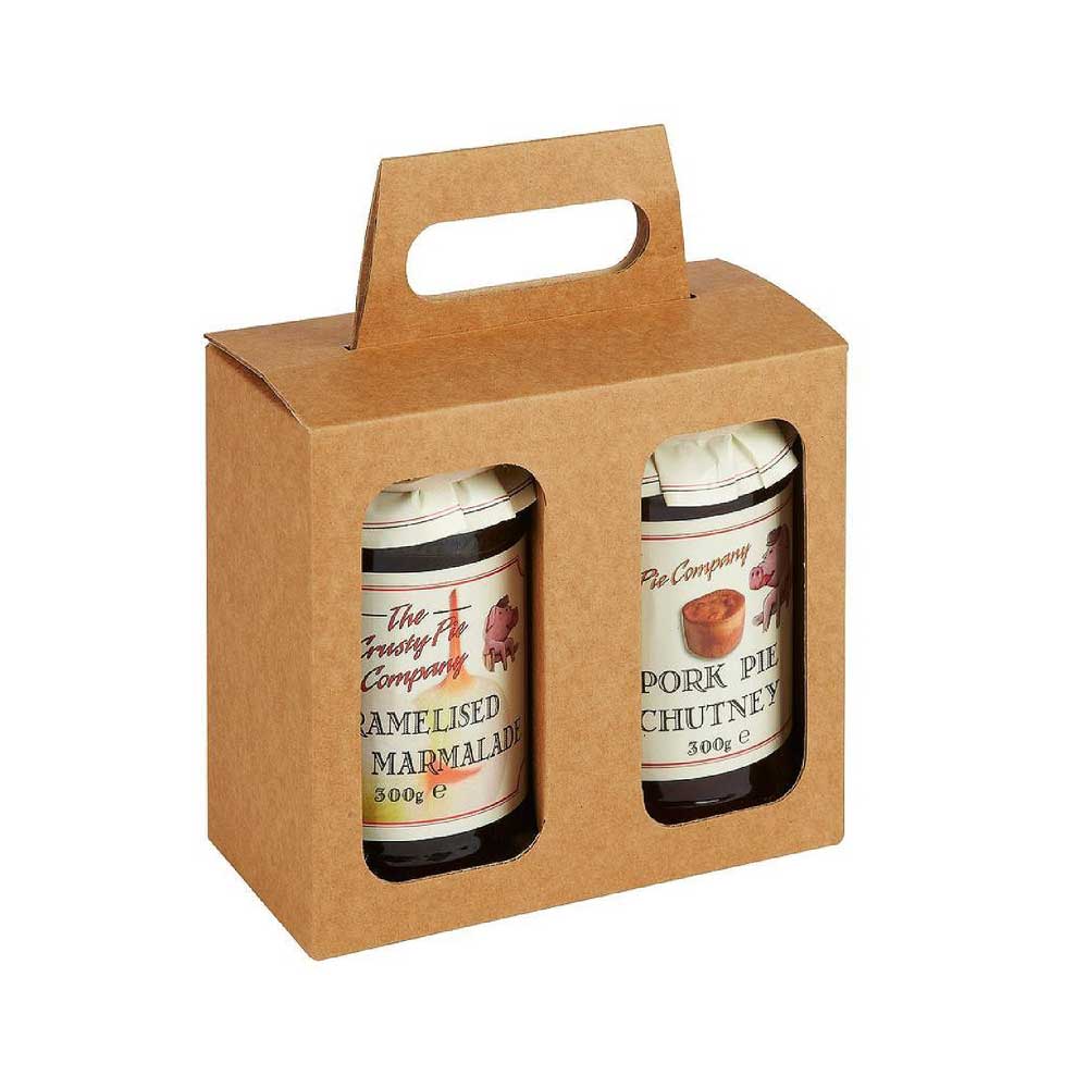
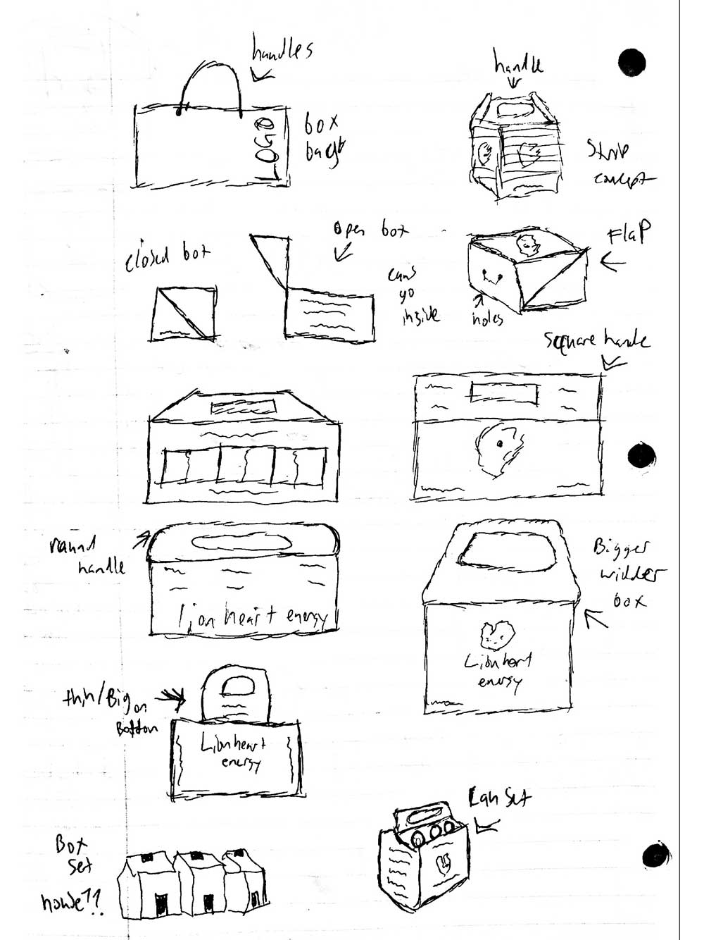
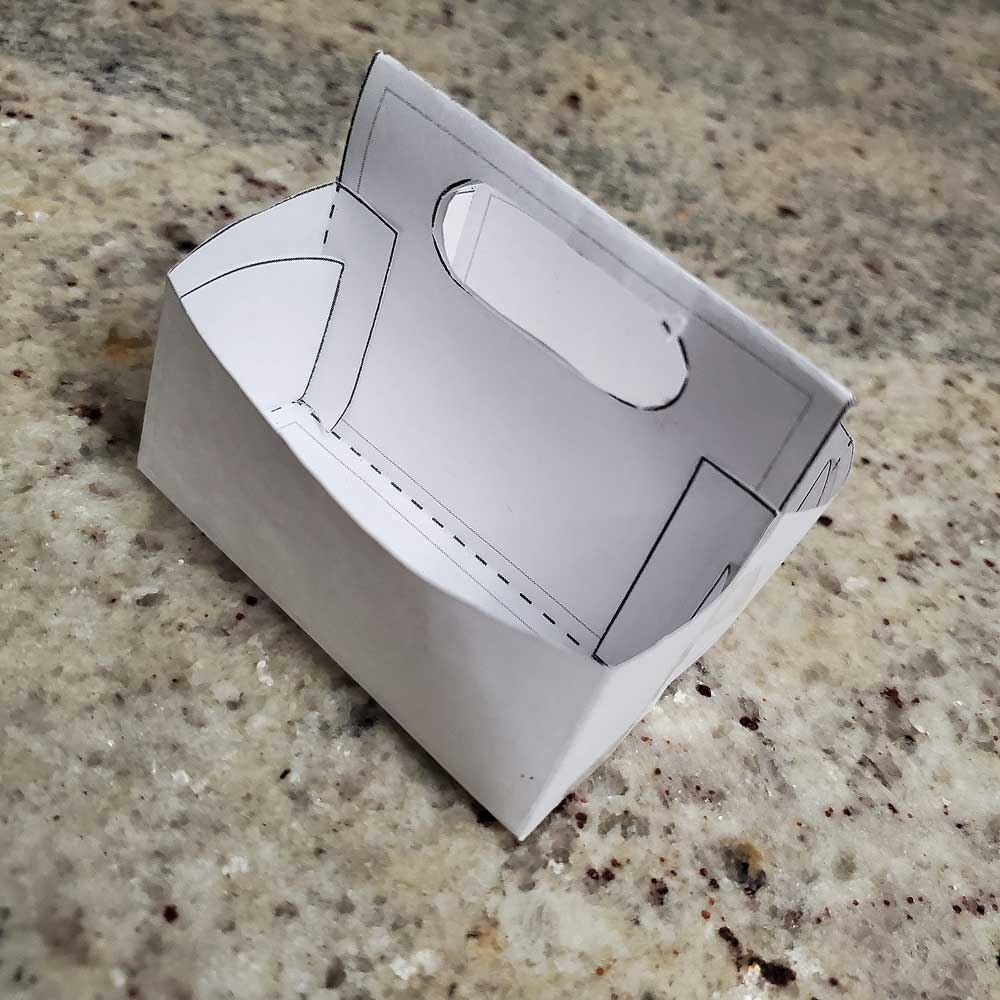
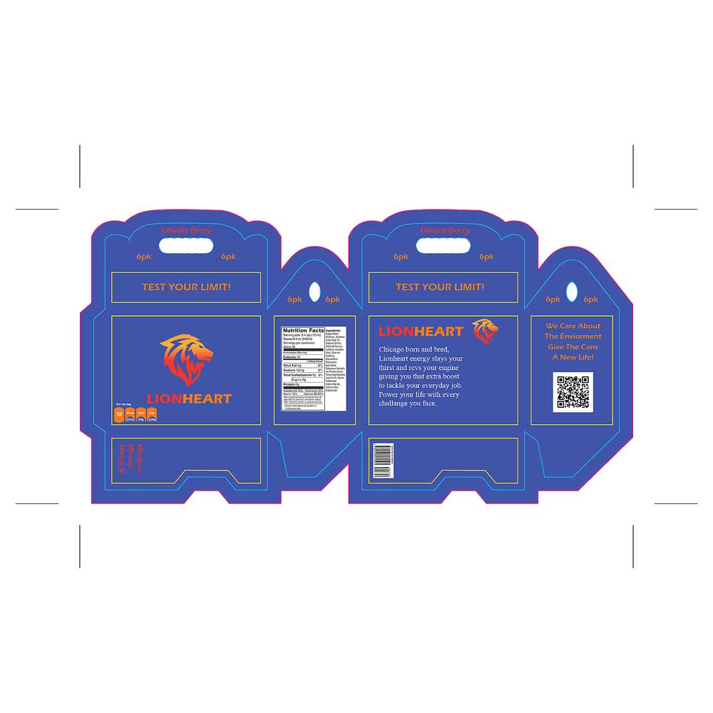
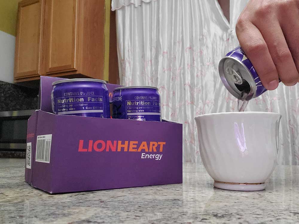
When I began my research, I wanted to focus on three simple packaging elements that I felt would really stand out and represent the brand well. One idea that stood out right away was using a cut-out window on the box, allowing customers to see the product inside before they buy it. This adds transparency and builds trust while also making the packaging more visually engaging. I also explored the idea of a shoebox-style package with attached strings at the top, making it easy to carry with one hand. This concept was inspired by a previous job where I saw a similar design used for shoes, and I felt it could translate well to an energy drink. Adapting this idea would also allow for more interior space, making it easier to fit multiple cans while keeping the packaging functional and convenient.
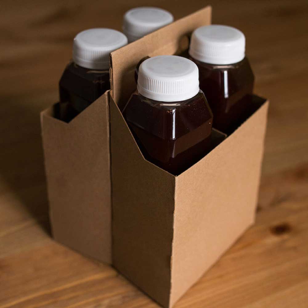
When sketching out my ideas for this project I wanted to create something that has't been done for one of the packaging components. Which was the box that you can carry like a bag, I wanted to either have some cut out at the top of the box to expose the cans so customers can see what they are about to purchase. I went to my local Target near my home and picked up a few packaging products that they had out there. One of them was a 4 pack carrier model for bottles and I thought this was a good idea to implement with the cans because instead of the bottles I would place cans and the idea became perfect as seen later in the project.
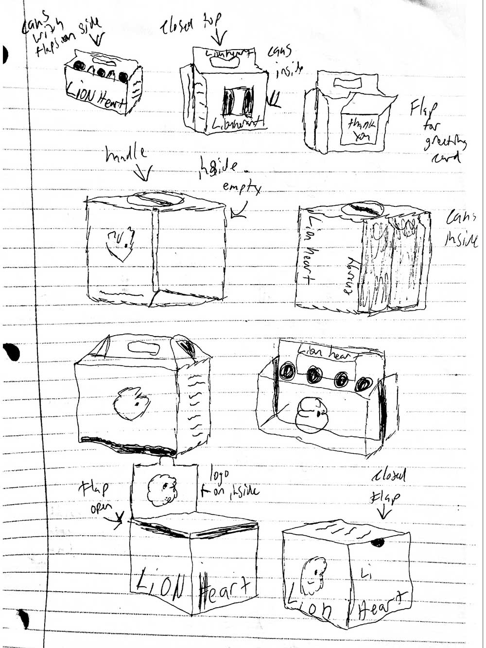
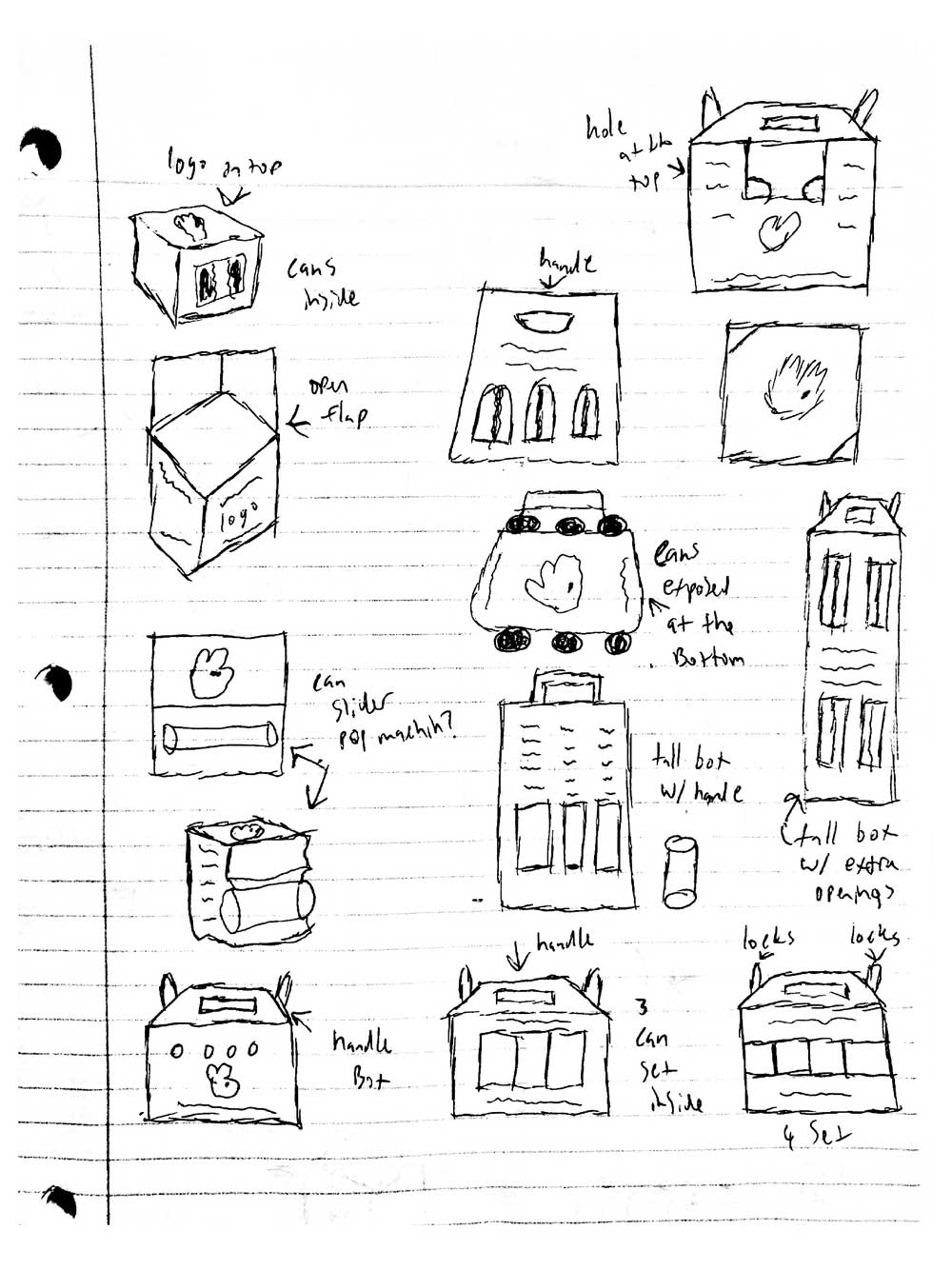
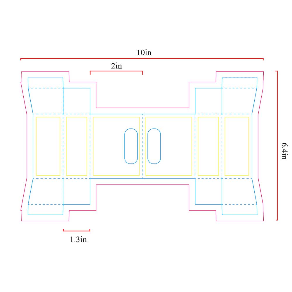
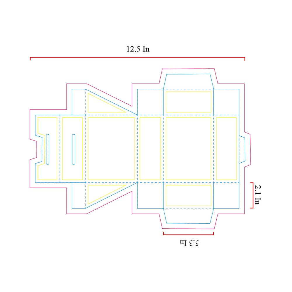
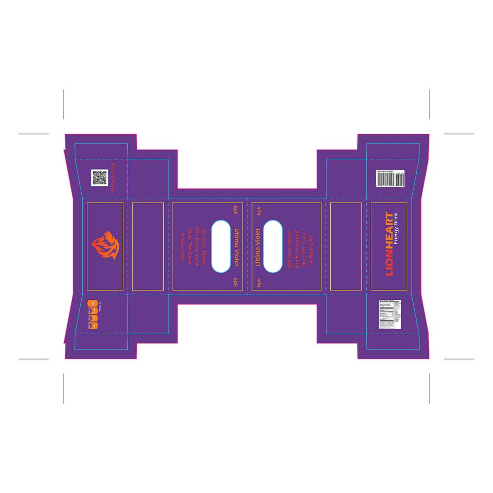
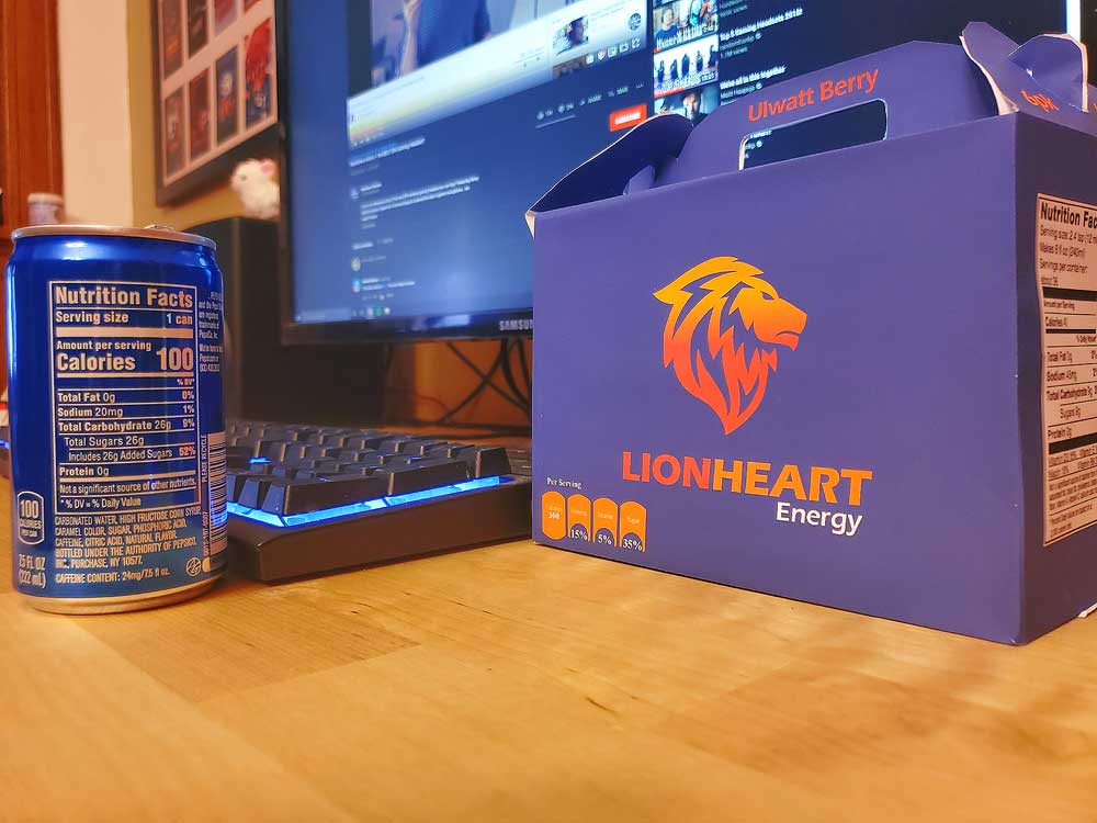
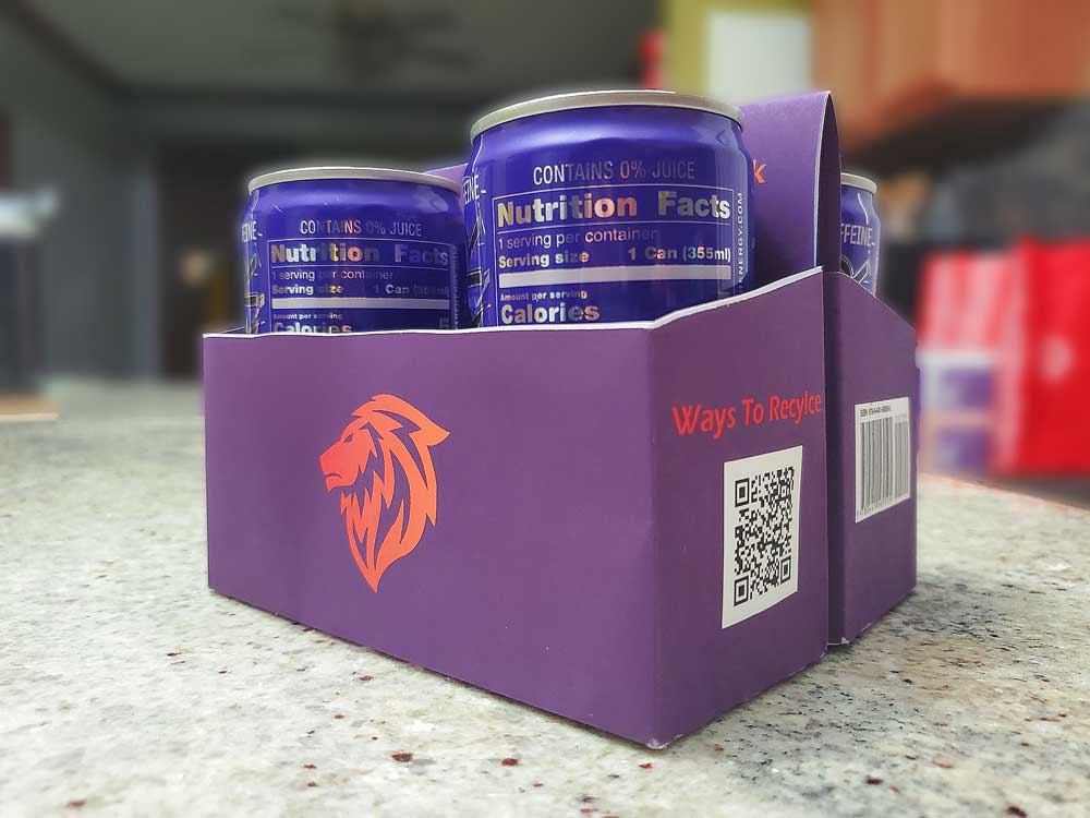
When I started designing the die templates, my main focus was understanding the structure of the packaging and how it would be built. By doing this first, I was able to plan where the graphics should live and make sure everything would align properly once the package was assembled. I chose to design a 4–6 pack carrier that could hold more cans, with added width and height and a more open, exposed structure. As I explored different ideas, I visited grocery stores to see what packaging styles were trending. I noticed a lot of similar carrier designs being used for bottles, but I hadn’t seen many that were adapted for cans. That gap inspired me to apply the concept here, which is shown across these two spreads. For branding, I placed the logo on one end and the product name on the other, so no matter how the package sits on the shelf, customers will immediately see either the logo or the brand name.
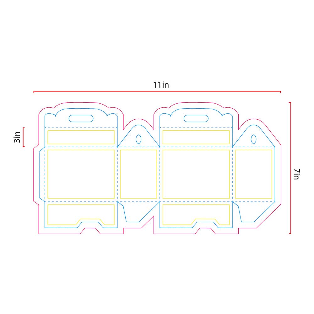
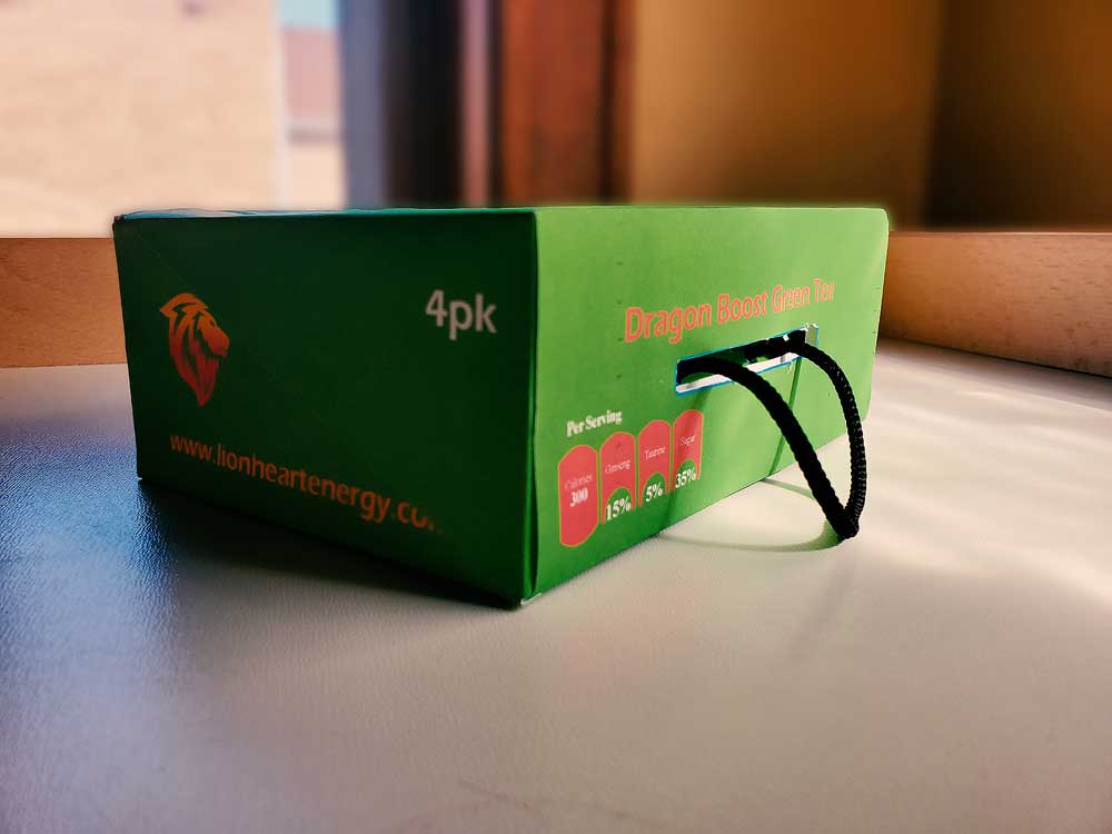
I printed out my die templates and physically constructed them to better understand how each package would be built. I really enjoyed this part of the process because I’ve always found it fascinating to see how designs come together structurally in real life. Once they were assembled, I began sketching directly on the templates using my initial concepts, which allowed me to further explore how the graphics would live on the packaging. This hands-on step helped me visualize the full design and see how all of the graphic elements would work together.
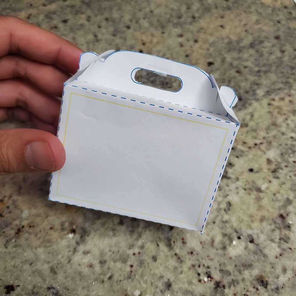
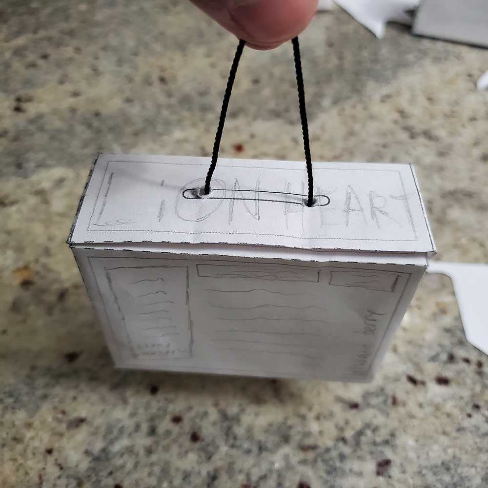
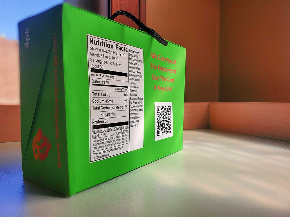
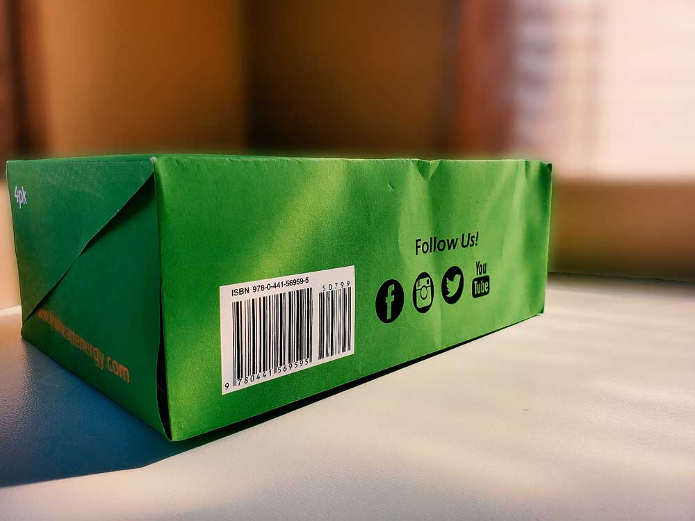
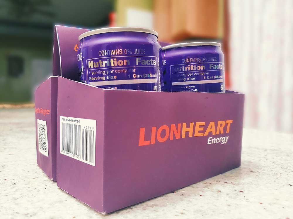
When refining my packaging designs, I revisited earlier work and made updates to better serve the customer. I added a “per serving” section across the designs so consumers—especially athletes—could easily understand what they’re consuming, and replaced the original cutout with the Lionheart logo for a cleaner look. As I continued testing my physical prototypes, I realized the cutout on the box-bag concept didn’t showcase the cans well, so I removed it and instead highlighted the logo on top, added social media icons near the barcode, and included a short brand bio on the back. These revisions were focused on improving clarity, usability, and visual appeal to make the packaging more engaging and informative.
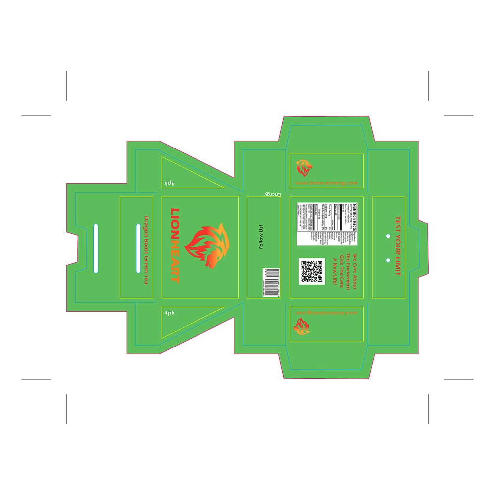
As I applied my ideas to the packaging, I revisited earlier designs and realized there were a few things missing. I added a “per serving” section across all versions so customers—especially athletes—could clearly understand what they’re consuming, and I replaced the center cutout with the Lionheart logo for a stronger, cleaner look. While refining the box-bag concept, testing my physical prototypes showed that the cutout didn’t display the cans well, so I removed it, placed the logo on top for clearer branding, and added social media icons near the barcode to encourage engagement. In the final iteration, I added a short brand bio to the back of the package and refined the layout to be more informative and visually engaging, making the product more appealing to customers.
My main competitors in the digital marketplace include Red Bull, Monster Energy, Rockstar Energy, 5-hour Energy, and Full Throttle. These brands each target slightly different audiences but largely focus on teens and young adults who want quick energy, whether for extreme sports, long work hours, or late nights. Red Bull and Monster lean heavily into action sports and high-energy lifestyles, Rockstar primarily targets young adult males, Full Throttle appeals to younger consumers, and 5-hour Energy is geared more toward working professionals. Together, they dominate the market by emphasizing performance, endurance, and staying energized.
My target audience consists of teens and young adults ages 18–25, primarily Caucasian and Mexican, who live busy, high-energy lifestyles. This includes students, athletes, partygoers, video gamers, and work-driven individuals who rely on energy to stay focused, social, and productive throughout long days and late nights.
My main goal is to connect with a wide audience while experimenting with fresh, lighter flavors that go beyond what most energy drink brands offer. Since we live in a digital-first world, I want to build strong brand awareness online through eye-catching, clever ads on platforms like YouTube and social media. By combining a strong online presence with in-store availability, the focus is on driving sales while showing people why this brand stands out from every other energy drink on the market.
Lionheart Energy Drink: New Energy Drink Company Making Headlines.
July 26, 2020 — A plant-based energy drink powered by organic caffeine is making headlines by offering more energy without unnecessary chemicals. With a clean approach and just three carefully crafted flavors, this new energy drink brand is redefining how people fuel their day.
No one needs more chemicals. This is how this new energy drink is making headlines.
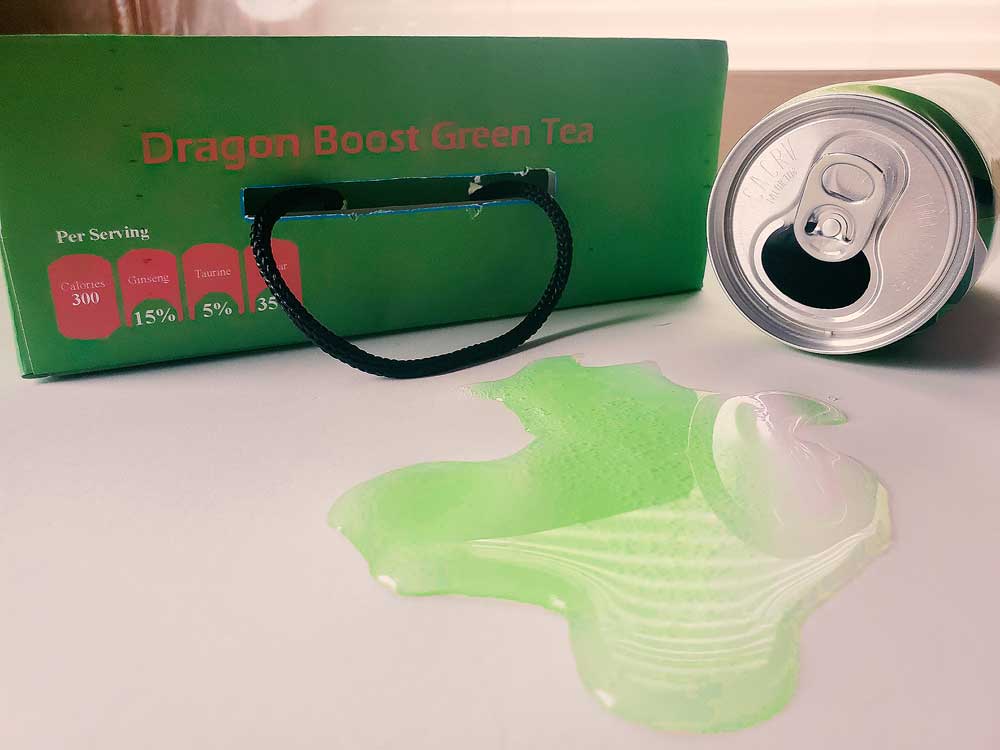
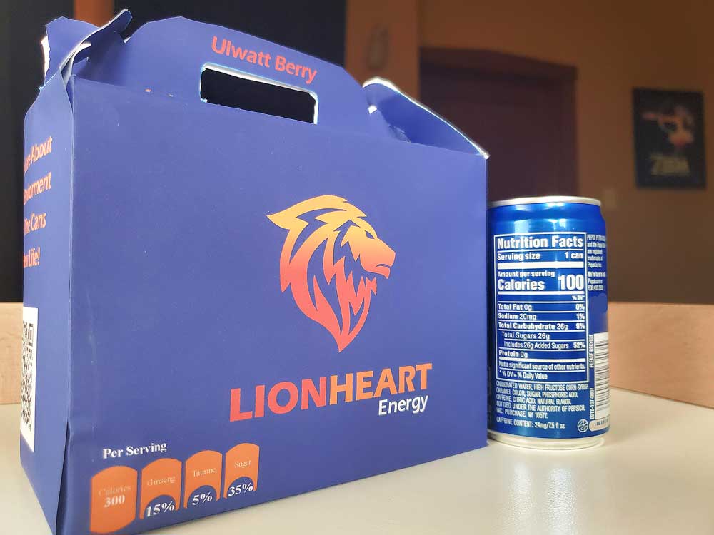
Lionheart Energy is a plant-based energy drink powered by organic caffeine, created for people who want more energy without unnecessary chemicals or harsh side effects. The brand is gaining attention for its cleaner approach, offering a healthier alternative to traditional energy drinks. Founded in Chicago, Lionheart started as a local product and has since grown to be sold worldwide. It’s currently available in three unique flavors: Ulwatt Berry, Dragon Boost Green Tea, and Ultima Violet.
Berried Memories
Lionheart began when a group of friends grew frustrated with energy drinks that left them feeling drained during workouts. What started as a joke turned into a real idea focused on creating a healthier, plant-based alternative inspired by their shared love for Final Fantasy XV and the Lionheart gunblade. Using berries and natural ingredients, the drink quickly gained local support, caught the attention of a critic, and grew into a brand that now offers three flavors available for purchase online.
3 Flavors
Ulwatt Berry is a one-of-a-kind flavor inspired by a rare ingredient from Final Fantasy XV, recreated using a blend of real berries to deliver a naturally sweet taste without added sugars while providing a clean boost of energy to help you stay focused. Dragon Boost Green Tea offers a smooth, plant-based source of energy made with green tea and essential vitamins and minerals to support metabolism and deliver sustained energy throughout workouts or long days. Ultima Violet combines berries with powerful natural ingredients like ginseng, guarana, and antioxidants to provide energizing benefits without relying on sugar, helping keep you hydrated, active, and fueled for both fitness and everyday performance.
I created an email blast to introduce customers to the new energy drink and encourage them to try it. The email was designed and built using Mailchimp, and I sent test versions to people I knew to see how it looked and performed. The goal was to drive interest in the three available flavors, with clear links that direct recipients to purchase the product and explore it further, which can be viewed below.
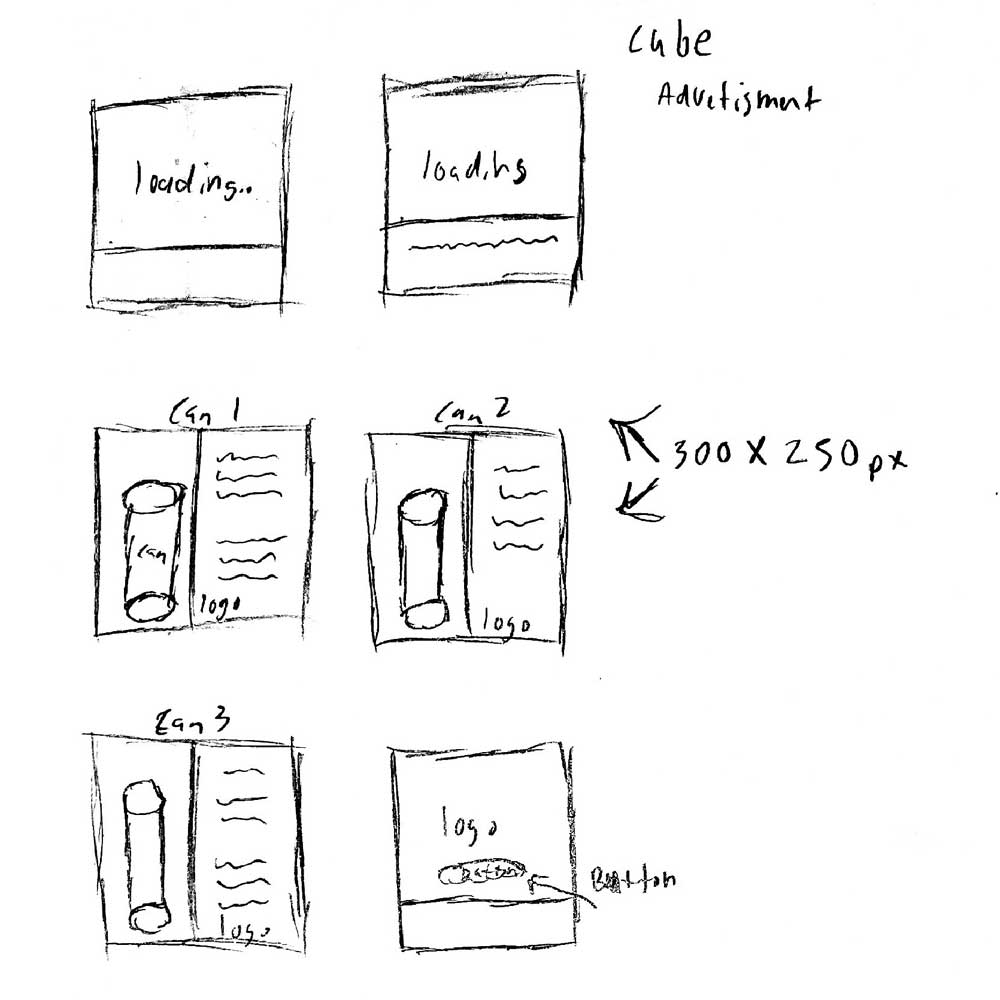
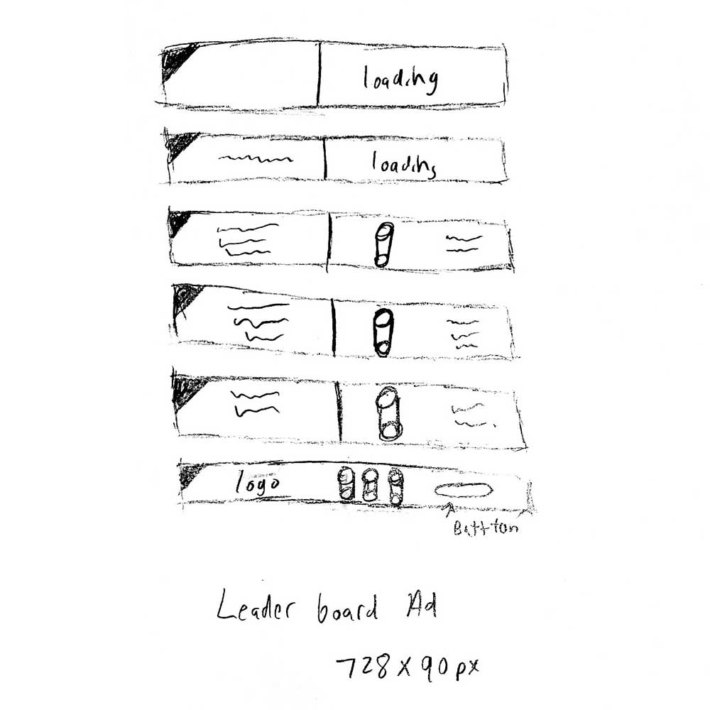
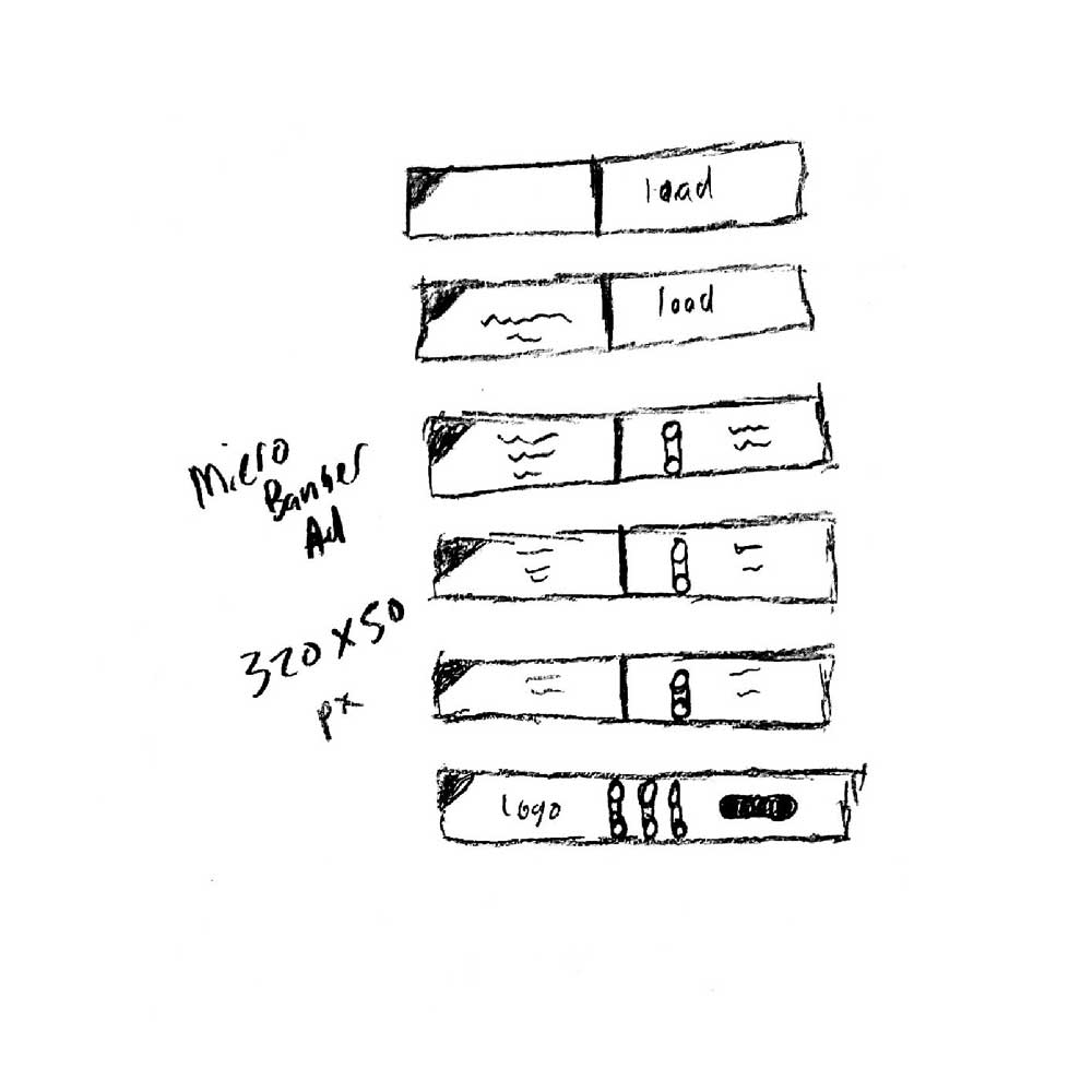
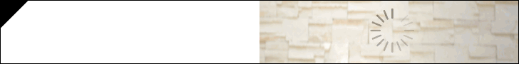
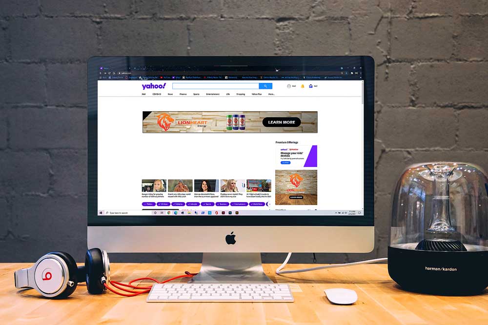
When sketching ideas for the advertisement, I researched common ad styles and focused on layout and visual hierarchy. I designed concepts for three standard formats: a leaderboard (728×90), a cube (300×90), and a micro banner (320×50). While planning each layout, I thought carefully about how to use the cans and logo to grab attention and encourage clicks. That led me to the idea of a “loading” screen—a clever visual metaphor that plays on how our brains process information, creating a moment of curiosity before the viewer takes action.
I created an email blast to introduce customers to the new energy drink and encourage them to try it. The email was fully designed and built using Mailchimp, and I sent test versions to people I knew to see how it looked and functioned. The goal was to drive interest in the three available flavors, with clear links that allow recipients to explore and hypothetically purchase the product, which can be viewed below.
Cube Advertisment 300 x 250 px
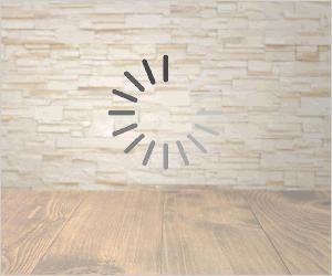
Microbanner Advertisment 320 x 50 px

Leaderboard Advertisment 728 x 90 px
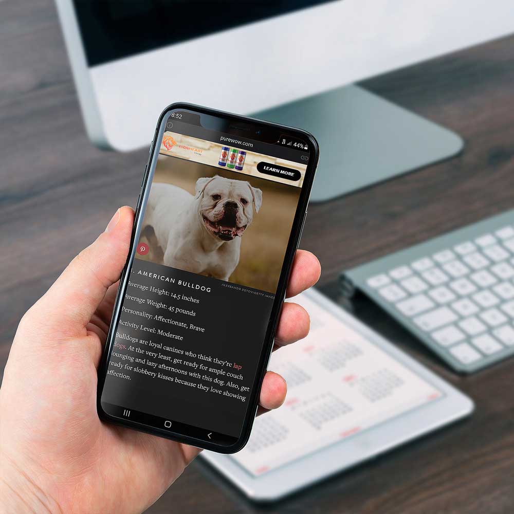
After developing the advertising concept, I wanted to show how the ads would appear in real-world digital settings, so I placed them within desktop and mobile environments. This approach helps visualize how users might encounter the ads online, with clear call-to-action buttons guiding them to where the product can be found. The mobile phone features the micro banner ad, while the desktop displays the leaderboard and cube advertisements on screen.
I created this animation in my motion design class as a way to bring one of my long-term branding logos to life. Using Adobe After Effects, I animated the logo with the Saber plugin by Video Copilot and added a particle background using Trapcode Particular by Red Giant. The result highlights both the brand and my motion design skills, which you can view below.