This was a collaborative team project completed by us graphic designers Noel Aguirre, Amber Long, and Heriberto Aguayo, for our final class and it was a great experience working together in clearly defined roles. We each took ownership of different parts of the project—layout and packaging design, logo and advertising design, and interactive media (UI/UX). Throughout the process, we consistently shared feedback and critiques, which helped us refine our ideas and successfully bring the project together as a team.
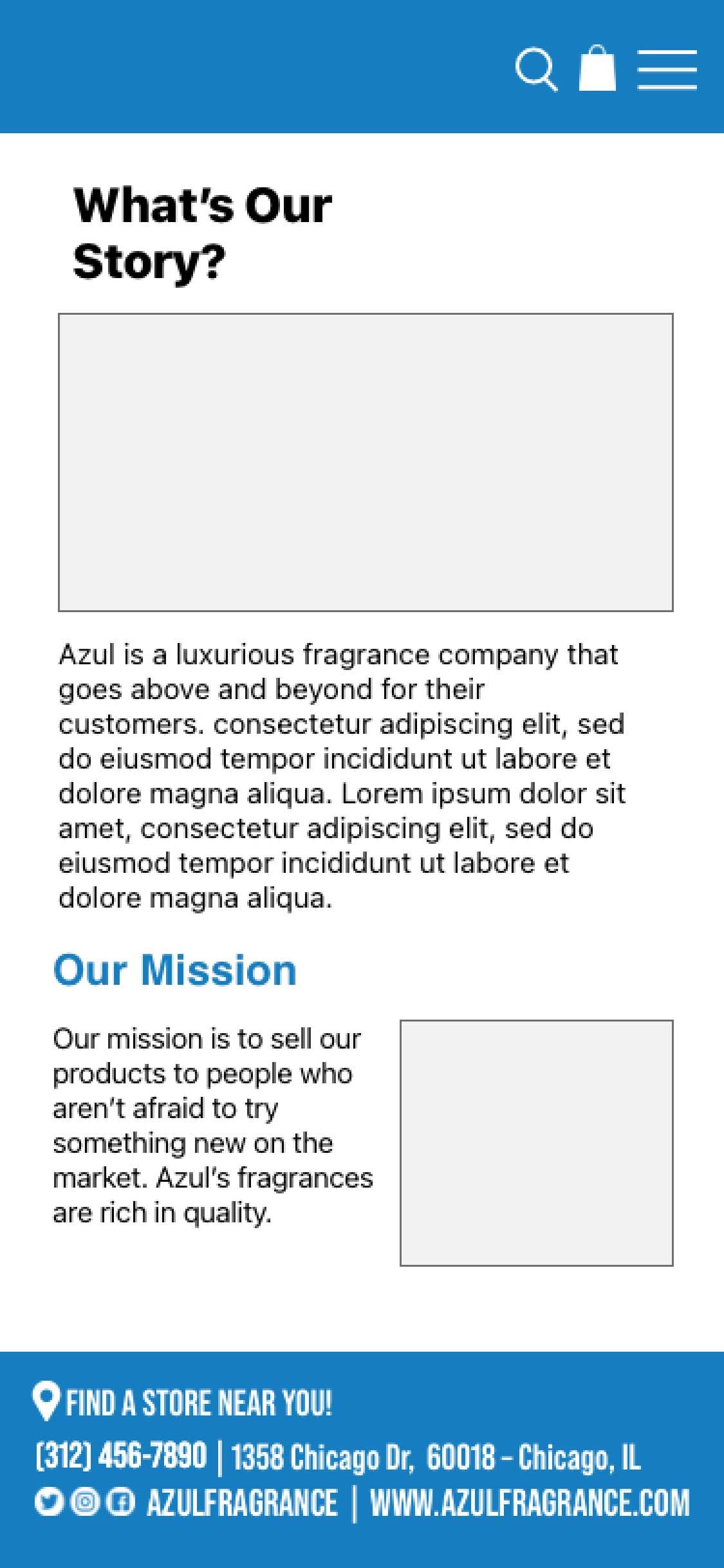
Azul is a rich, luxurious fragrance designed to elevate everyday moments and enhance the human experience. Our mission is to create a refined, unisex scent that encourages people to reconnect with life, create meaningful memories, and move forward with confidence. Azul is made for everyone—without discrimination—inviting individuals to express themselves and “leave a mark” through a memorable, lasting aroma.
Millennials ages 18–35 who enjoy exploring new experiences and trying fresh, innovative products.
While researching other fragrance and cologne brands with similar goals, we explored companies known for their luxurious and refined identities. This research helped guide our initial concept of designing a logo that feels high-end and sophisticated. We aimed to create a brand that represents quality, freshness, and an exceptional scent experience for both men and women. These references inspired the overall look and feel of our logo as we worked toward building a premium, unisex fragrance brand.
During our online research, we created a mood board to guide the direction of the logo design. We explored four logo types—lettermark, wordmark, brandmark, and combination mark—and were drawn to a lettermark since many high-end brands use this approach effectively. We also considered incorporating natural elements like wind and earth, choosing to move away from animal imagery and lean into a more eco-conscious direction. By experimenting with different layouts, orientations, and shapes, we enjoyed collaborating and exploring ideas that helped define how we would approach the project together.
During these iterations, our team explored different shapes for the wordmark and discovered the logo could also work as an emblem, helping it stand out from competitors. We tested simple shapes and borders, then applied consistent color treatments to view the logo in different contexts. In the second round, we focused on a lettermark using Bodoni URW, and an accidental merge of two wave forms created a wing-like shape that fit the Azul brand and was worth exploring further.
Letter Mark
Live Area: x/4 when x is the height of the logo.
Min Use: .25 Inches for the height
Word Mark
Live Area: x/4 when x is the height of the logo.
Min Use: .25 Inches for the height
Combination Mark
Live Area: x/4 when x is the height of the logo.
Min Use: .25 Inches for the height
Final Logo
After exploring many variations, the team chose this logo because of its strong structure and clarity. Placing “fragrance” beneath the name helped clearly communicate what the company is about and avoided any confusion for customers.
Didot
ABCDEFGHIJKLMNOPQRSTUVWXYZ
abcdefghijklmnopqrstuvwxyz
1234567890
!@#$%^*()_+
Bebas Neue
ABCDEFGHIJKLMNOPQRSTUVWXYZ
There is no lowercase form
1234567890
!@#$%^*()_+
Ocean Blue
RGB: 20, 125, 180
CMYK: 85, 45, 0, 0
Web Safe: #0066CC
Black
RGB: 35, 31, 32
CMYK: 0, 0, 0, 100
Web Safe: #000000
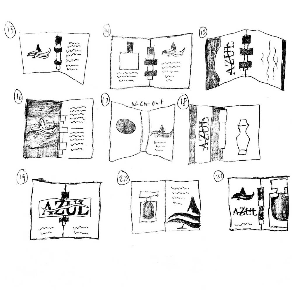
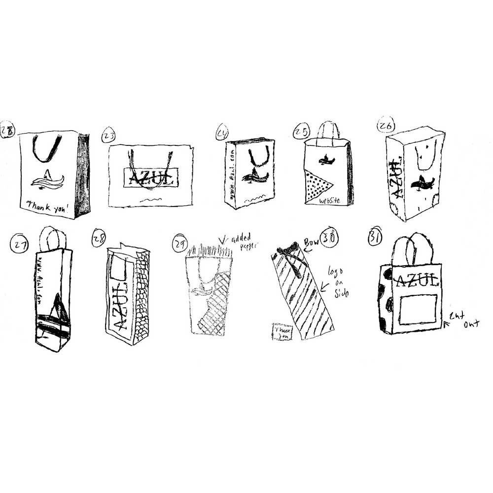
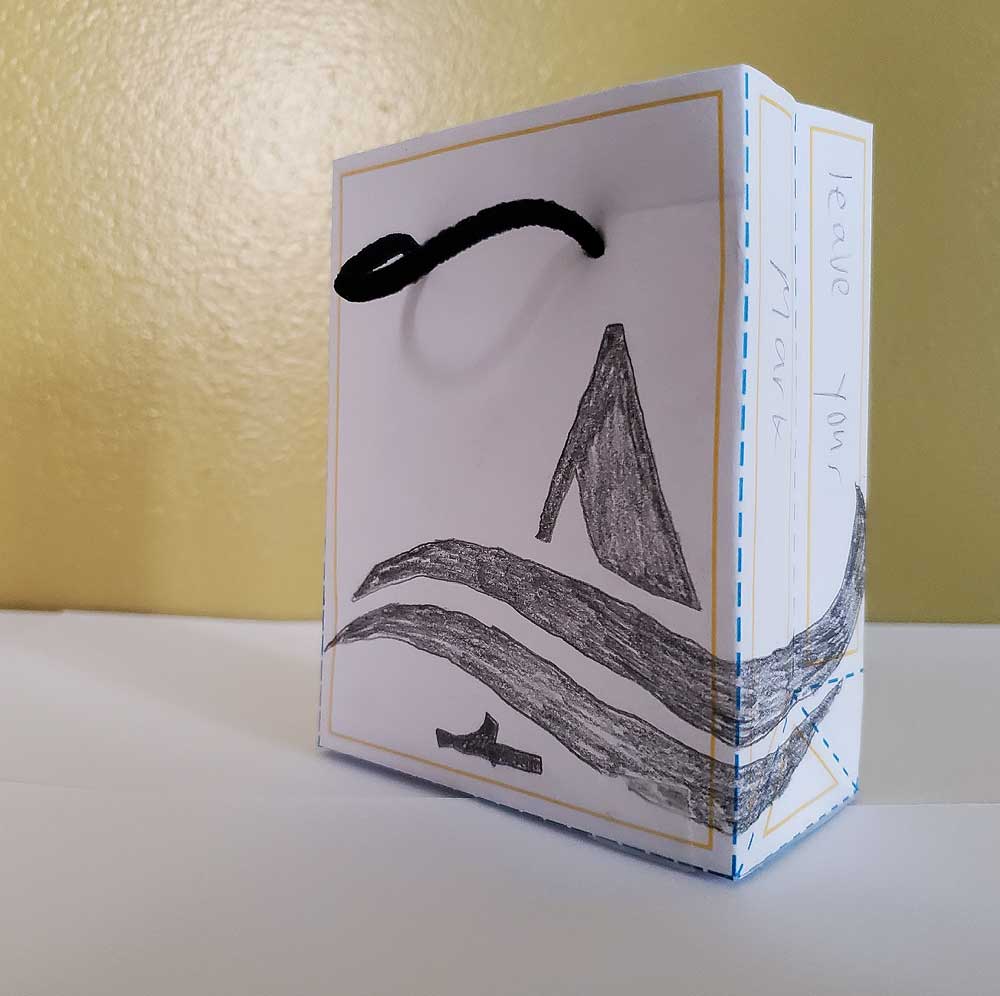
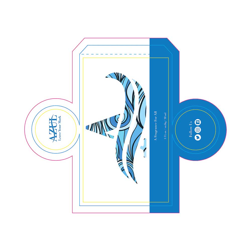
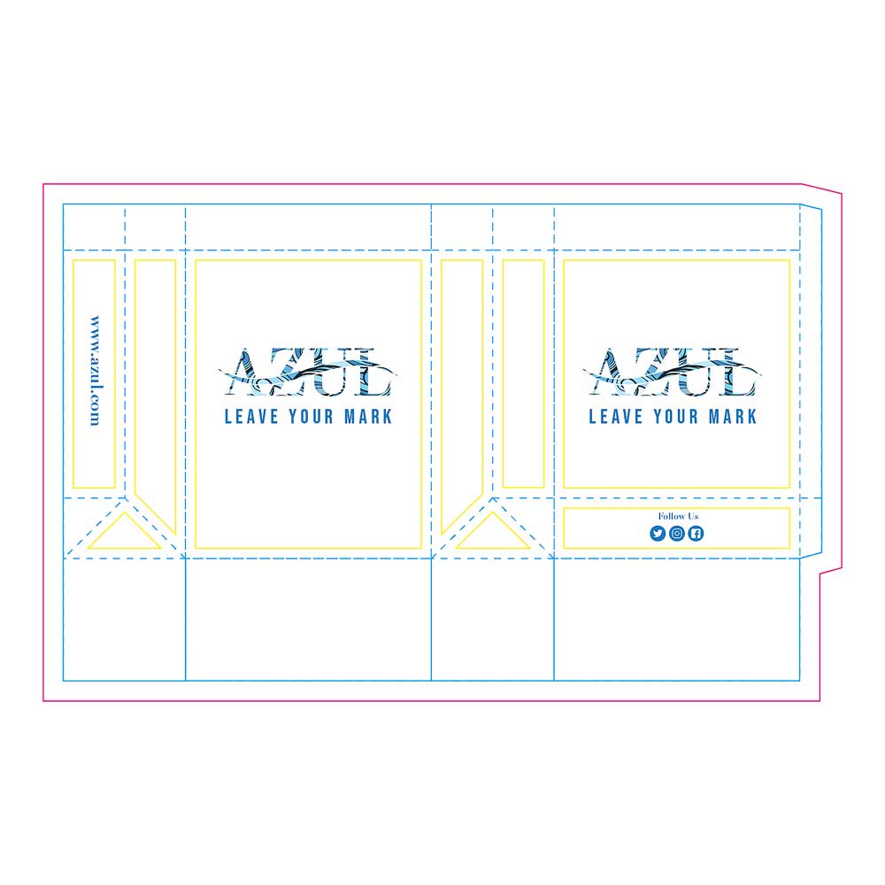
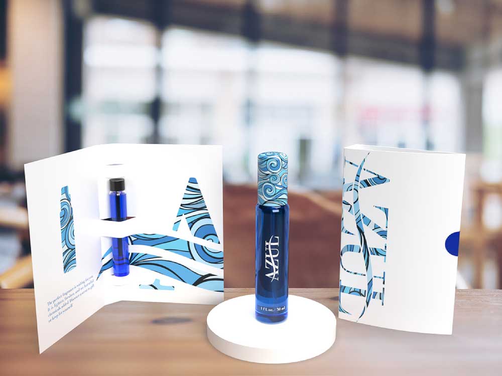
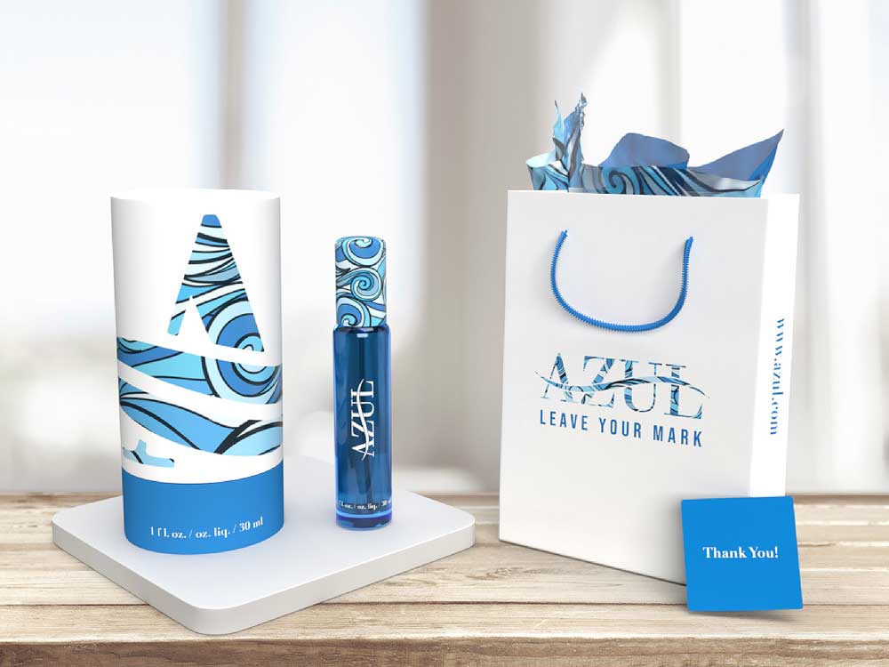
For the packaging, our team decided on a cylinder tube, a sampler, and a gift bag. We researched cylindrical fragrance packaging and liked the flexibility it offered for placing graphics, as well as the different ways it could open from the top, bottom, or side. The sampler concept came from seeing in-store product samples, which inspired a “try before you buy” approach or an easy gift option. We added a gift bag to enhance the purchase experience, including a thank-you note for customers. Together, these ideas helped make the packaging portion of the project feel thoughtful and complete.
When sketching packaging ideas, we focused on the tube pattern since it’s the first thing customers would notice in-store. We explored different ways to feature the logo, added a window cutout so customers could see the product inside, and included icons to communicate the materials used and our eco-conscious approach. We also sketched gift bag concepts to enhance the purchase experience and thank customers for supporting the brand.
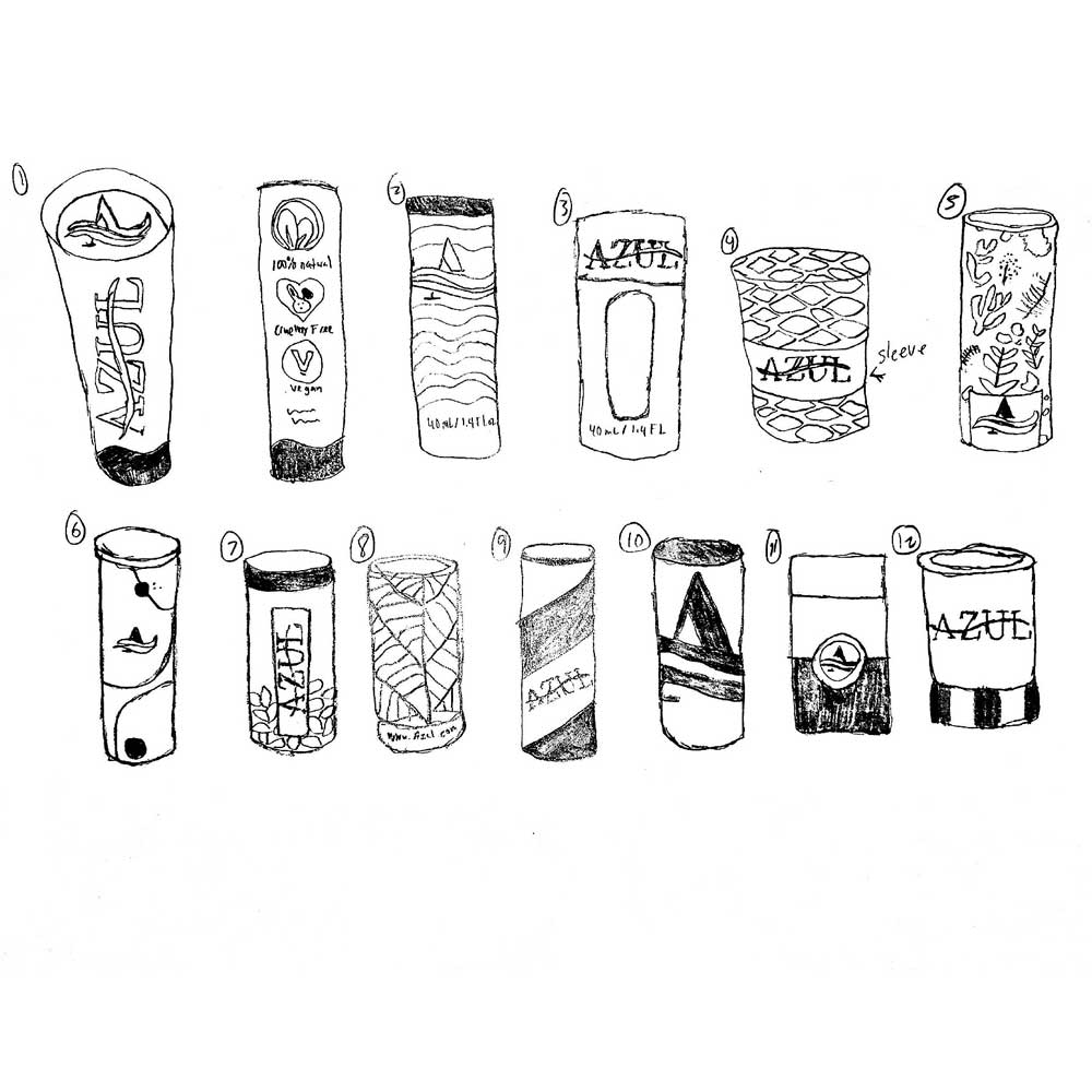
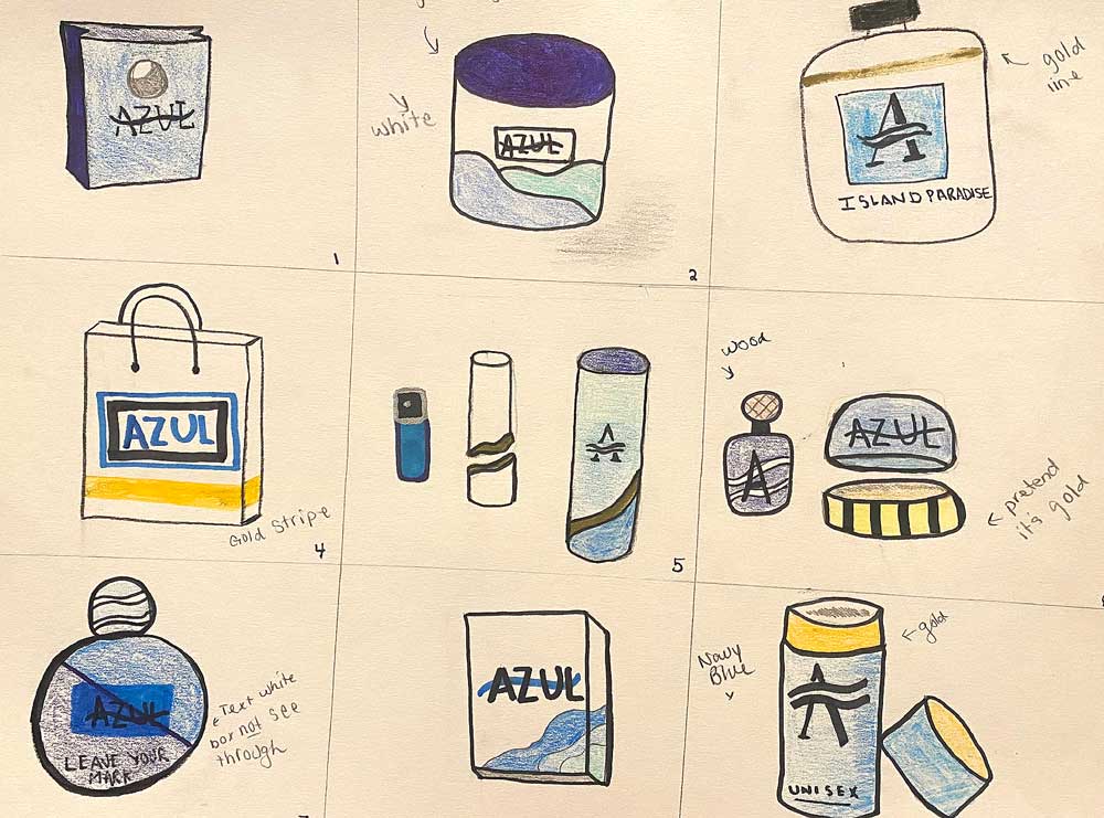
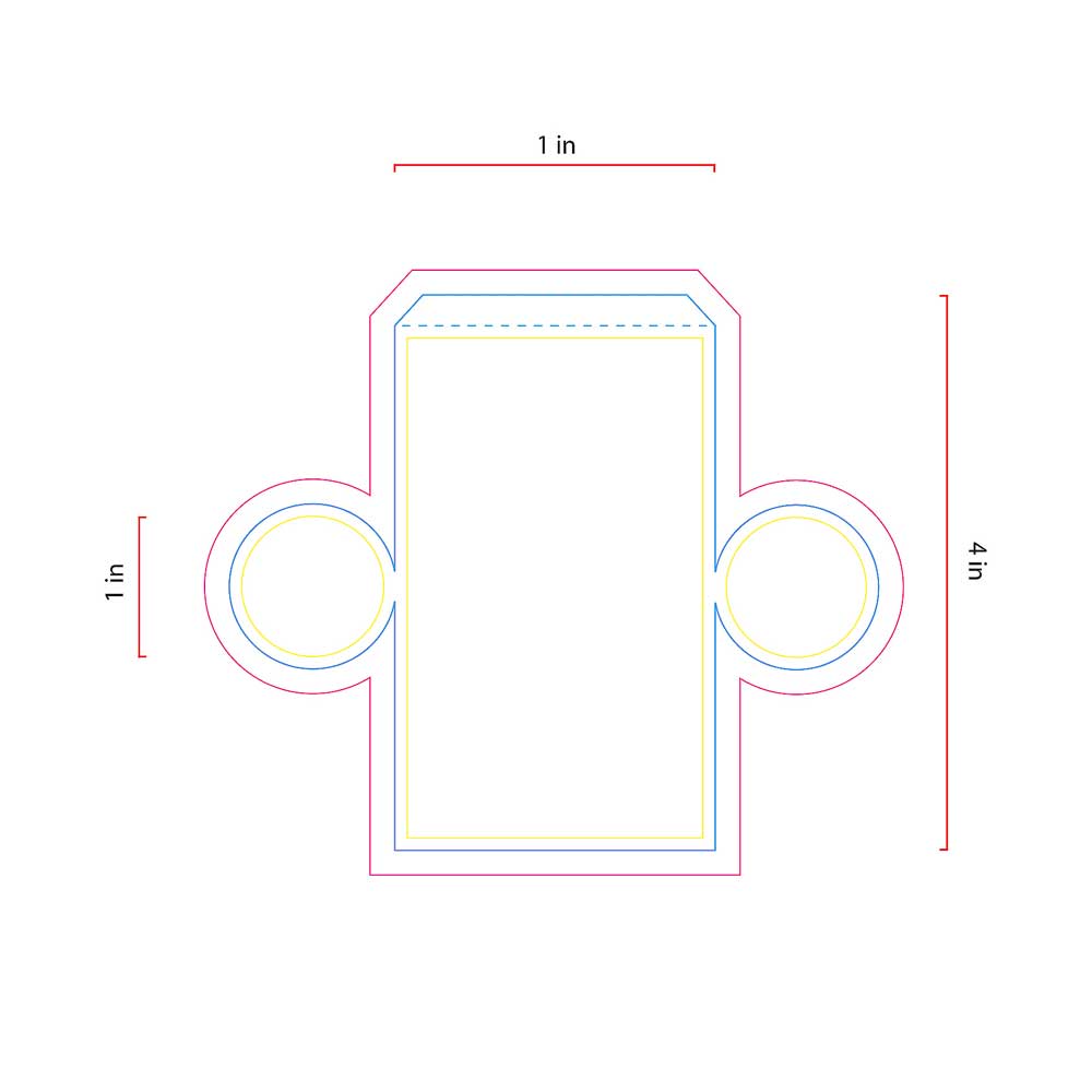
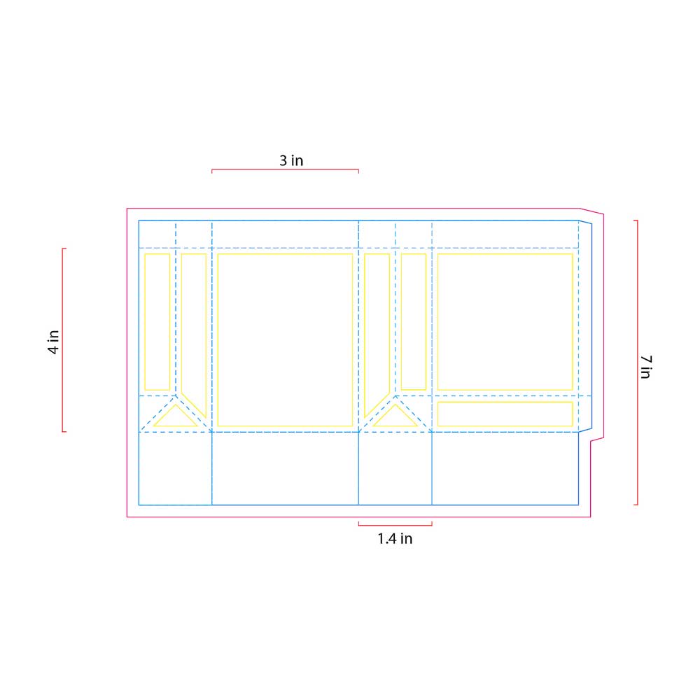
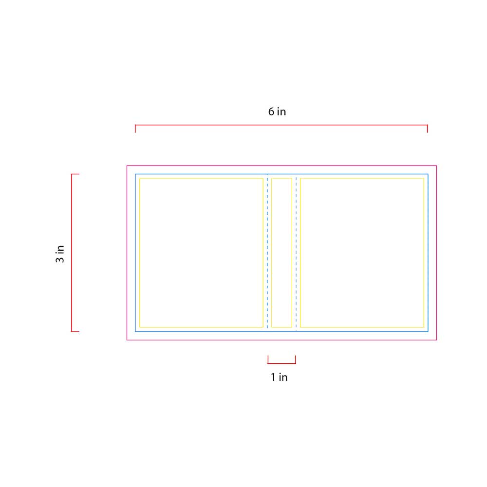
After sketching, our team decided to move forward with a cohesive suite of products. We designed a Euro-style gift bag and chose a wider format to accommodate multiple purchases. The main fragrance packaging is a cylindrical tube that can hold either a square or circular bottle, with options for a top or bottom cuff opening. We also included a sampler, giving customers a chance to try the fragrance or share it with others, helping spread the brand and attract new customers.
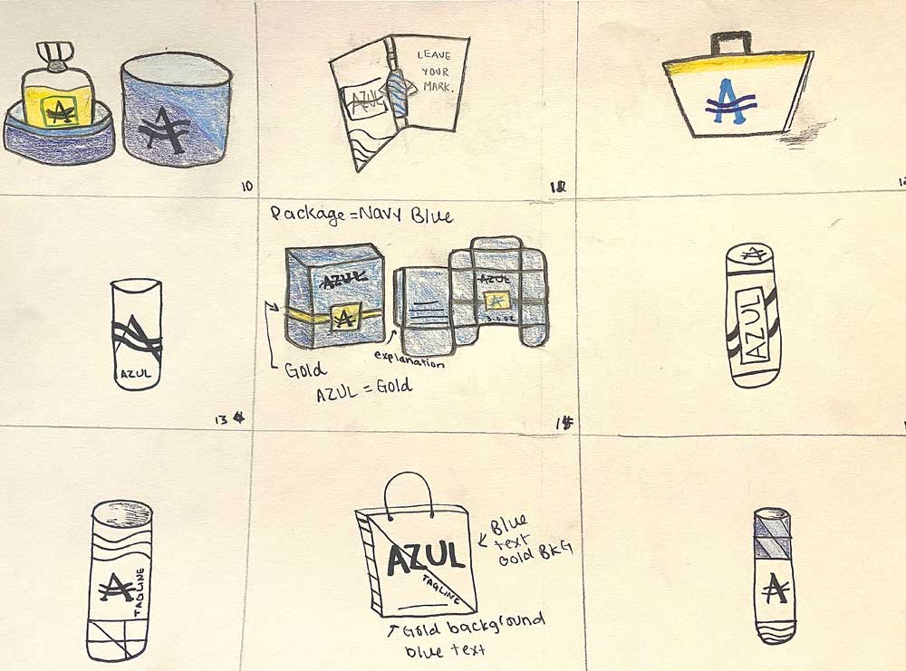
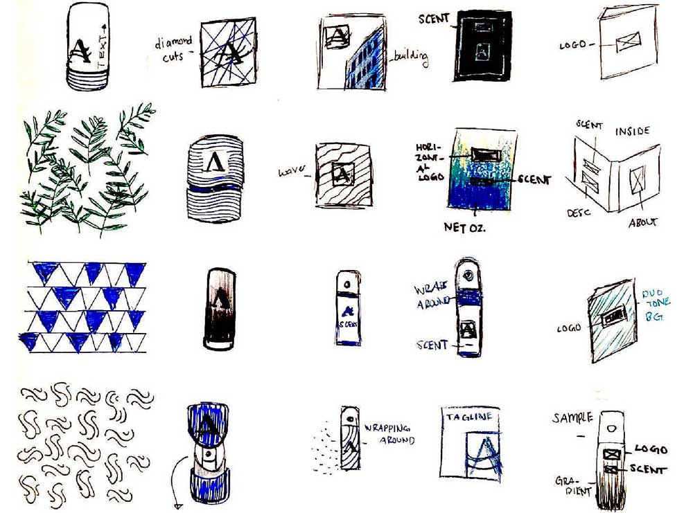
After assembling the 3D paper models and applying the adhesives, we began sketching where the graphics would live on the packaging. This helped us ensure everything was clearly visible, properly oriented, and easy to read. Inspired by the logo’s connection to water and wind, we explored using patterns along the sides of the cylinder in different arrangements. We applied both the lettermark and wordmark logos across various areas of the packaging to create visually engaging and cohesive designs.
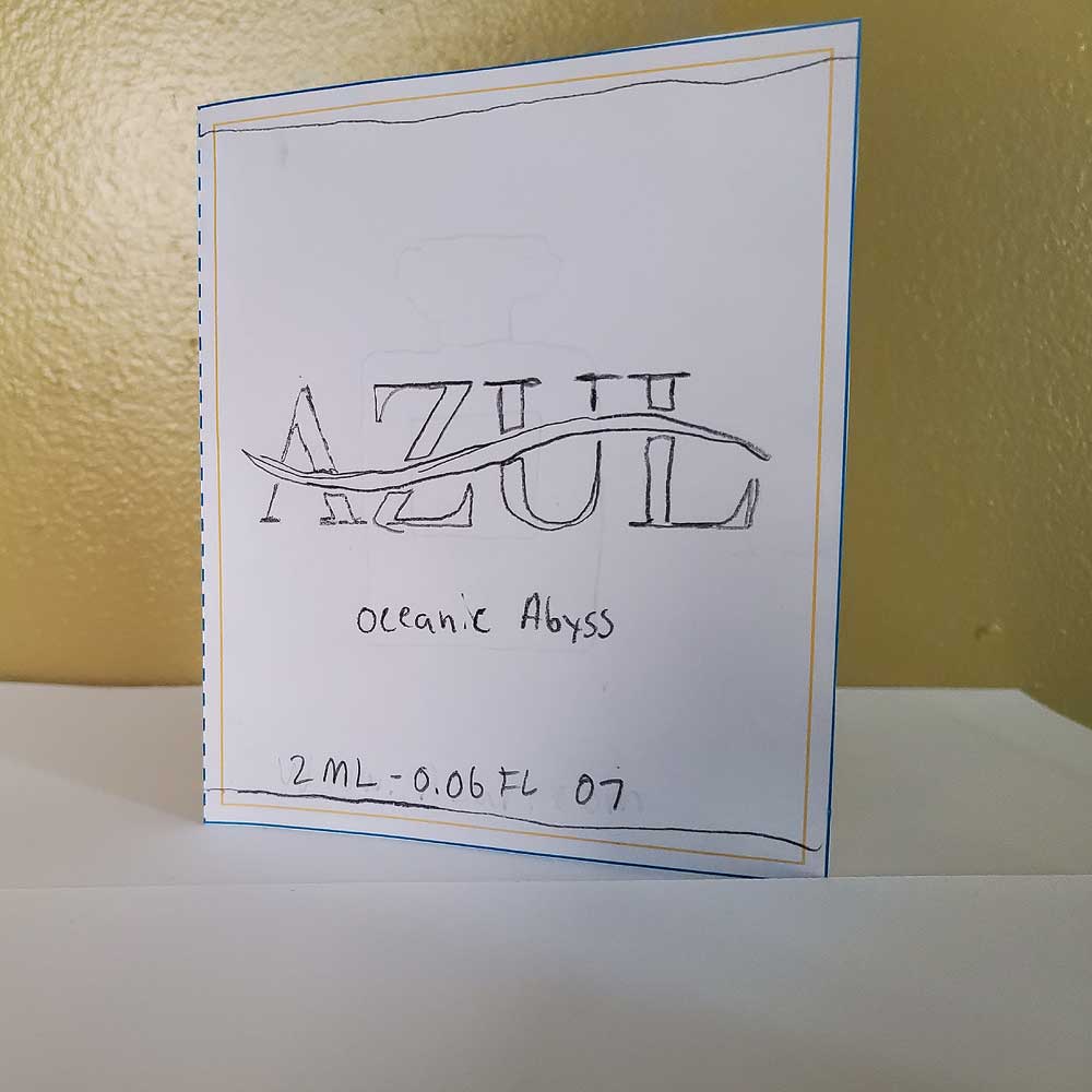
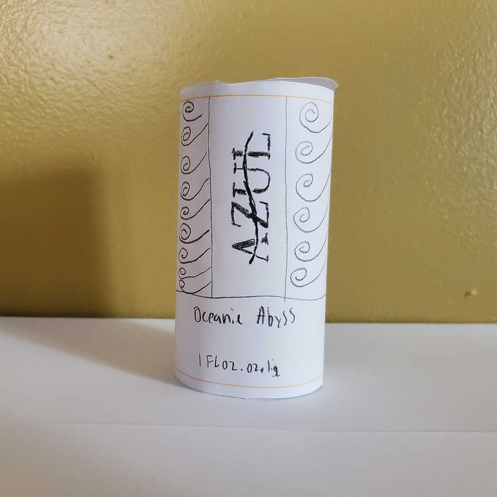
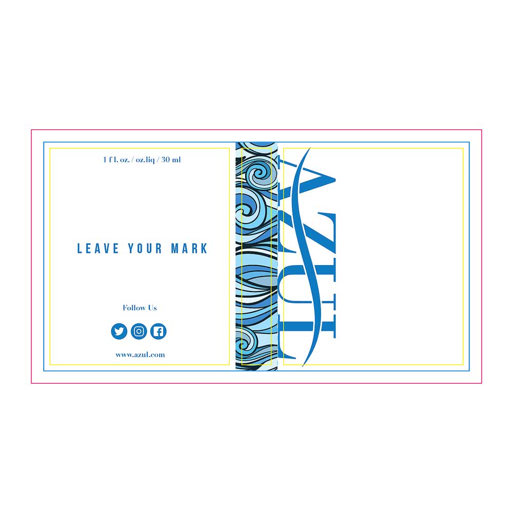
After team critique and guidance, we narrowed down our variations and finalized the fragrance packaging, refining ideas and introducing new ones along the way. Adding the pattern to the edge of the sampler helped it stand out without getting lost in the overall design, and we created custom social media icons so customers could easily find and follow the brand. Through multiple iterations, we focused on creating packaging that would catch attention and encourage repeat interest. We ultimately chose to feature the parent company name rather than individual fragrance names, and overall, this stage of the project was both creative and rewarding.
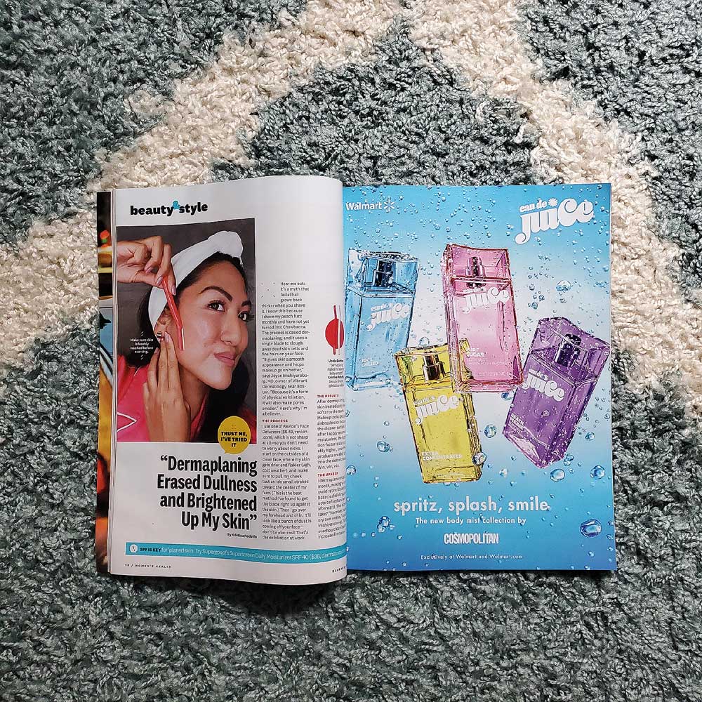
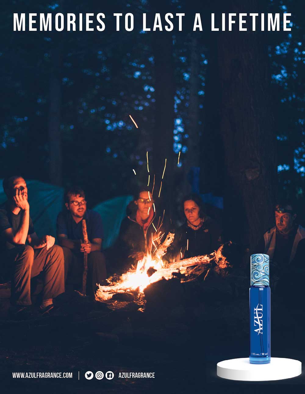
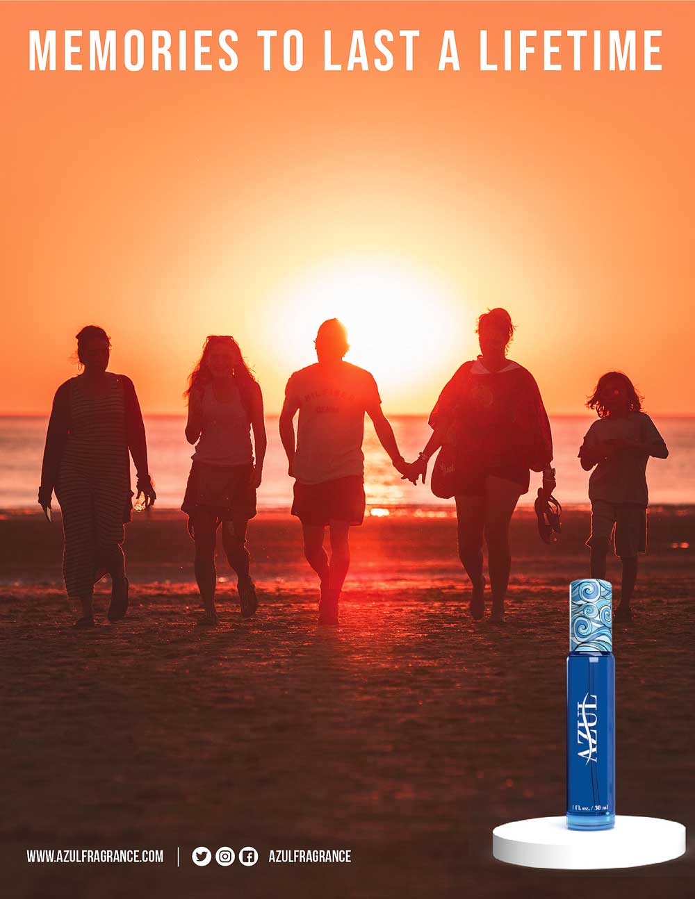
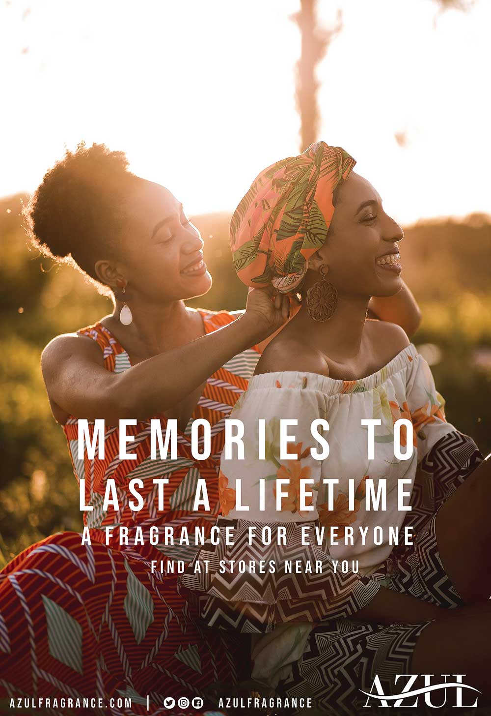
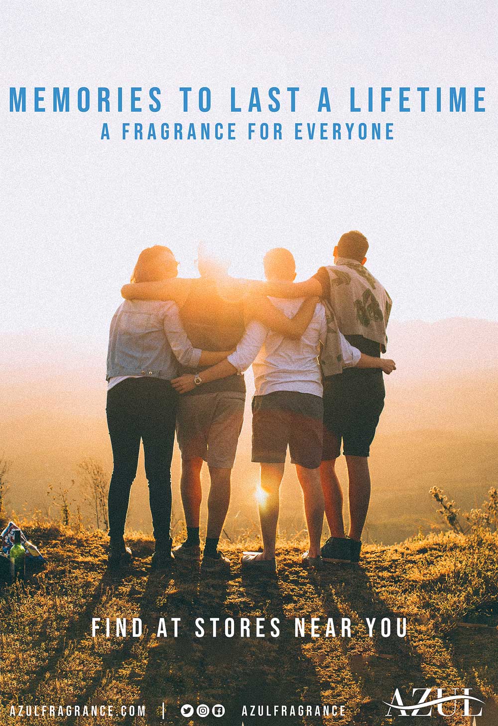
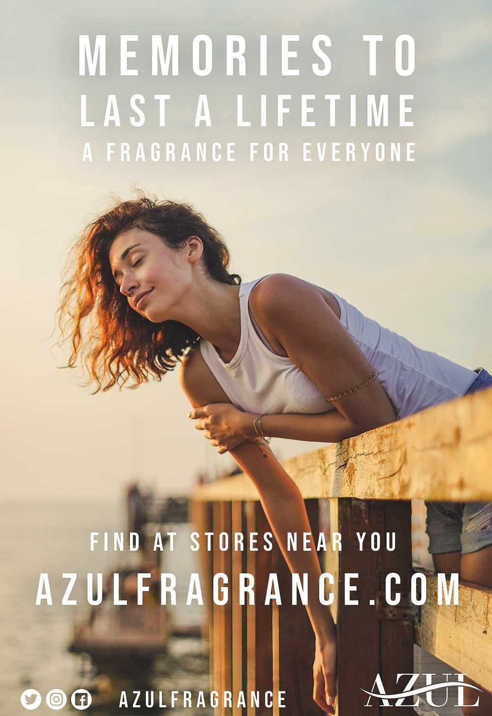
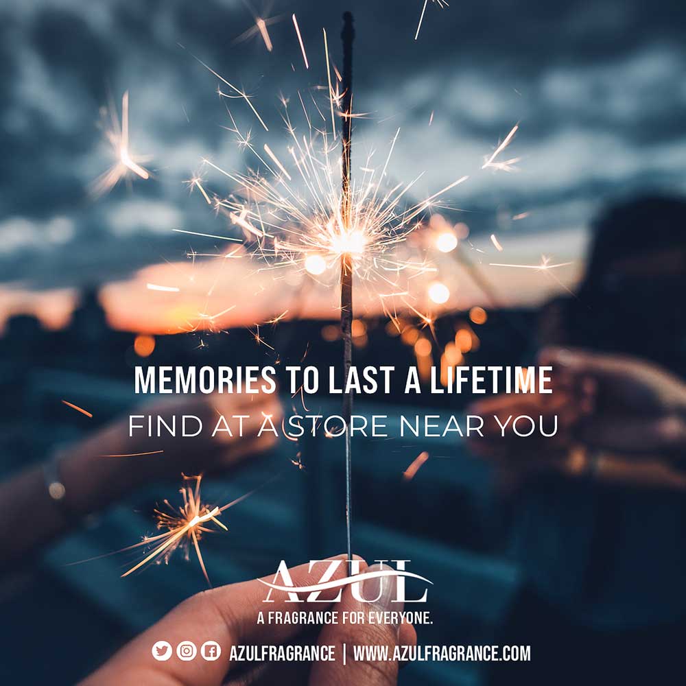
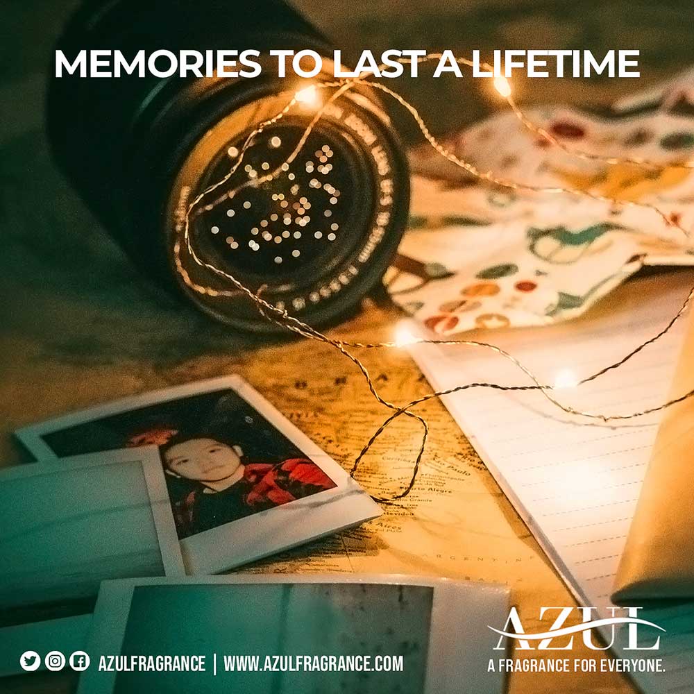
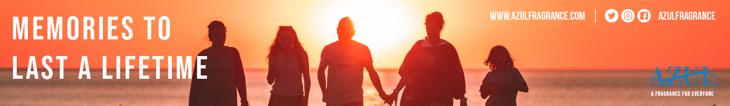
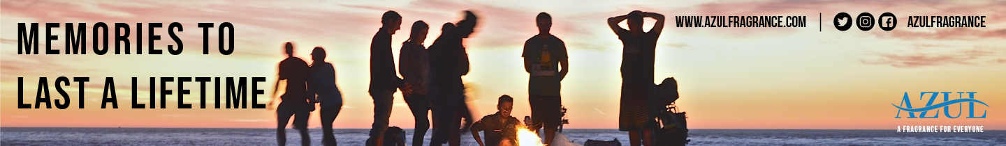
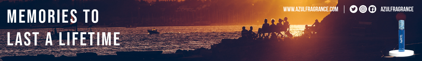
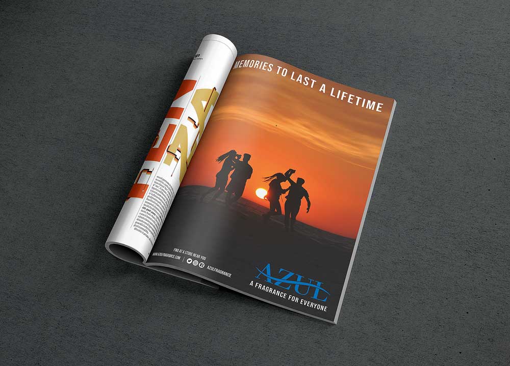
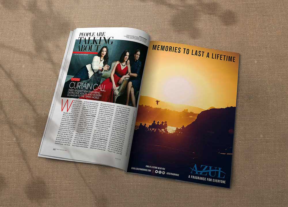
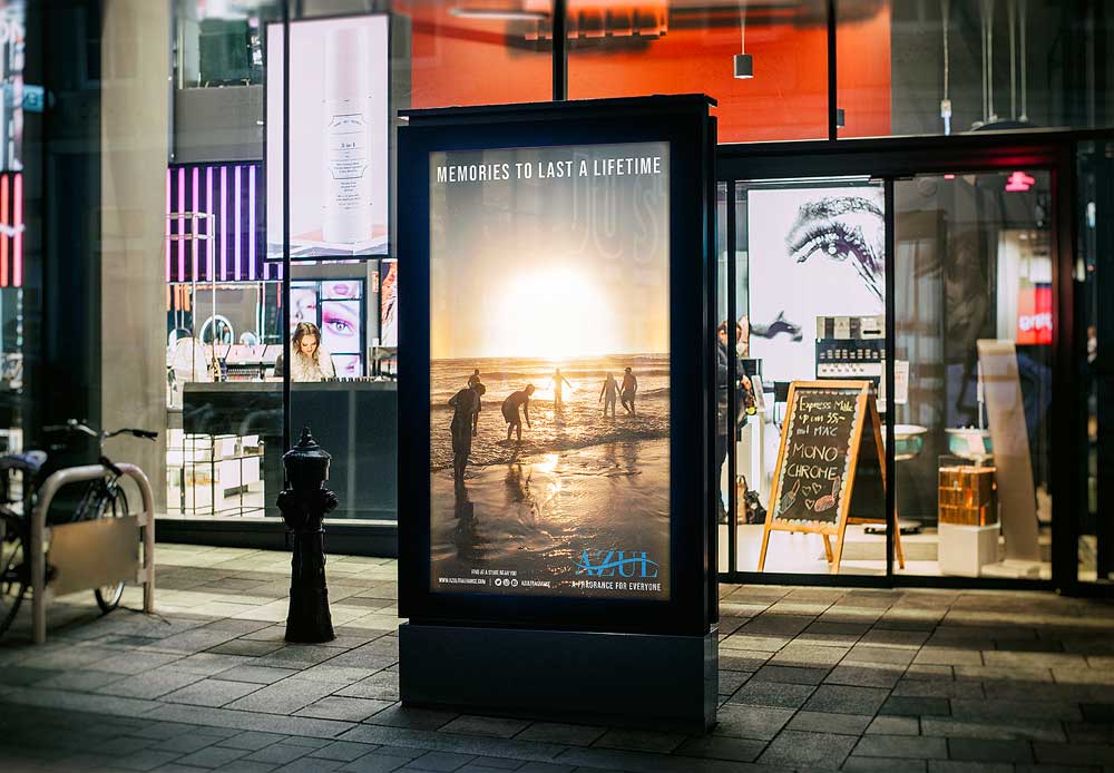
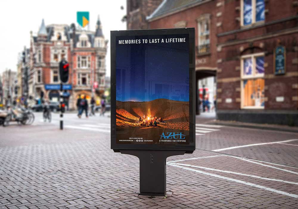
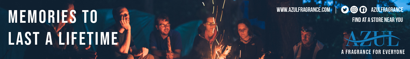
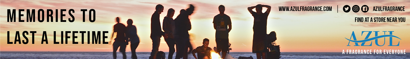
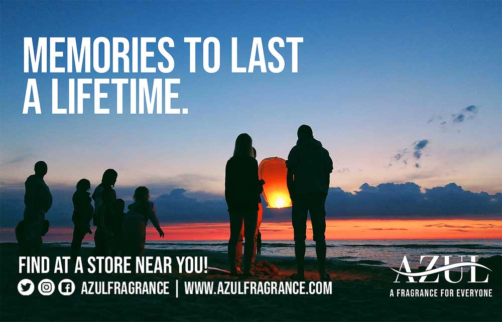
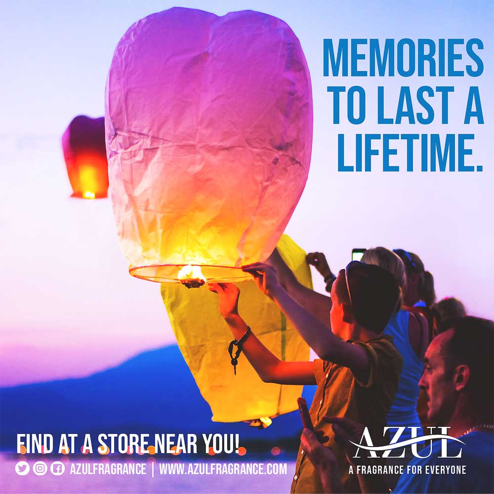
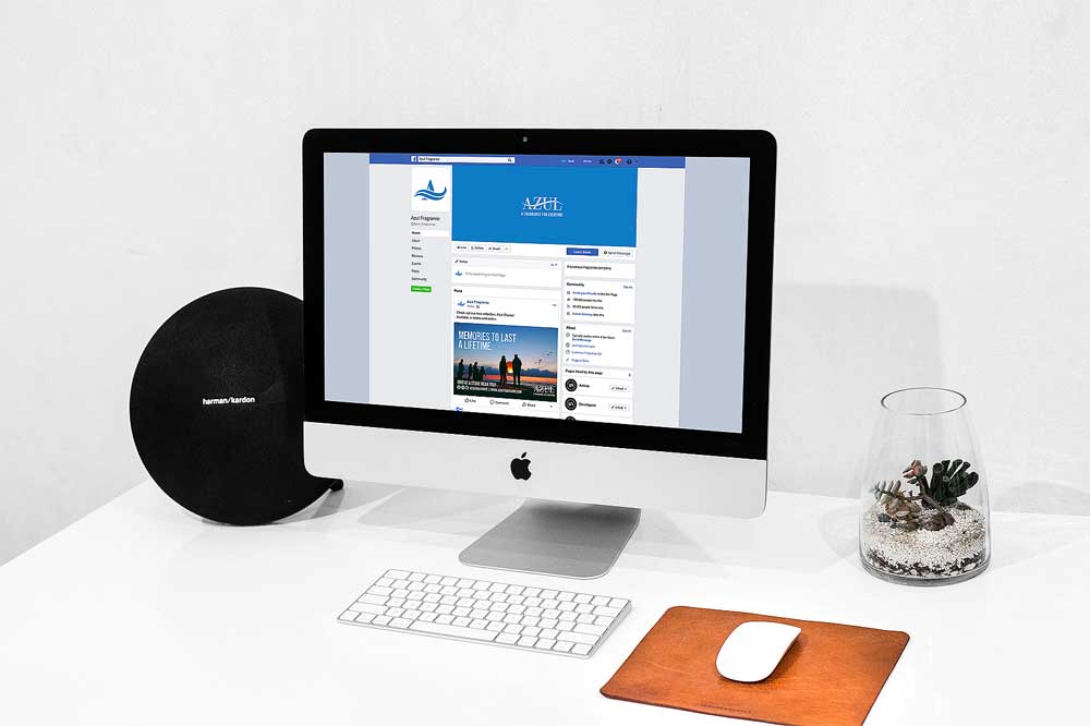
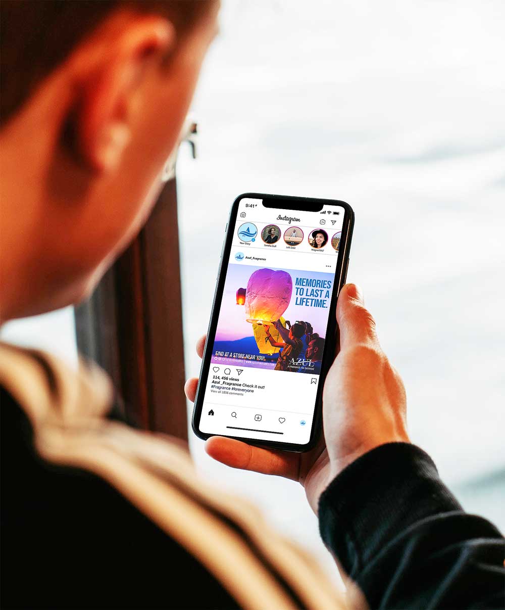
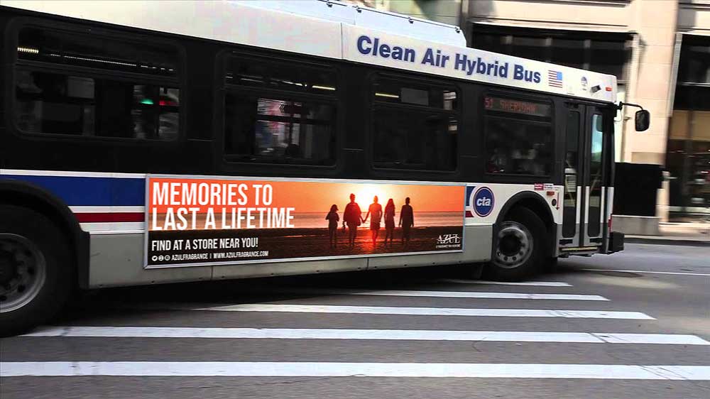
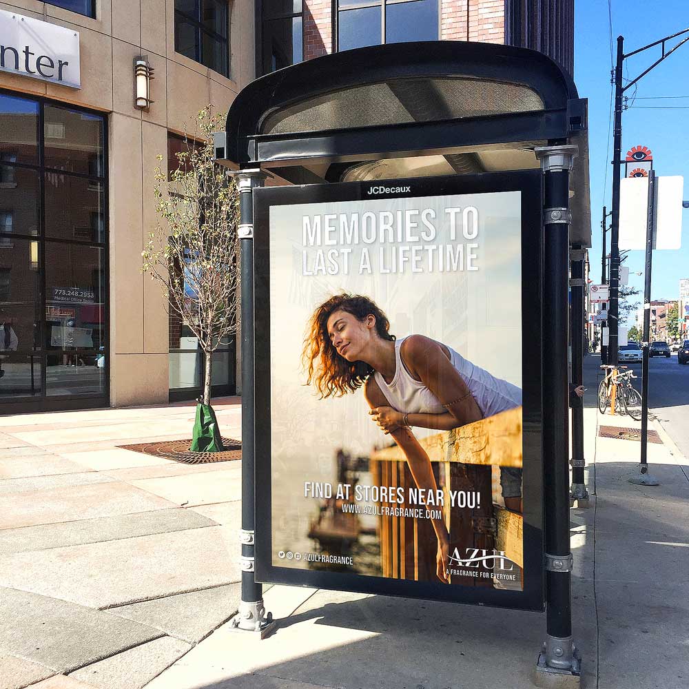
The goal of the Azul ad campaign is to promote an inclusive, unisex, vegan fragrance made with non-harmful ingredients and no animal testing. The campaign spans magazine ads, social media, outdoor displays, and in-store stands designed to spark curiosity and encourage product exploration. By featuring real people of all backgrounds and advertising across platforms like Cosmopolitan, Time, Facebook, Instagram, and YouTube, the campaign emphasizes authenticity, inclusivity, and connection.
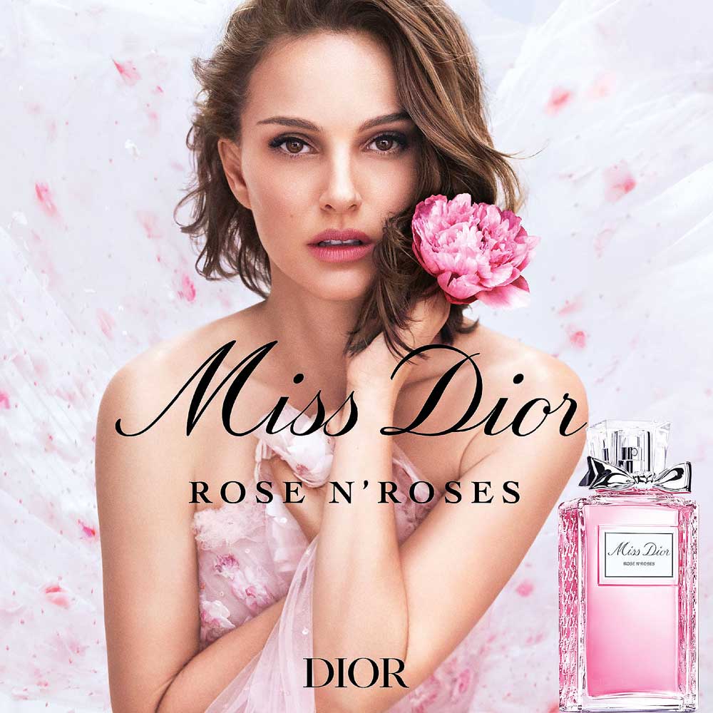
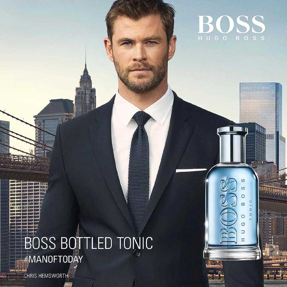
During our research, we explored pairing a model with the fragrance to encourage people to try it, recognizing how strongly audiences connect with public figures. While we initially considered focusing solely on the product and logo, we shifted toward a more emotional approach. This led to the “memories” concept, where we feature real moments of people creating memories together, reinforcing the idea that the fragrance is about connection, shared experiences, and meaningful moments with others.
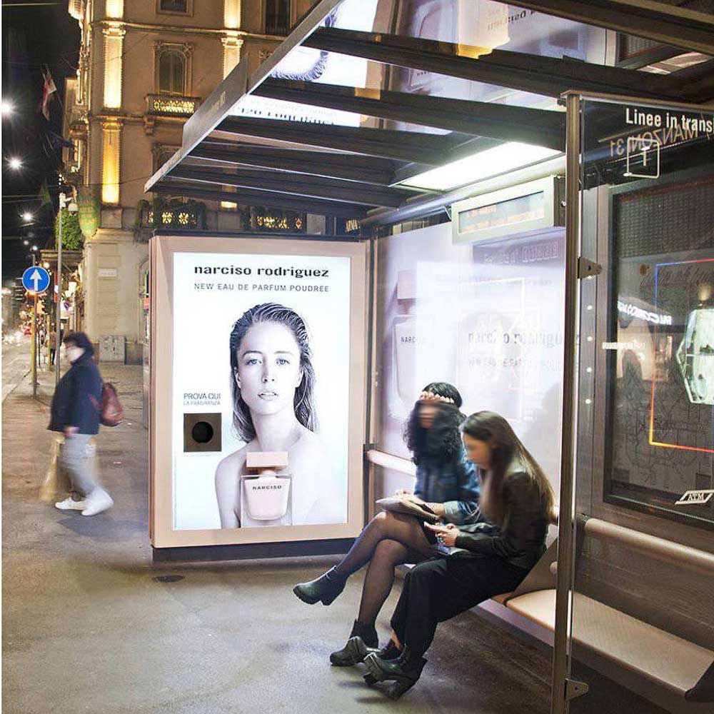
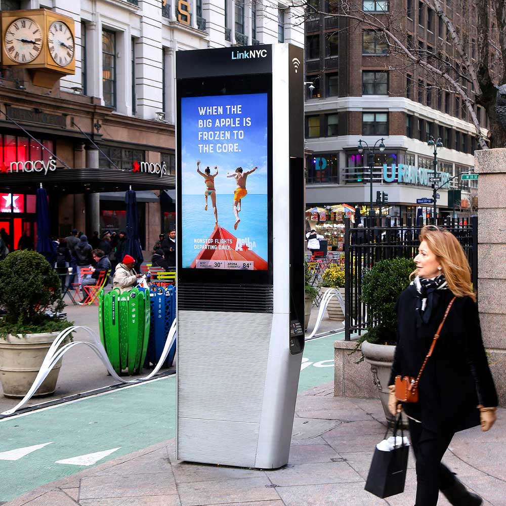
As a team, we developed three main advertising concepts: magazine ads, social media ads on Facebook, Instagram, and YouTube, and bus shelter ads to reach our city-based audience. We also explored kiosk ads, as they encourage interaction and offer a more grounded, approachable alternative to billboards. Through our sketches, we focused on reflecting Azul’s brand identity by experimenting with different layouts, orientations, typography, and graphics. Inclusivity was a key priority throughout the process—ensuring our ads represent people of all genders, races, and ethnicities—so Azul communicates authenticity and celebrates what’s real.
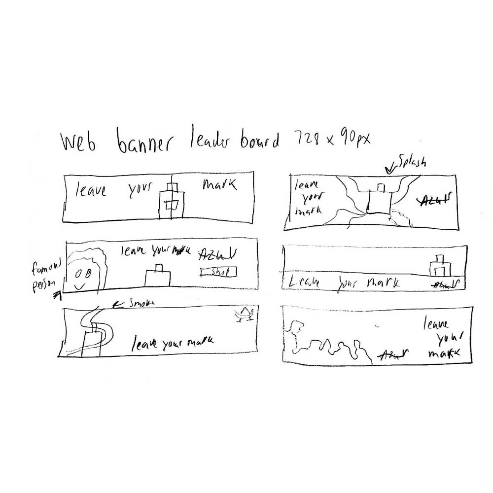
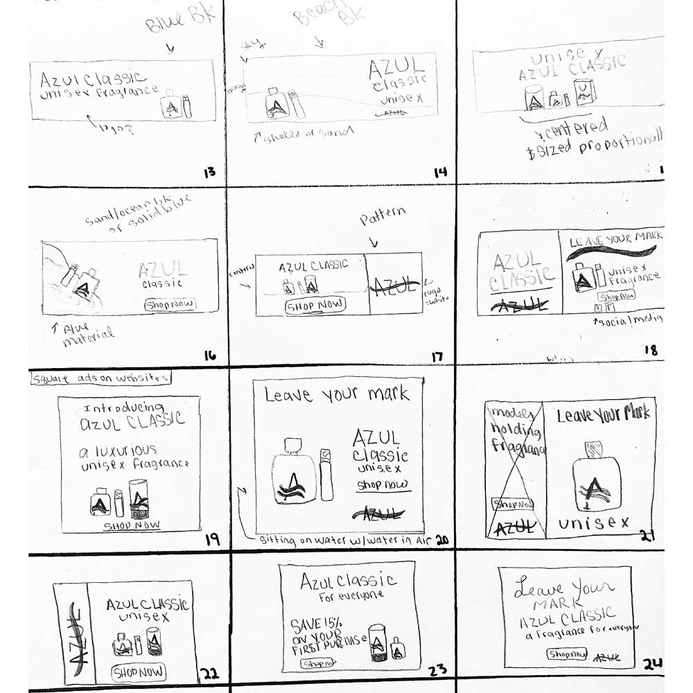
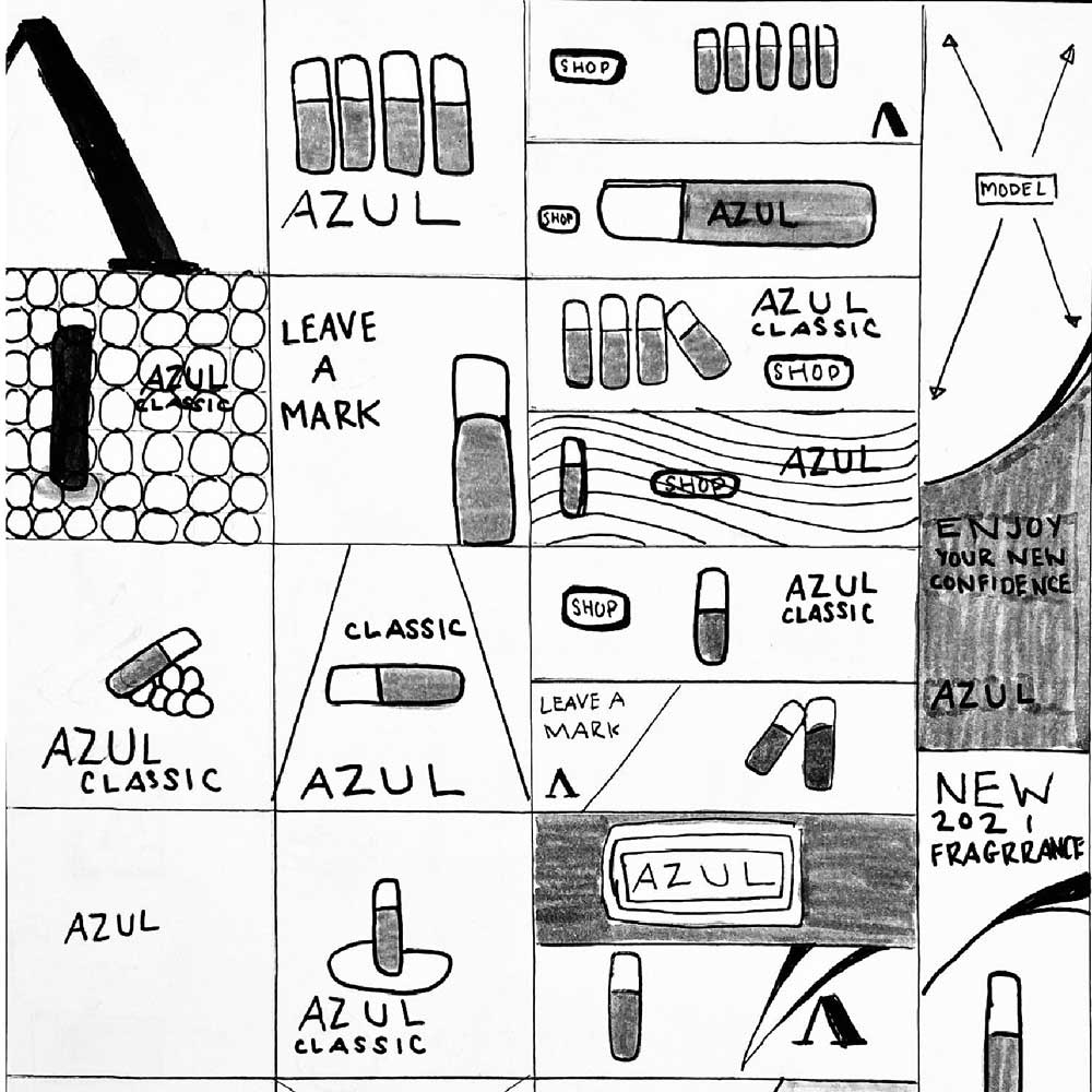
For our research, we focused on magazine, kiosk, and bus shelter ads, with social media as a supporting channel. We chose People magazine because print ads appear in everyday places and are easy for audiences to engage with, while bus shelter ads allow us to reach city commuters with bold, eye-catching visuals. We also explored ads on Facebook, Instagram, and YouTube to build awareness and drive traffic, along with interactive kiosk ads that let users engage directly with the brand.
After receiving extensive feedback from our classmates and instructor, our team revisited the ads and refined them to be more visually engaging. We simplified the copy while keeping the overall structure, added our website and social media icons so customers know where to find us, and included a clear call to action encouraging them to locate a nearby store to purchase the product.


After receiving feedback from our classmates and instructor, our team revisited the ads and refined them to be more visually appealing. We simplified the copy while maintaining the original structure, added the website and social media icons to help customers find the brand, and included a clear call to action encouraging them to locate a nearby store and purchase the product.
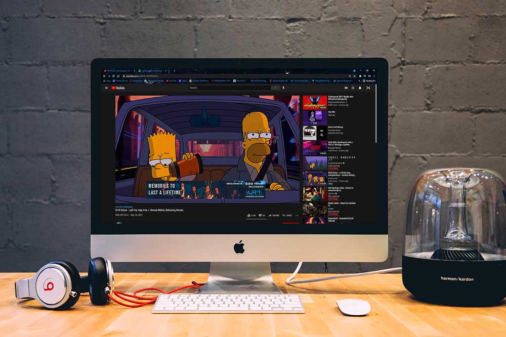
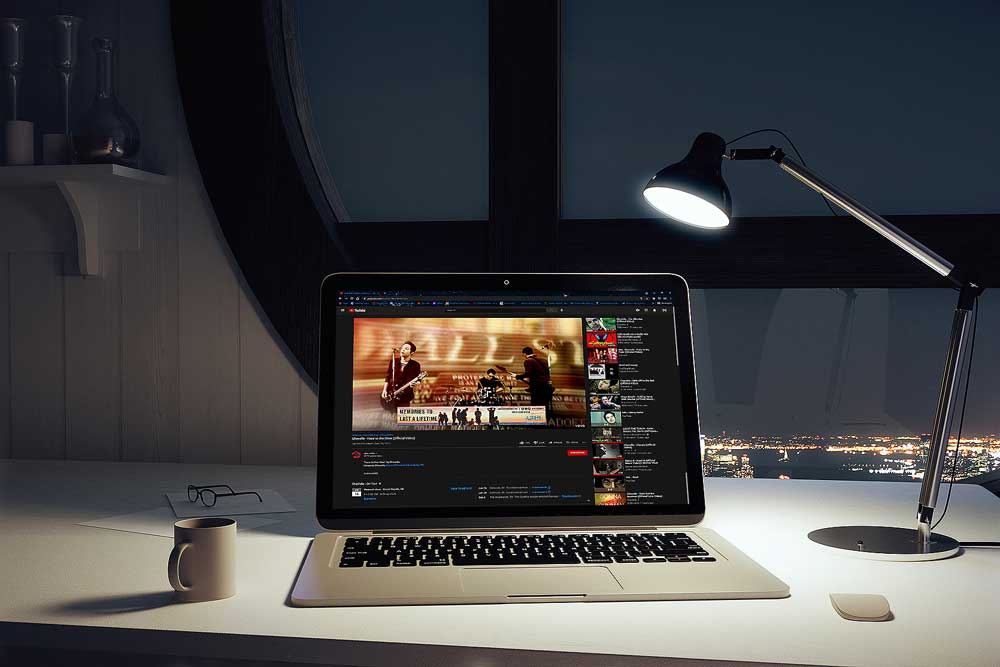
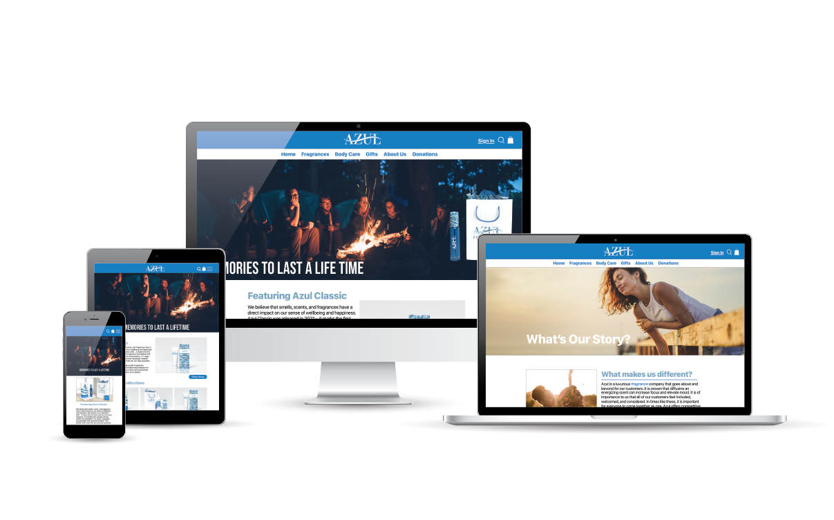
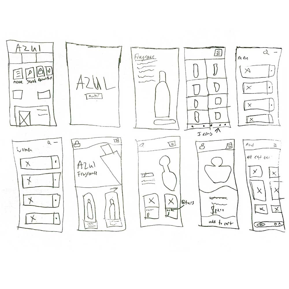
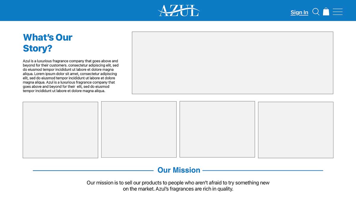
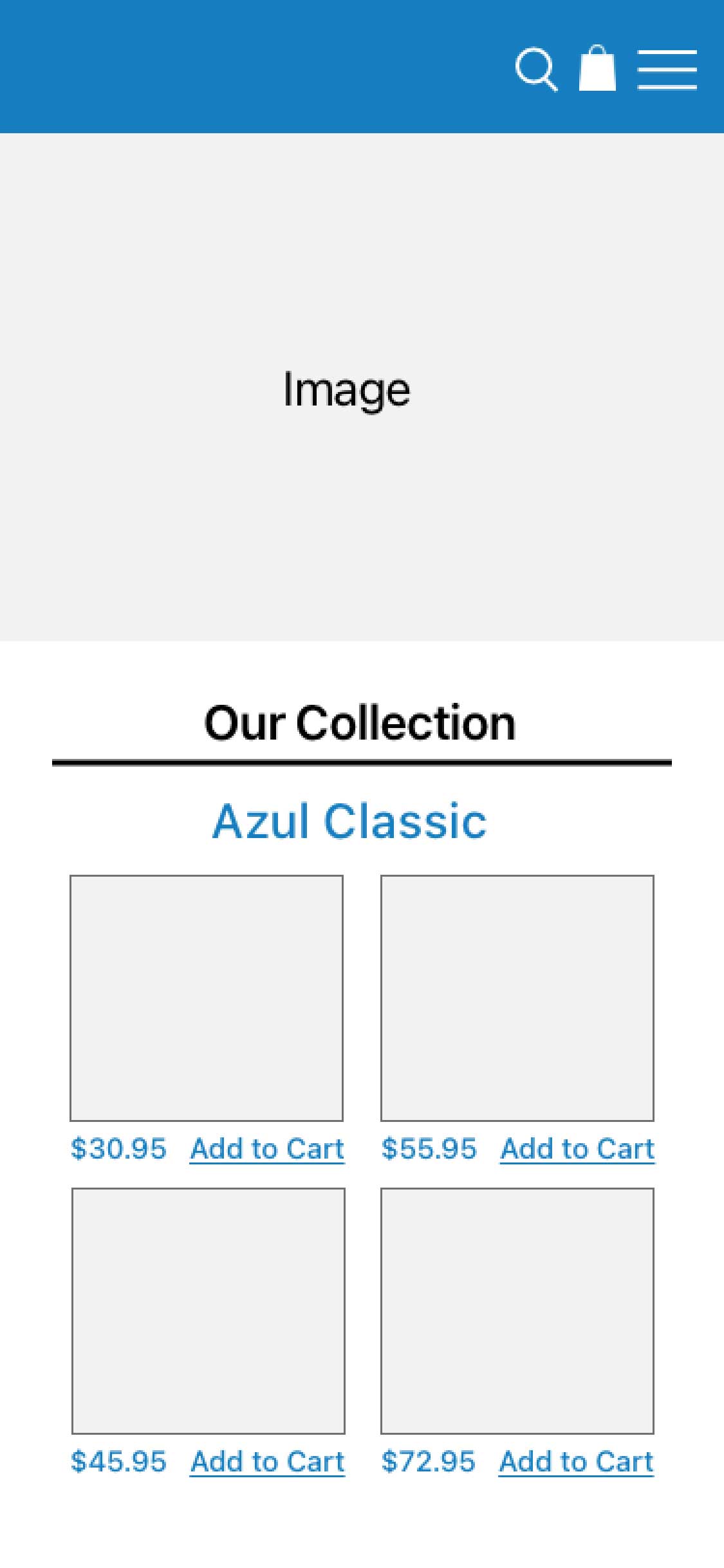
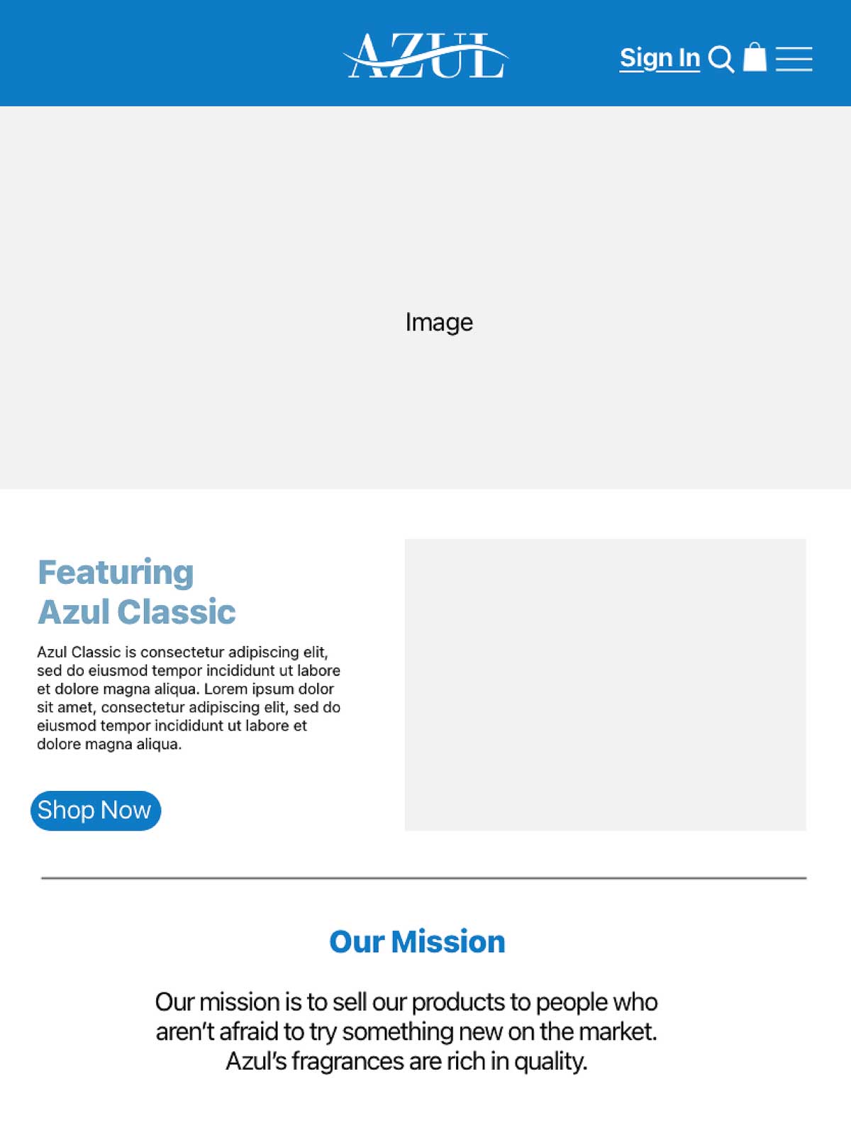
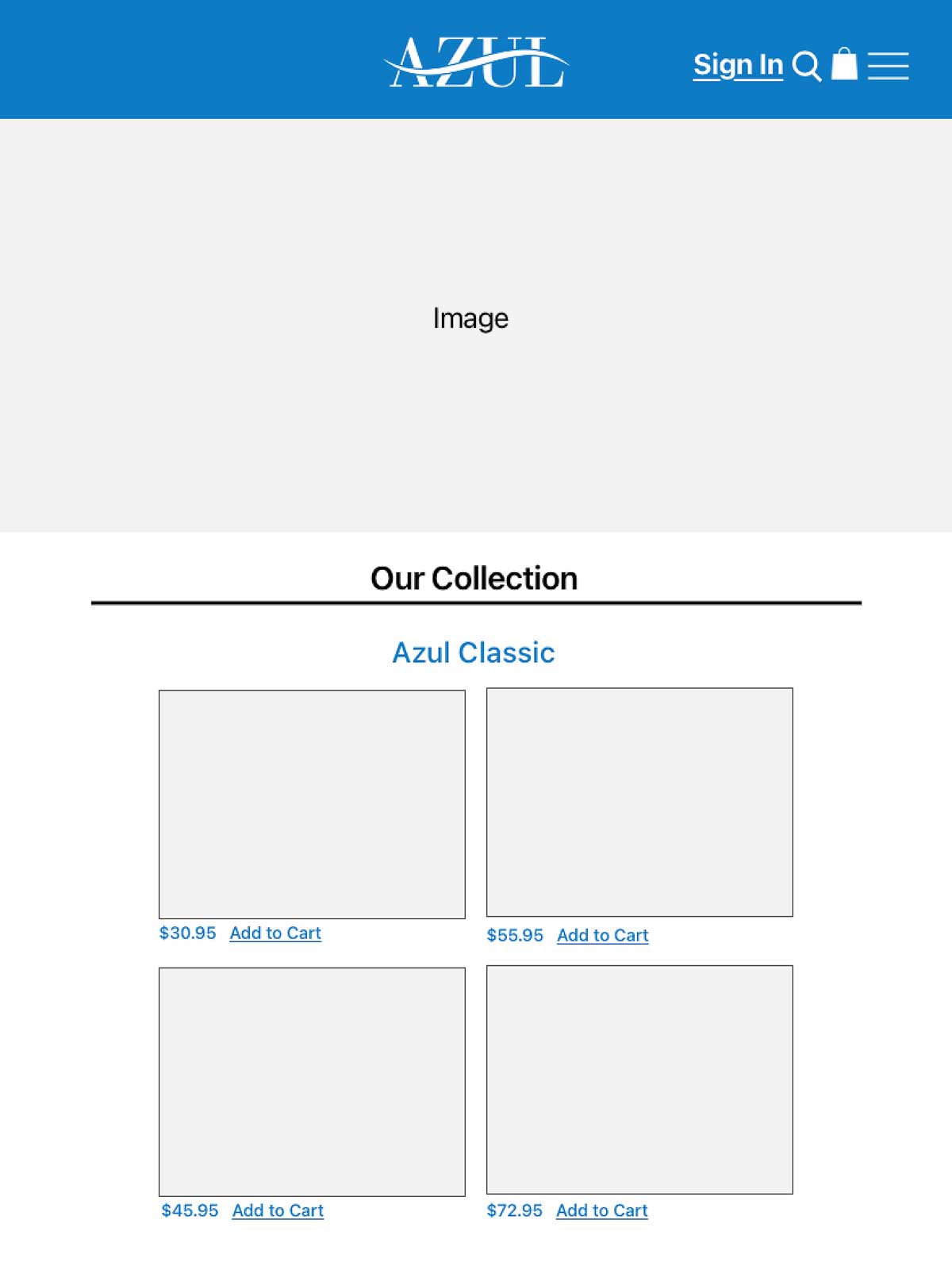
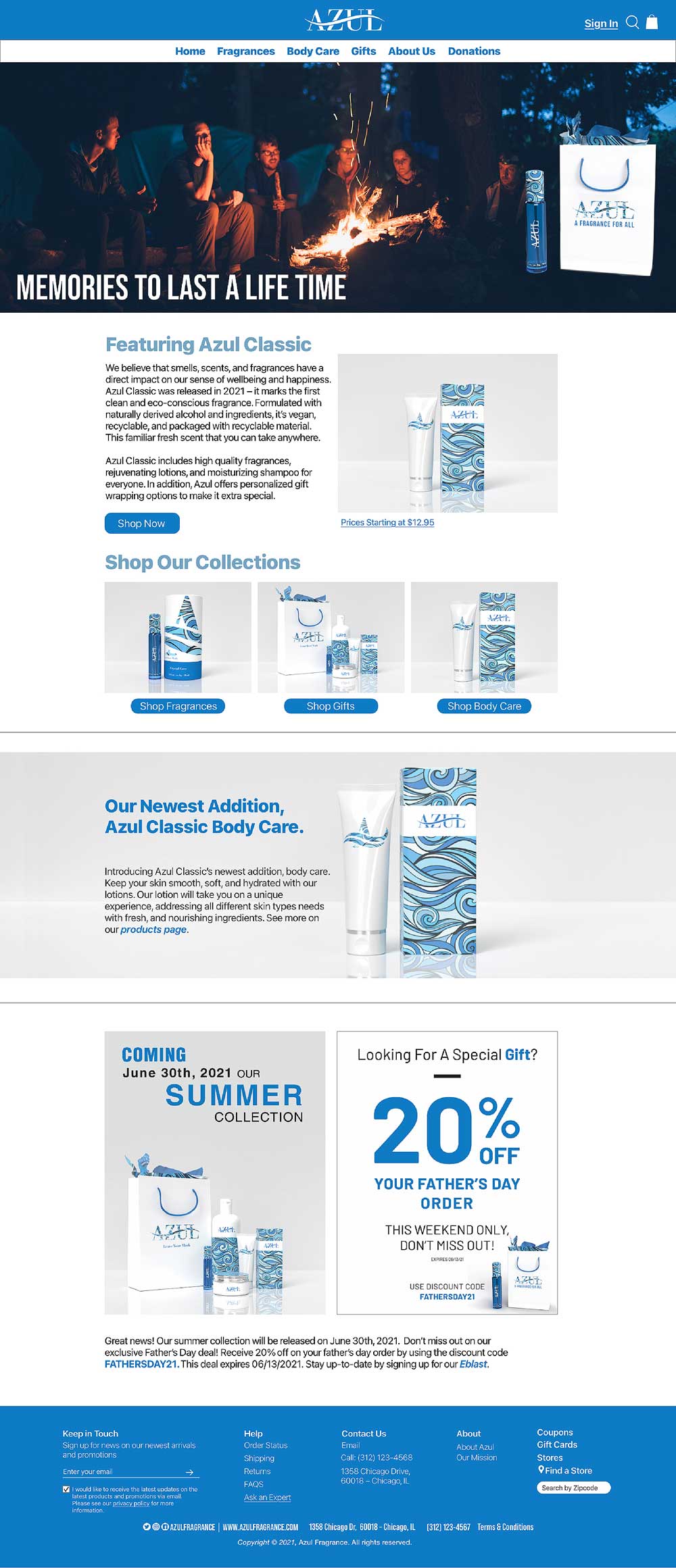
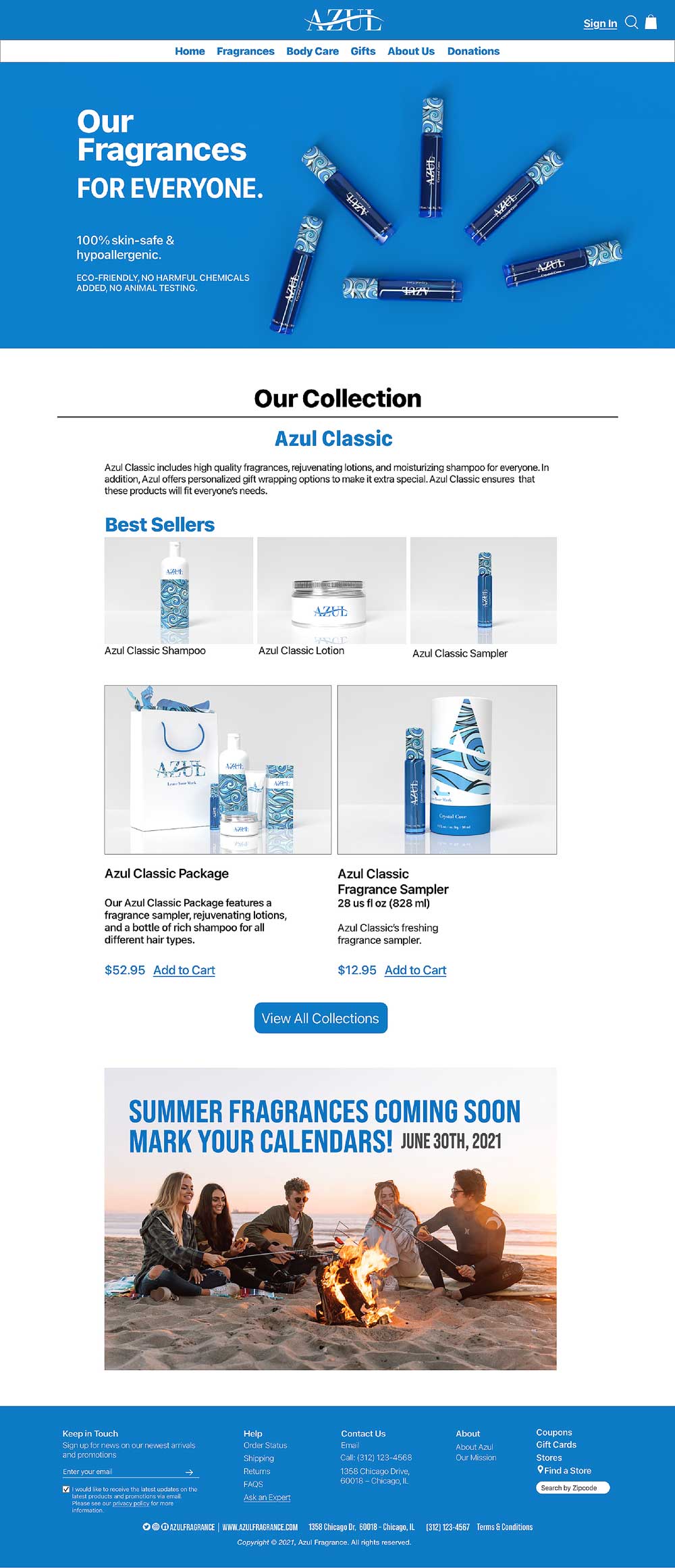
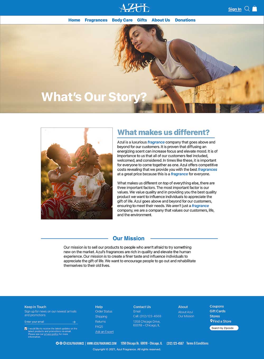
For the UI/UX component of Azul, we focused on designing a mobile-friendly website, knowing most users browse on their phones while on the go. The interface follows a clean, minimal style to present information clearly and encourage easy shopping. Our designs are informed by competitor research while maintaining originality, with the goal of creating a cohesive and intuitive mobile experience that stands out.
During our research, the team decided to focus on a mobile-friendly site, recognizing that most people rely on their smartphones while in the city for work, school, or everyday browsing. We drew inspiration from other websites and adapted those ideas into our own approach to create a site that fits our vision and user needs.
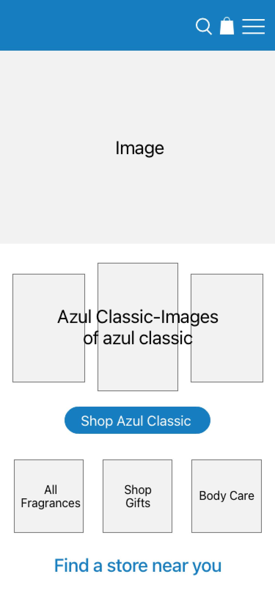
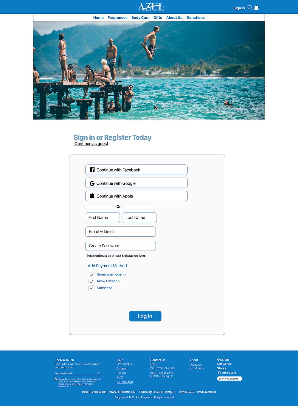
In our sketches, we focused on expressing the brand’s luxurious feel while keeping the pages clean, simple, and well organized with a strong visual hierarchy. We explored various layouts for images, text, buttons, and graphics to clearly map out our ideas. The concept includes a sign-in page featuring the logo as the first touchpoint, along with strong product imagery and consistent icon placement throughout the mobile-friendly experience.
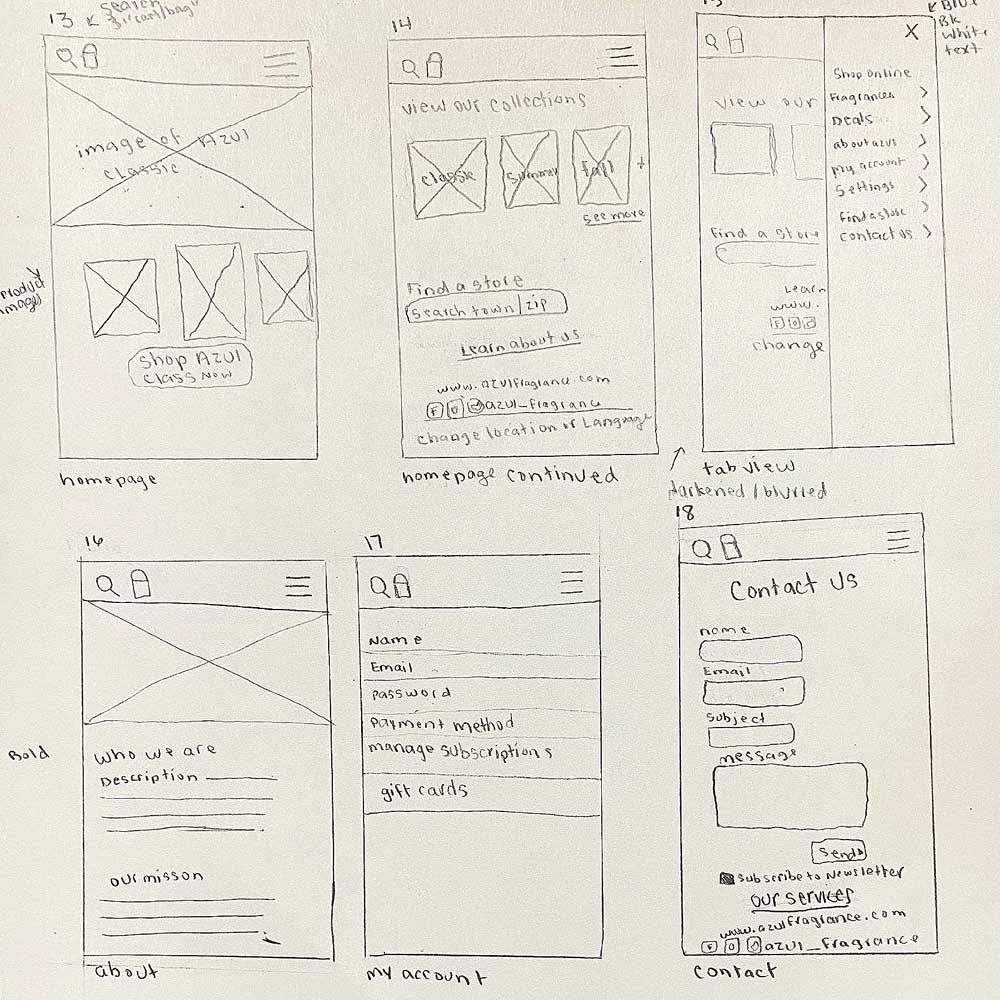
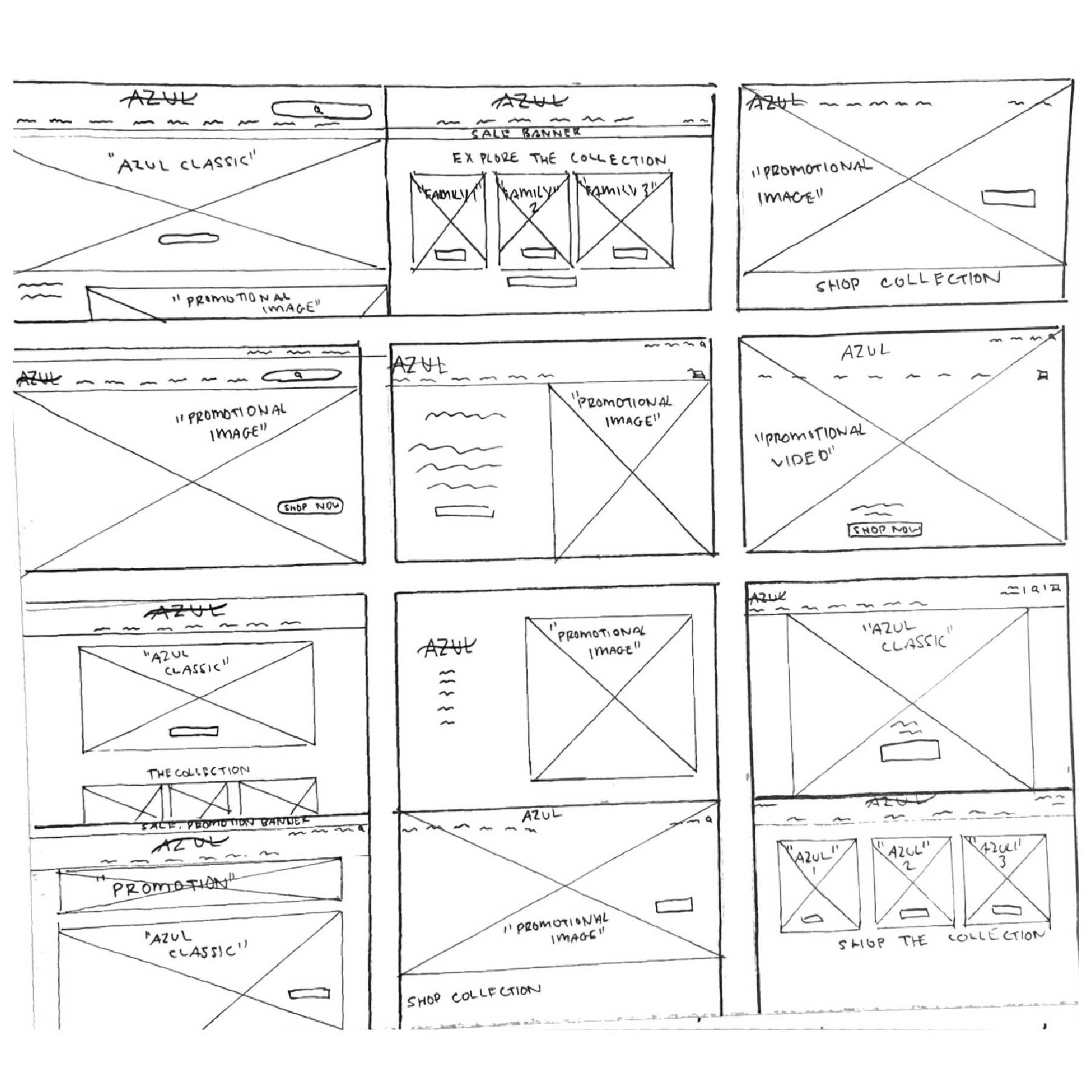
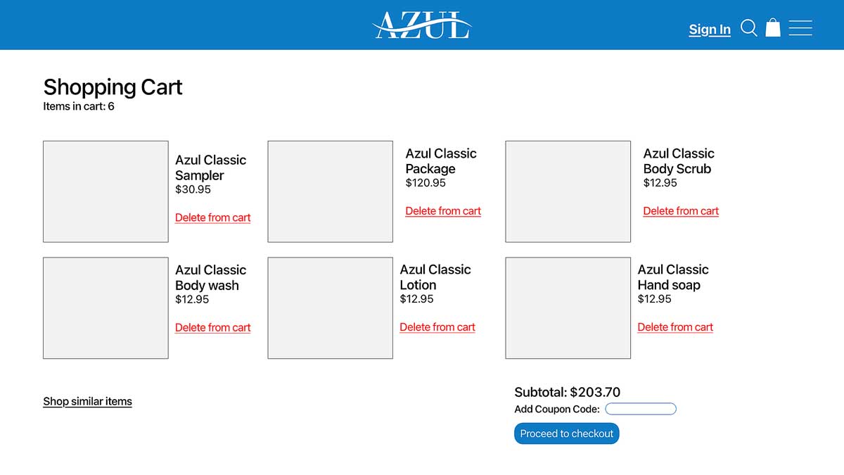
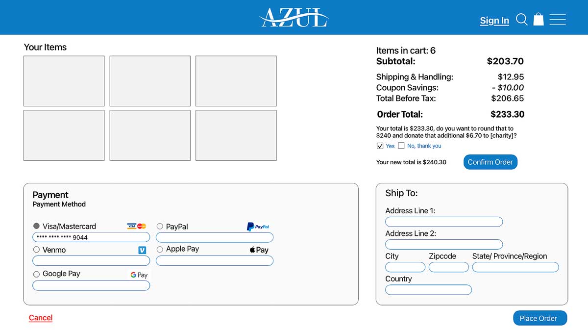
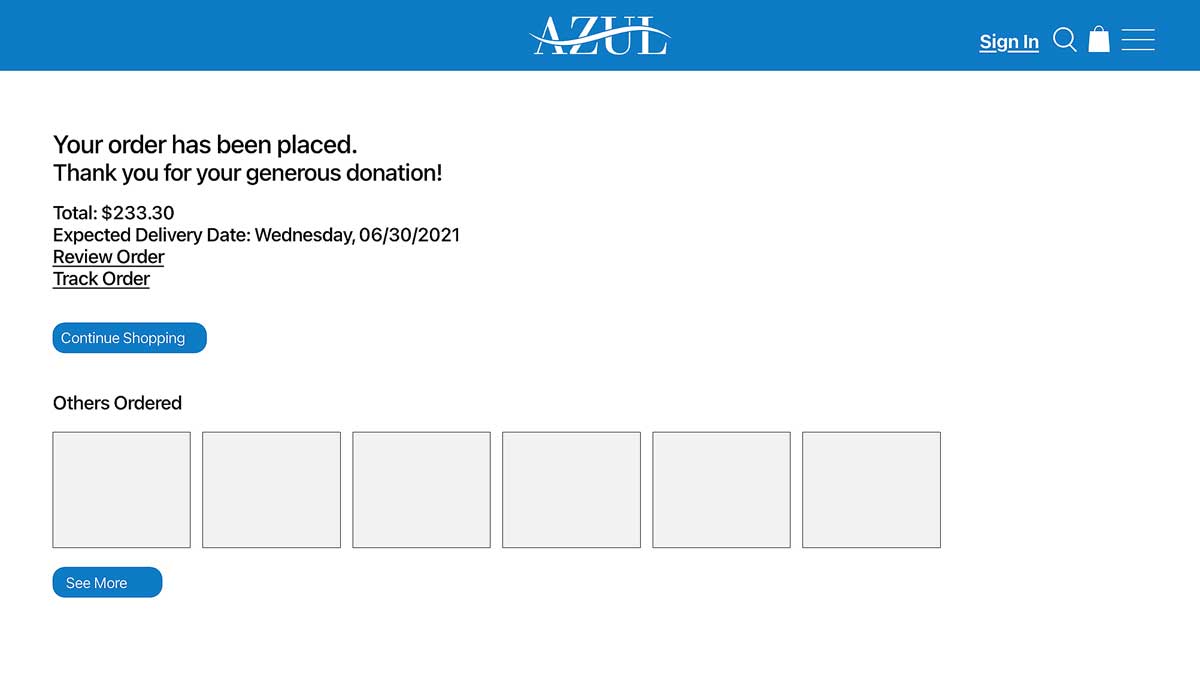
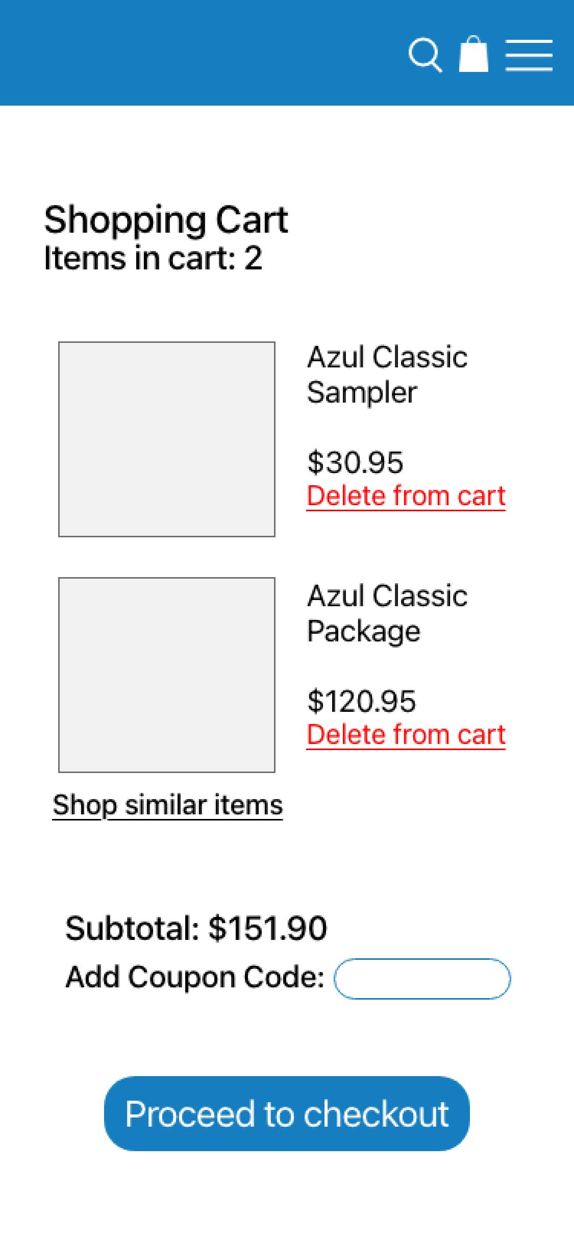
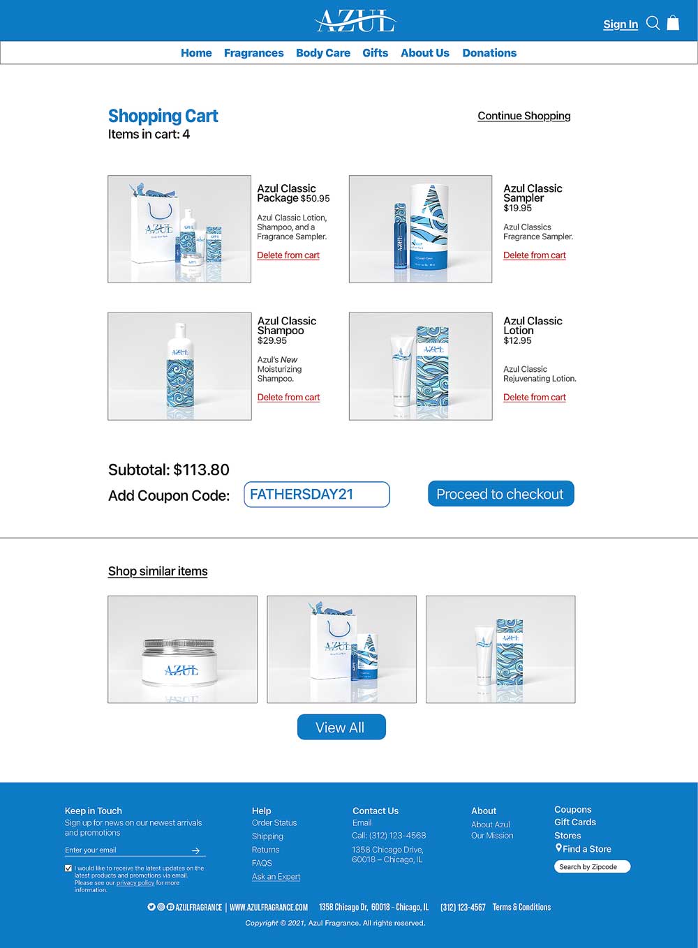
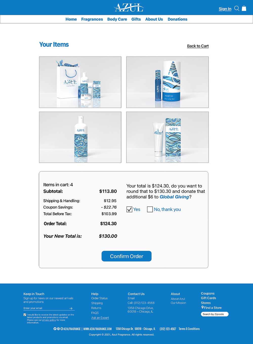
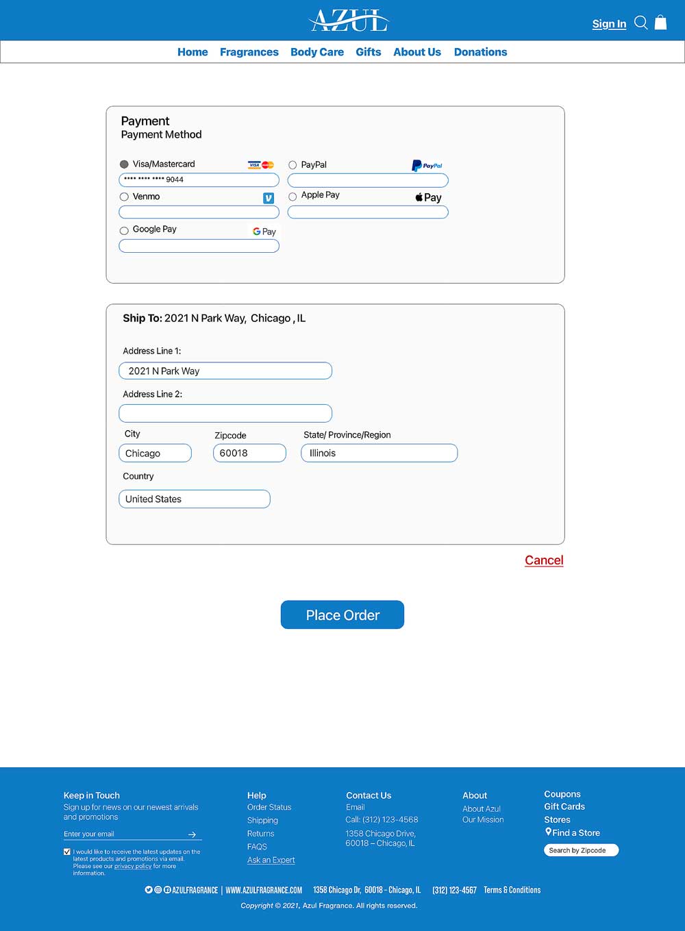
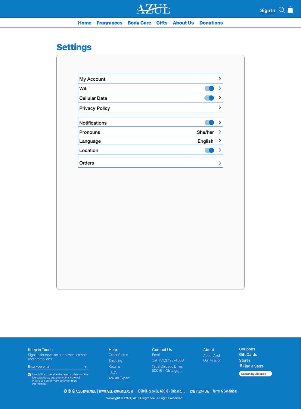
For our wireframes, we expanded the experience by adding more content, buttons, and pages such as payment, confirmation, donation, settings, and account pages. This phase allowed us to better define the overall structure and functionality of the site. The user flow shows how pages connect, with navigation and the footer accessible throughout to ensure an easy and intuitive experience for all users.
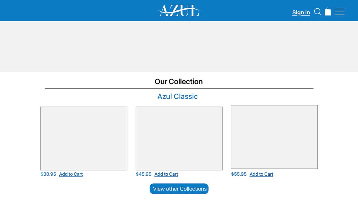
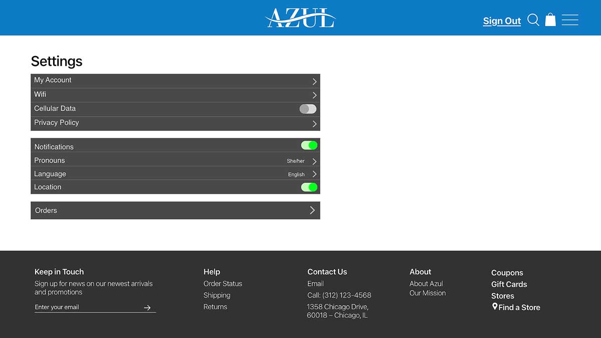

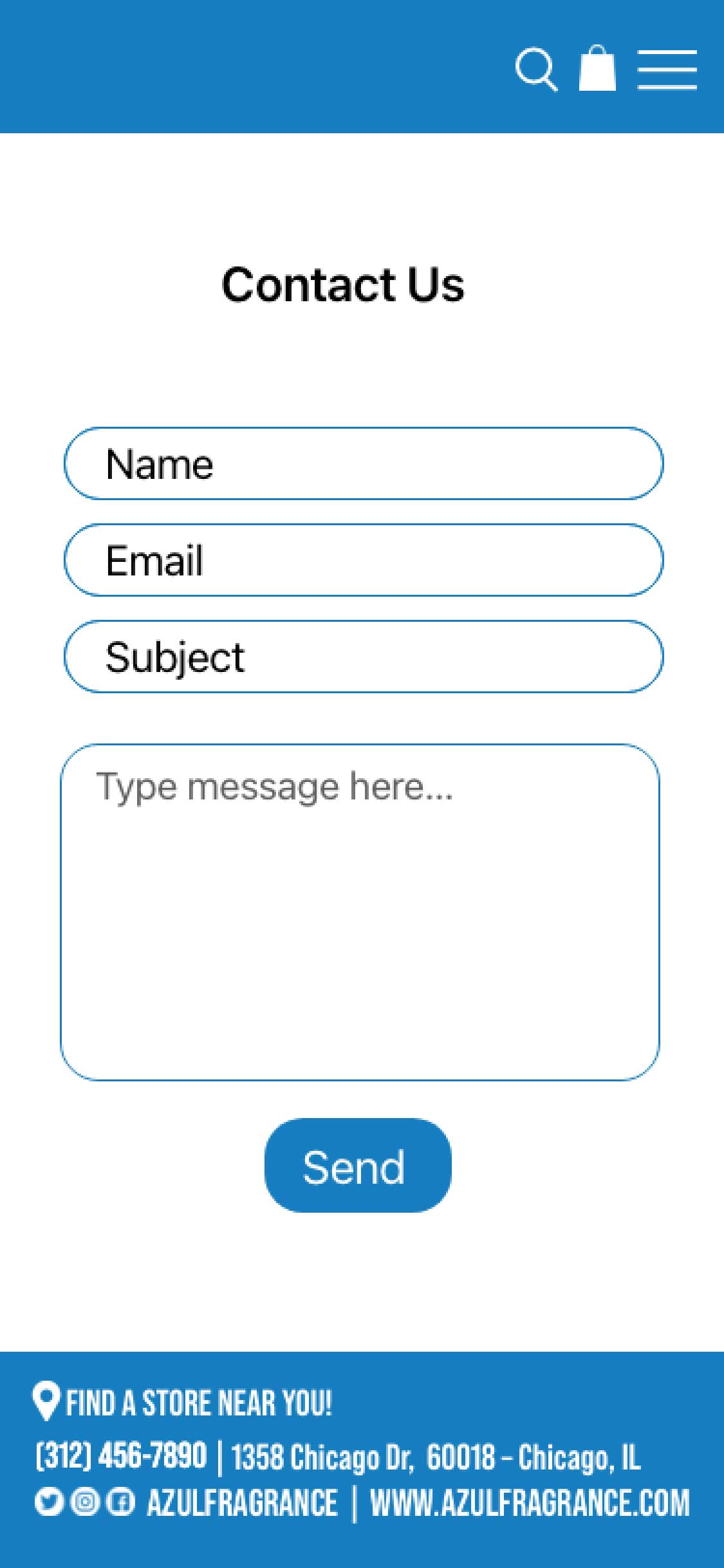
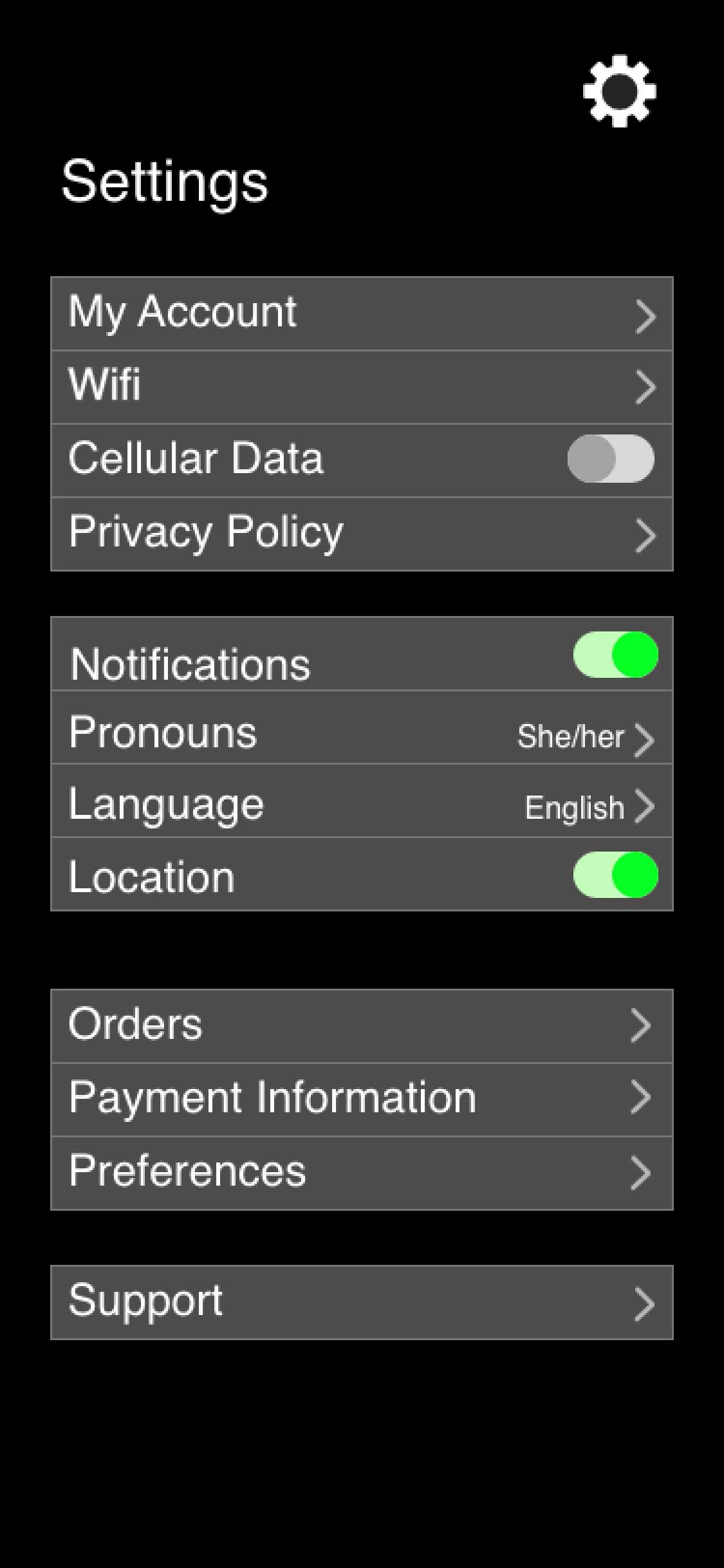
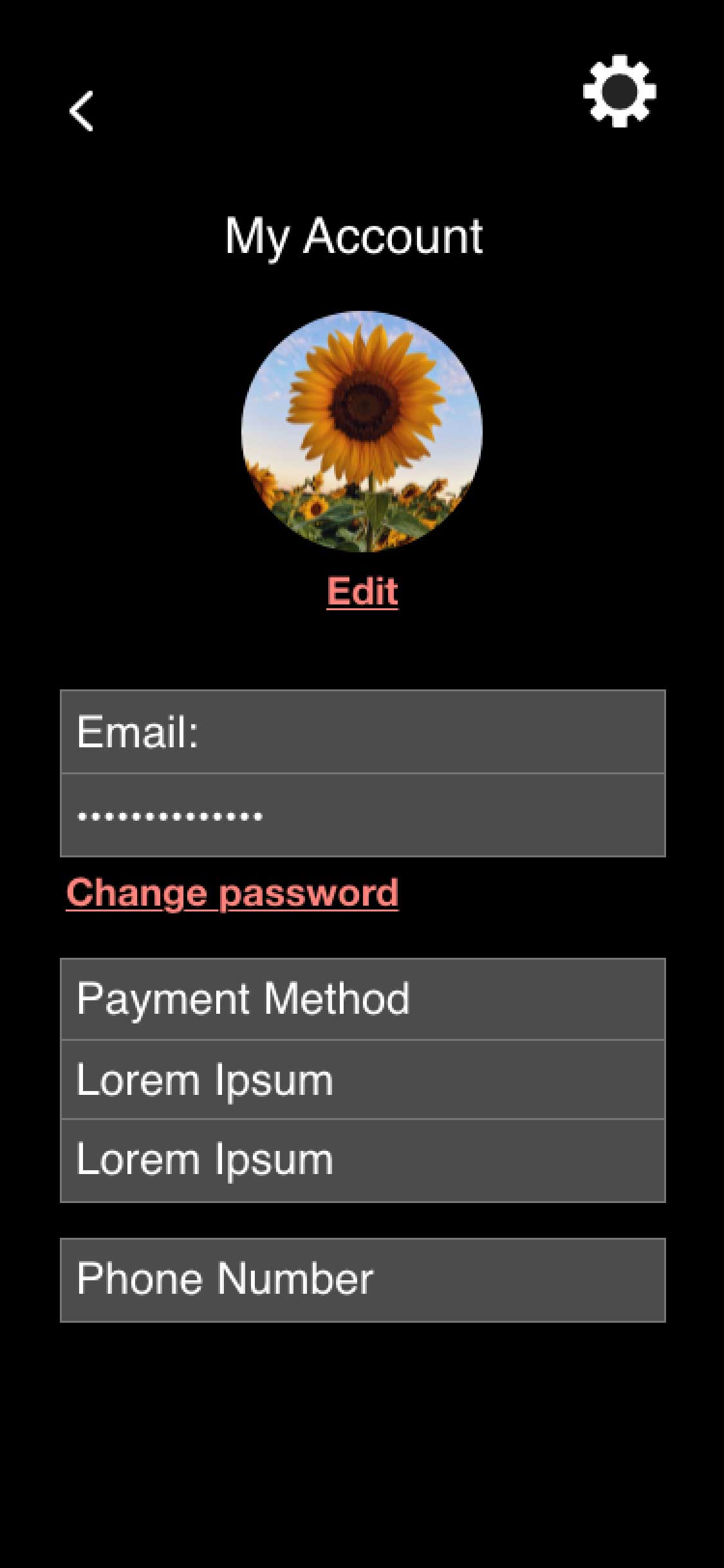

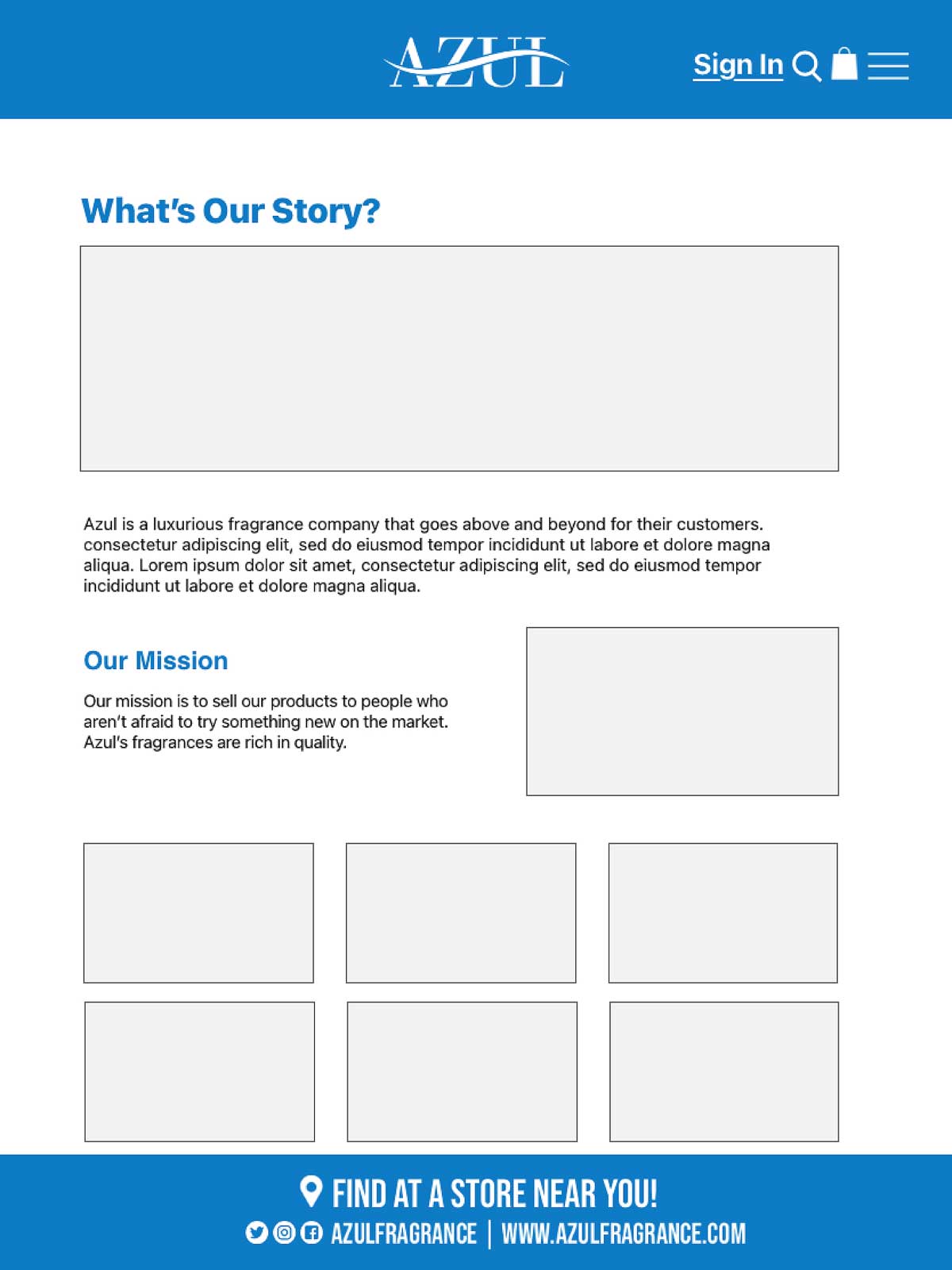
For the site map, our team added several features to make the website more user-friendly and inclusive. These include language options, preferred pronouns, multiple payment and checkout pages, an “ask an expert” feature, and a body care section. Our goal is to create an accessible experience where every customer feels welcomed. Each page will include a footer with an email form, social media links, FAQ, contact information, store locator, and expert support.
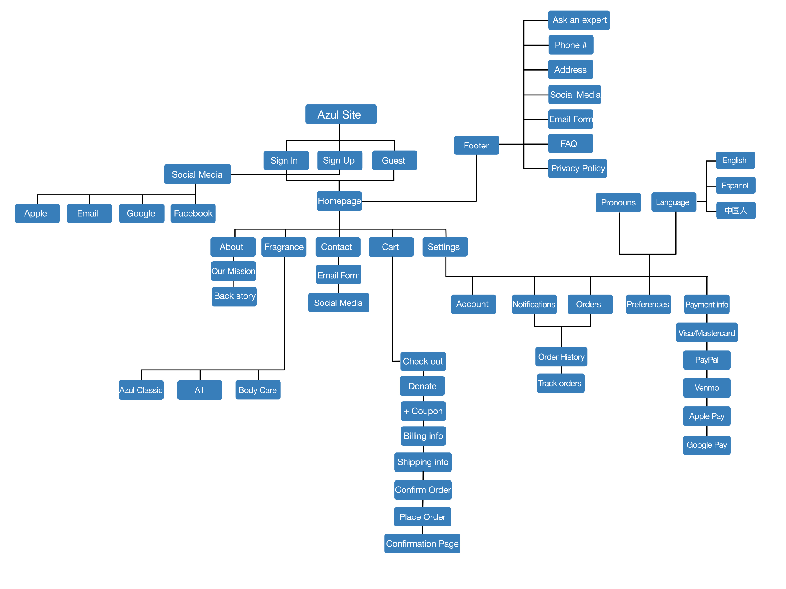
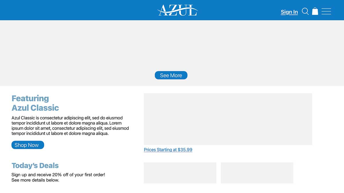
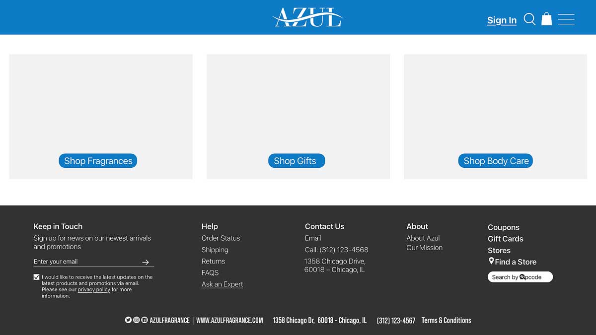
For the visual design phase, we revised and updated the site based on team discussions and feedback. We centered the main content within a 1200px width to improve readability and updated imagery to keep the experience consistent across the site. Additional pages like checkout and settings were added to complete the website structure. After final refinements—including layout adjustments, imagery updates, alignment fixes, and color tweaks—the site feels cleaner, more organized, and easier to navigate, with a strong focus on clarity, hierarchy, and accessibility.
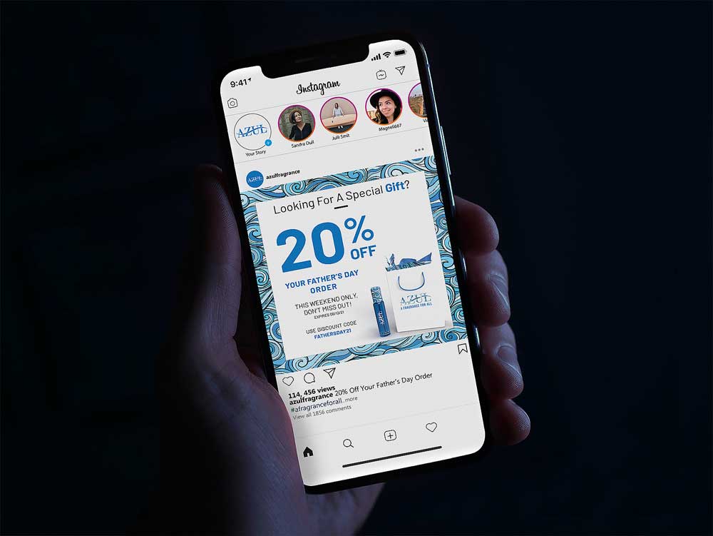
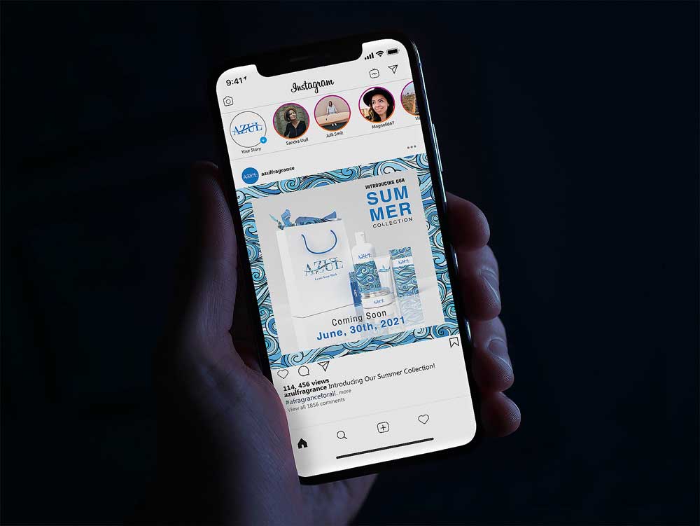
I designed two email blasts to communicate key promotions to customers. One focused on a 20% Father’s Day discount, timed to help customers find a thoughtful gift with ease. The second introduced our summer collection, featuring a shampoo, cream, and lotion with newly designed packaging. Both campaigns were sent through Mailchimp and thoughtfully designed to engage our audience—these email blasts can be viewed below.
For our final mockups, we brought all of our work together to showcase how the website would appear across tablet, desktop, laptop, and mobile devices.