This project was created in my Graphic Design I class, where I was tasked with developing a concept for a record label. I chose this direction because music has always been a huge part of my life, and it gave me the chance to build a brand around something I’m genuinely passionate about. Designing my own label felt both exciting and personal, and it allowed my creativity to really come through.
Electric Eye Records is an artist-first label built to support creativity, not control it. The label focuses on high-quality music, strong visual design, and meaningful connections with the metal community, while handling production, merch, marketing, and distribution. With a commitment to excellence, it also manages licensing, royalties, and partnerships to help artists grow and succeed.
Young men and women ages 18–30 who are passionate about metal music and crave the adrenaline and intensity it delivers through powerful sound.
When researching logo inspiration, I looked closely at companies that actively support metal and rock bands, since my brand is rooted in that same scene. Labels and brands like Facedown Records, Red Bull, and Sumerian Records often use bold symbols or animal imagery, which felt powerful and fitting. At the same time, I explored lettermark logos inspired by Epitaph Records, Tooth & Nail Records, and Rise Records, allowing me to experiment with both approaches to shape a strong, authentic identity for the company.
When sketching ideas, I focused on how metal music makes me feel—energized and electrified. The company name is inspired by Judas Priest, which led me to explore the idea of an electrifying eye, almost god-like, with energy bursting out the way music does when you’re playing guitar or fully immersed in sound. I also experimented with typography, using boxed text and lettermarks to see how type alone could carry the identity, but the eye symbol stood out the most. While I explored combining the eye with a record shape, it felt too forced, so I chose to focus on a single strong symbol and explore different ways it could be applied.
After exploring ideas from my sketches, I landed on the concept of using a record disc. The idea came from noticing how a broken vinyl almost resembled a human eye, which felt like a strong and meaningful connection to music. From there, I created digital versions of the logo and tested it in three layouts—stacked, horizontal, and vertical—to see how it could adapt across different uses and objects.
Brand Mark
Live Area: x/4 when x is the height of the logo.
Min Use: .25 Inches for the height
Word Mark
Live Area: x/4 when x is the height of the logo.
Min Use: .25 Inches for the height
Combination Mark
Live Area: x/4 when x is the height of the logo.
Min Use: .25 Inches for the height
Final Logo
For the final logo, I chose the stacked version because the wordmark felt the most balanced and visually strong in that layout. I wanted the viewer’s eye to land on the brand mark first, then naturally move downward to the logo name. Adding blue to the word “eye” gave the design a subtle pop and helped reinforce the identity.
Proxima Nova
ABCDEFGHIJKLMNOPQRSTUVWXYZ
abcdefghijklmnopqrstuvwxyz
1234567890
!@#$%^*()_+
HP Simplified
ABCDEFGHIJKLMNOPQRSTUVWXYZ
abcdefghijklmnopqrstuvwxyz
1234567890
!@#$%^*()_+
Royal Blue
RGB: 44, 163, 221
CMYK: 70, 20, 0, 0
Web Safe: #3399CC
Black
RGB: 35, 31, 32
CMYK: 0, 0, 0, 100
Web Safe: #000000
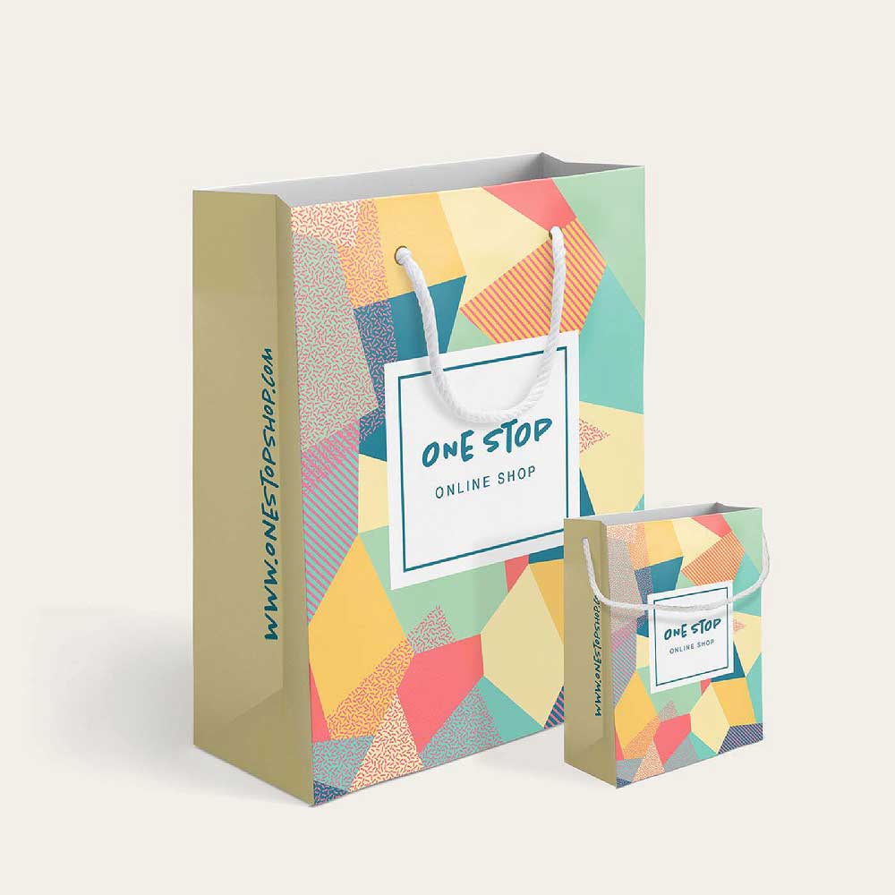
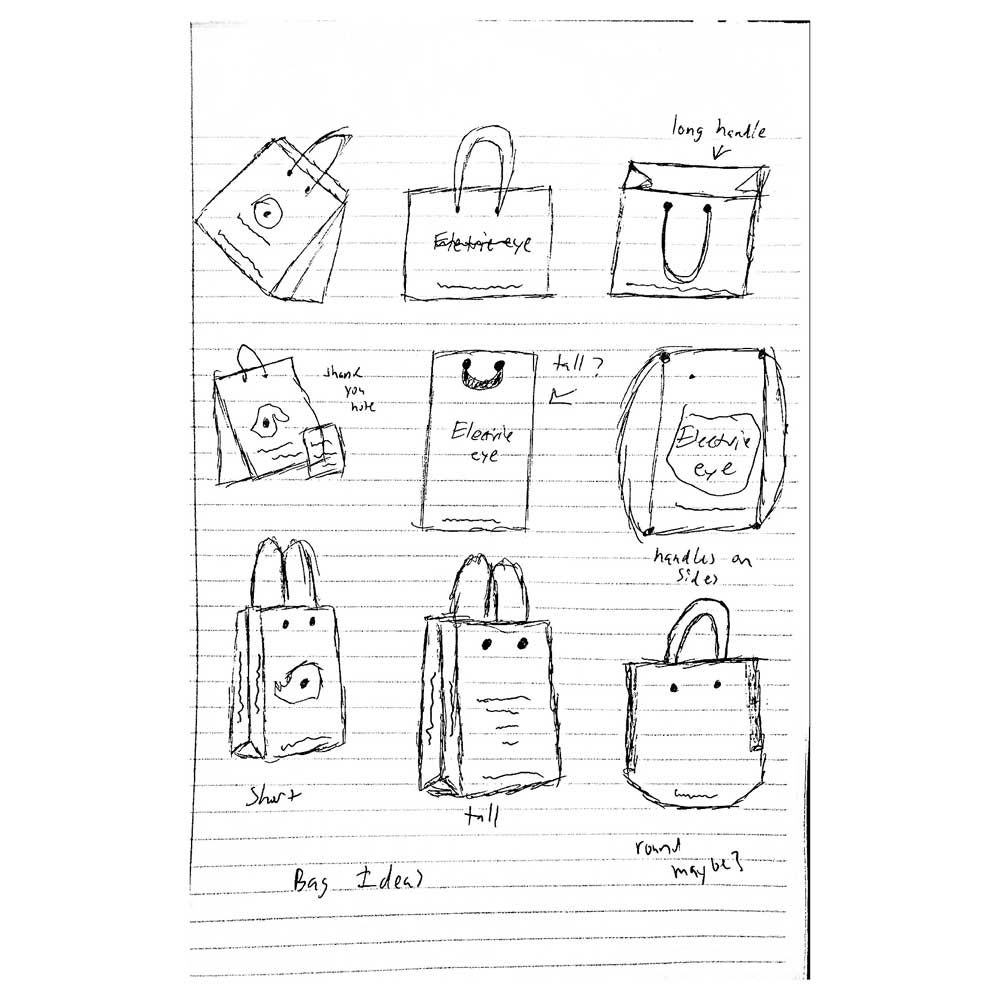
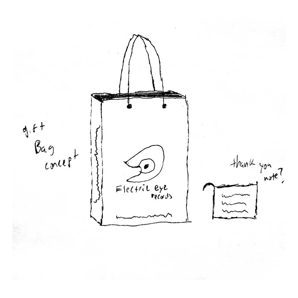
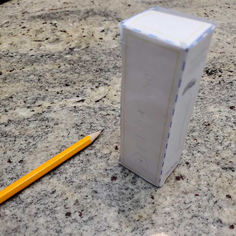
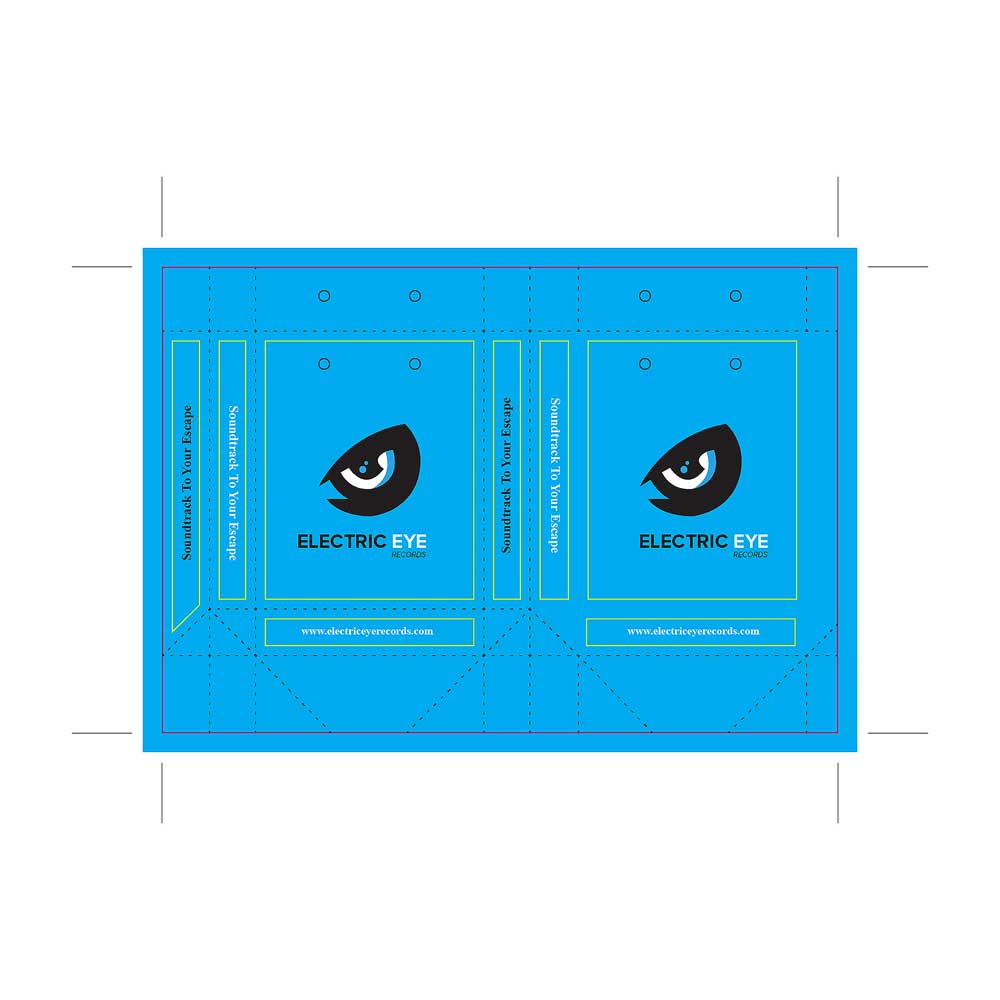
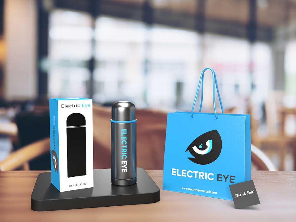
When I first started thinking about packaging for this brand, I wanted to avoid the typical vinyl record route most record companies take. Instead, I explored ideas like a reusable water bottle flask and a branded gift bag as a way to show appreciation to customers. I sketched out several box and bag concepts, focusing on creating something people would actually want to take home, reuse, and talk about—helping the brand live beyond the purchase and spark conversations with new audiences.
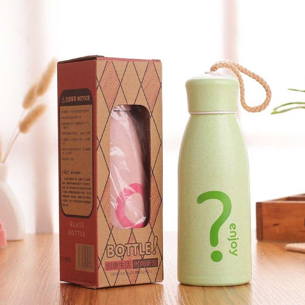
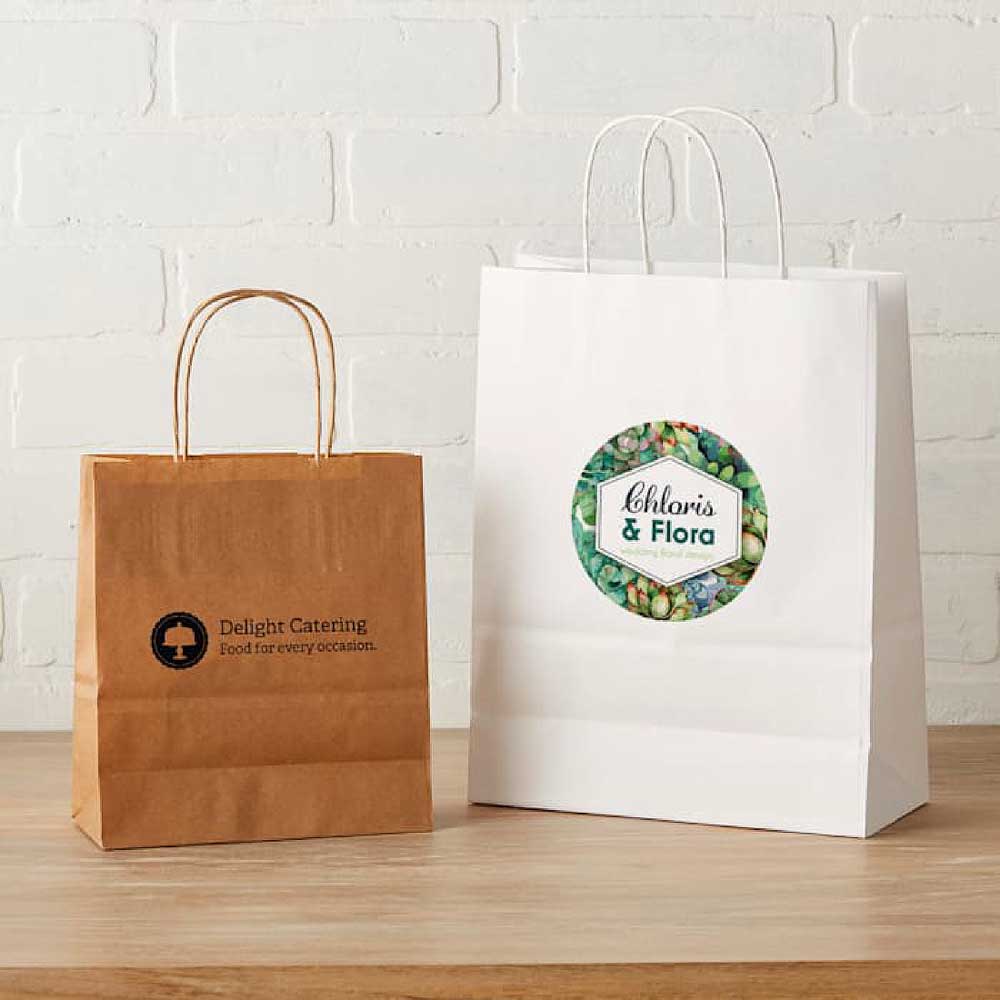
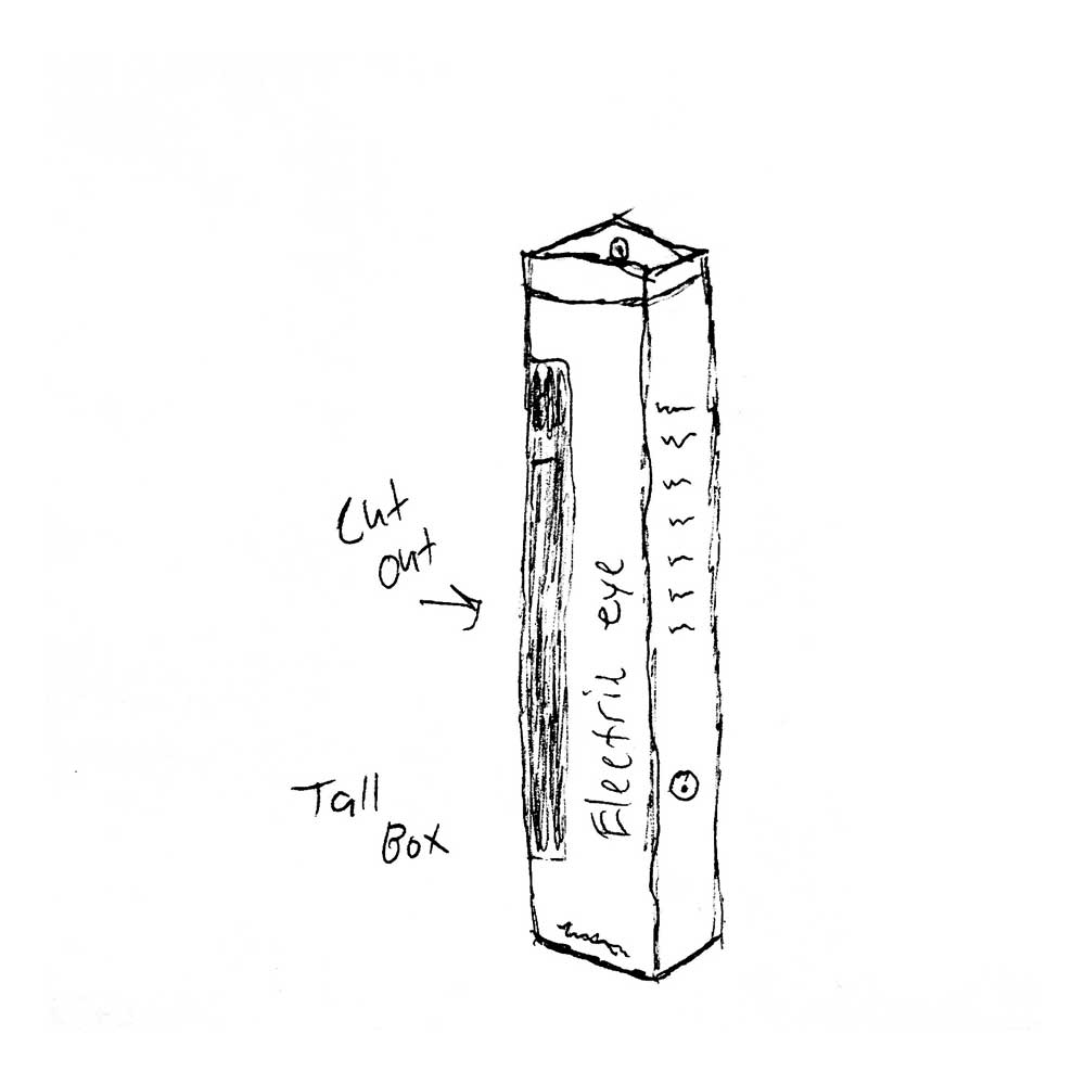
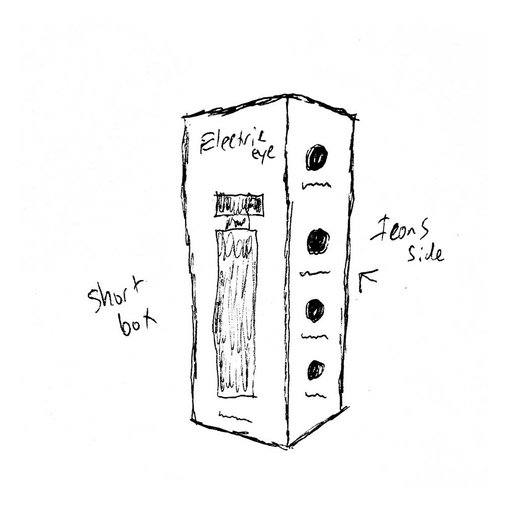
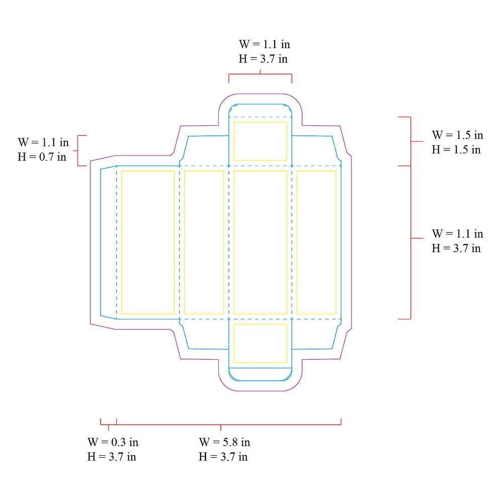
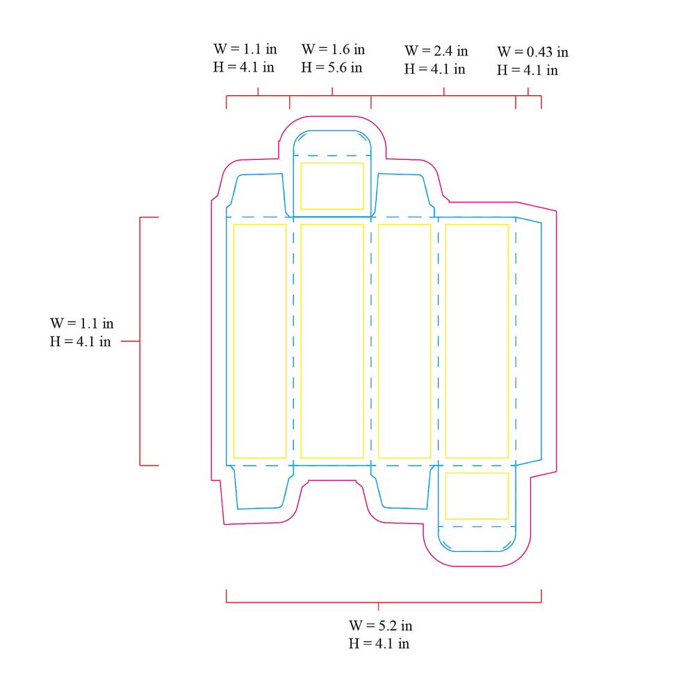
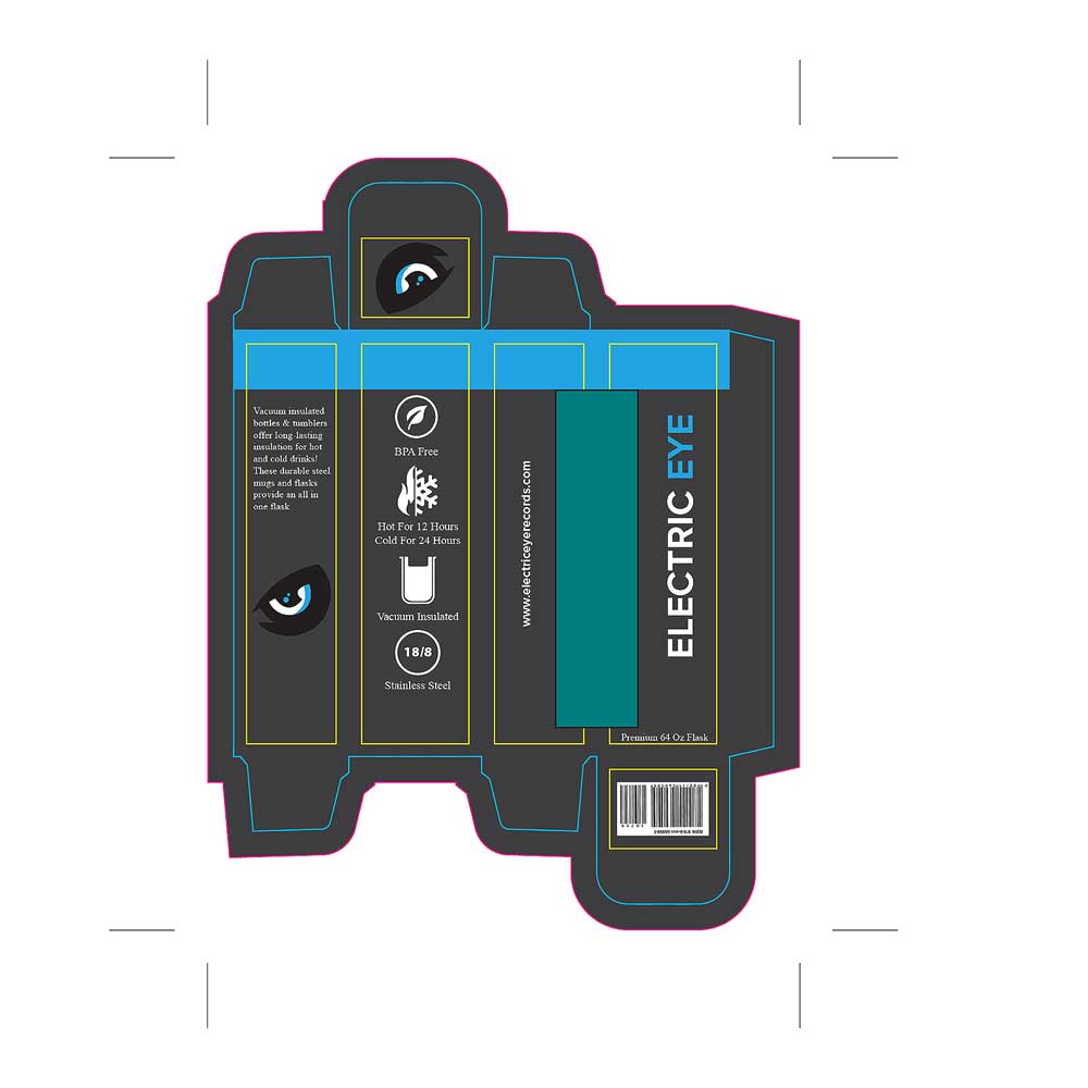
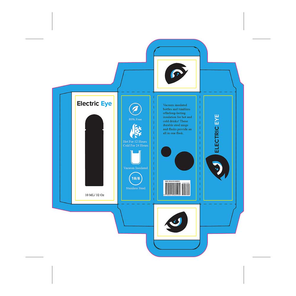
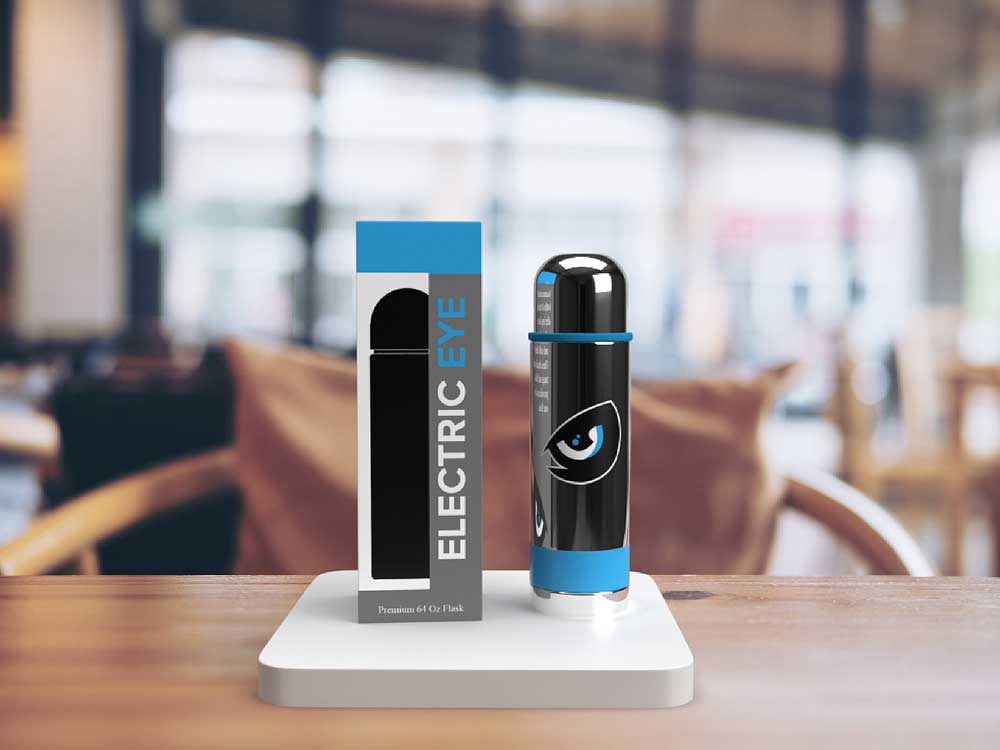
When sketching ideas for the packaging, I wanted to move away from the typical vinyl record approach and create something more thoughtful and useful. I explored tall and medium box designs for reusable water bottle flasks, inspired by the long hours artists spend in the studio recording until they get the sound just right. The flasks serve as both a practical studio essential and a thank-you gift for clients after doing business with the label. Each flask comes with a branded gift bag, given either during recording sessions or after a project is completed. I also designed a cutout on the left side of the box to showcase the bottle and its graphics, creating a “try-before-you-buy” feel that lets customers connect with the product right away.
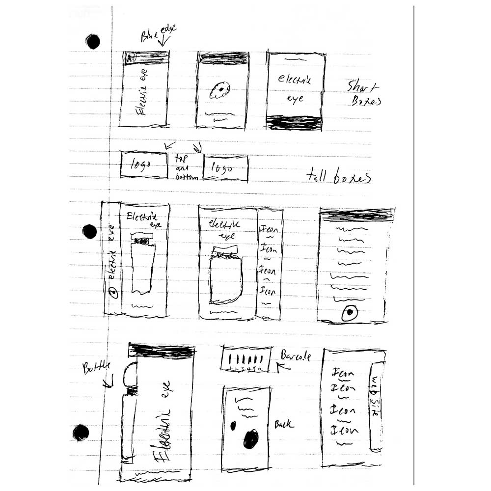
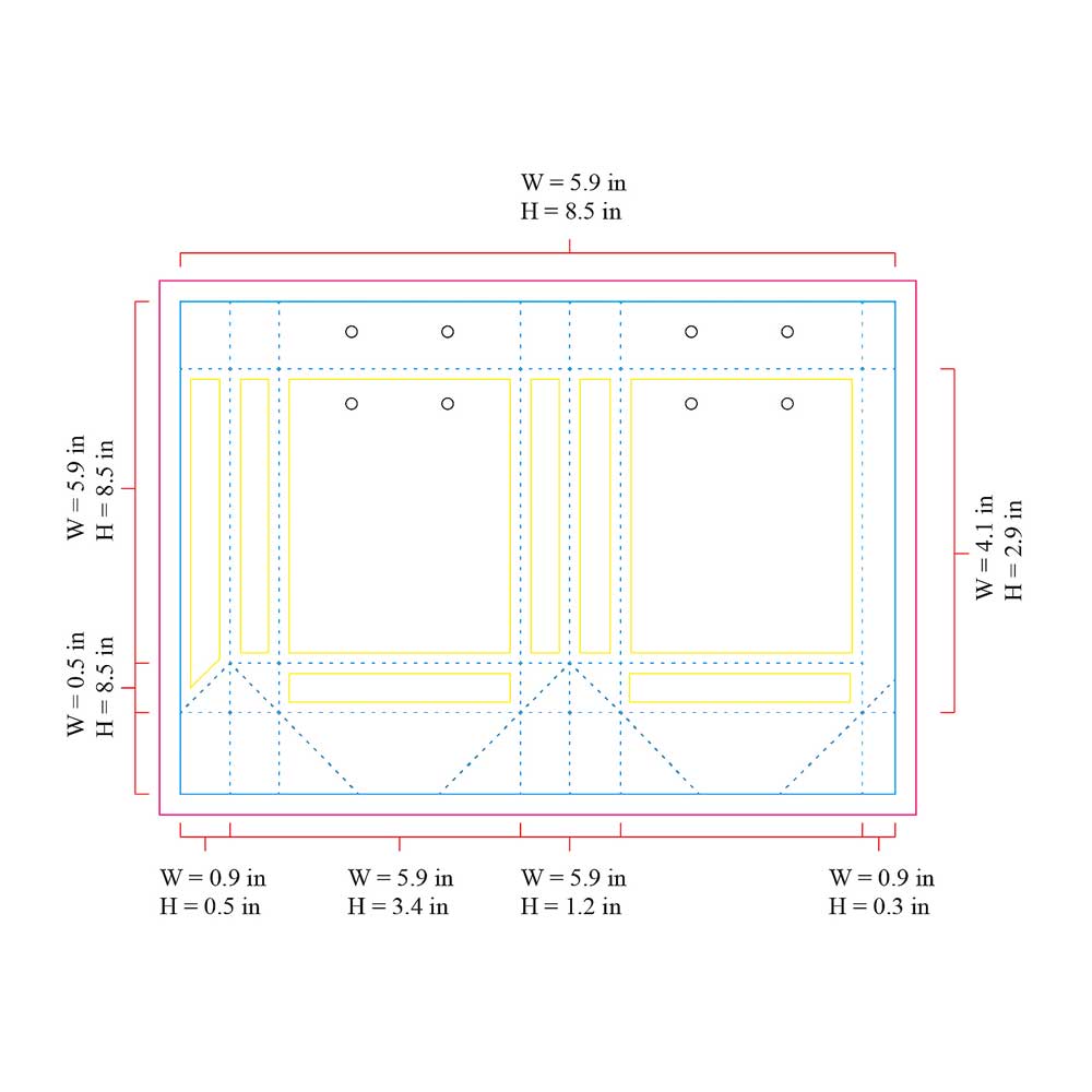
When designing the production templates, I focused heavily on understanding the structure of the packaging so I could place the graphics intentionally and accurately. I developed a 4–6 carrier concept that is wider, taller, and more exposed, allowing it to hold multiple items comfortably. I researched current packaging trends by visiting grocery stores and noticed this style was commonly used for bottles, but rarely for cans—so I decided to apply that idea here. Across the two spreads, I positioned the logo on one end and the name on the other, ensuring the brand remains visible on the shelf from multiple angles.
After researching potential products for the brand, I began sketching ideas that felt both practical and meaningful. I landed on reusable water bottle flasks, inspired by the long hours artists spend inside studios creating music, and explored two different sizes, each with its own unique packaging. I also designed a branded gift bag to accompany the products when clients do business with the company. This serves as a simple thank-you gesture and encourages customers to return or share their experience with others, helping spread awareness of the brand and what we can create together.
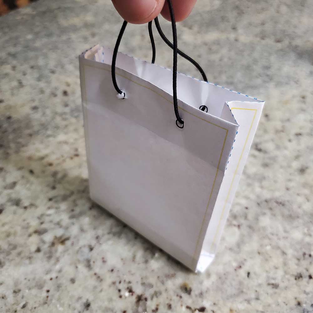
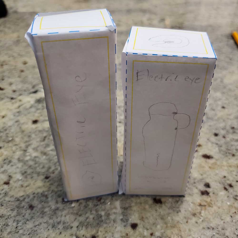
After receiving feedback from my classmates and instructor, I refined the packaging by rearranging graphics and adding new elements to better use the space. I introduced cutouts to showcase the product inside and added icons to highlight the materials used, giving customers clearer information at a glance. After several iterations, I redesigned the smaller box while keeping the bag the same, as it was consistently well received.
I created this piece in my motion design class as part of a project focused on animating text or a logo. I chose one of my own branding logos because it’s a project I’ve developed over time and wanted to expand on it by showcasing additional skills. Using Adobe After Effects, I animated the logo outline with the Saber plugin by Video Copilot, incorporating masking and track mattes, and built a dynamic particle background using Trapcode Particular by Red Giant. The final animation highlights both the brand and my motion design capabilities, and the video can be viewed below.